Updated May 2026: I’ve refreshed this ROC guide with a clearer rate-of-change formula, more detailed notes on overbought and oversold readings, and an updated Python chart tutorial for readers who want to build the indicator step by step.

What Is the Rate of Change Indicator?
The Rate of Change indicator, usually shortened to ROC, measures how much price has changed compared with a previous bar.
For example, a 14-period ROC compares the latest close with the close from 14 bars ago. If today’s price is higher, ROC is positive. If today’s price is lower, ROC is negative. If price is roughly unchanged versus that earlier bar, ROC sits near zero.
That makes ROC one of the more direct momentum indicators. It is not smoothing price first or running through several layers of calculation. It is simply asking how far price has moved over the lookback period.
A bar just means one chart interval. On a daily chart, a 14-period ROC compares today with 14 trading days ago. On a 5-minute chart, it compares the latest candle with the candle 14 five-minute bars ago.
The useful part is also the danger. ROC reacts quickly because the formula is simple. A sharp move can make the line jump. A sideways market can make it flick around the zero line. That is why I would not treat every ROC cross as a trade by itself.
In this guide I’ll walk through the ROC formula, how traders read the zero line, extremes and divergence, how the lookback period changes the indicator, and how to build a ROC chart in Python step by step.
Where the ROC Indicator Comes From
ROC does not have the same neat origin story as some named indicators. It is better thought of as a trading version of a basic rate-of-change calculation: compare a current value with an earlier value and measure the difference.
In market terms, that means comparing the latest price with the price from a chosen number of bars ago. The result is plotted as an oscillator around zero.
Momentum and rate-of-change ideas have been part of technical analysis for decades. Traders wanted a simple way to see whether price was moving faster, slowing down, or losing direction. ROC does that without much decoration.
That simplicity is why it is still useful. It also means the indicator needs context. ROC can tell you that price has changed sharply over the lookback period, but it cannot tell you whether that move is the start of a trend, the end of a trend, or a temporary burst of volatility.
How the ROC Indicator Is Calculated
ROC compares the current price with the price from a chosen number of bars ago, then expresses the difference as a percentage.
Before the formula, here are the symbols:
P means price.
t means the current bar.
P_t means the price on the current bar.
n means the lookback period.
P_{t-n} means the price n bars ago.
A 14-period ROC compares the latest close with the close from 14 bars earlier. On a daily chart, that means 14 trading days. On a 5-minute chart, it means 14 five-minute candles.
ROC_t = \left(\frac{P_t - P_{t-n}}{P_{t-n}}\right) \times 100ROC = ((current price – price n bars ago) / price n bars ago) × 100
Here is a quick example.
Suppose a stock closed at 100 fourteen bars ago and closes at 108 now.
ROC = \left(\frac{108 - 100}{100}\right) \times 100 = 8ROC = 8%
That means price is 8% higher than it was 14 bars ago.
If the current close were 94 instead, the calculation would be:
ROC = \left(\frac{94 - 100}{100}\right) \times 100 = -6ROC = -6%
That means price is 6% lower than it was 14 bars ago.
If you only compare the current bar with the previous bar, the formula becomes the one-period rate of change.
ROC_t = \left(\frac{P_t}{P_{t-1}} \times 100\right) - 100One-period ROC = (current price / previous price × 100) – 100
That version is useful for understanding the logic, but it is usually too jumpy for most chart work. Traders normally use a longer lookback so the line shows momentum over a chosen window rather than one bar at a time.
ROC is an unbounded oscillator. It does not have fixed limits such as 0 and 100.
That makes it different from indicators such as RSI. RSI is designed to stay inside a fixed range. ROC can keep rising or falling as the percentage move gets larger.
In practice, ROC will usually spend most of its time within a familiar range for that market and time frame. The important point is that there is no universal level where ROC must be “too high” or “too low.” A high ROC reading can show stretched momentum, but it can also show a strong trend. A low ROC reading can show downside pressure, but it does not automatically mean price is ready to bounce.
What ROC Is Good At
ROC is useful because it shows the speed of price change over a chosen lookback period.
A price chart can rise slowly, rise sharply, drift sideways, or fall quickly. ROC gives those changes a percentage reading, which makes momentum easier to compare.
When ROC is above zero, price is higher than it was n bars ago. When ROC is below zero, price is lower than it was n bars ago. When ROC is close to zero, price has not moved much over the lookback period.
That makes ROC useful for three main jobs.
First, it can help confirm momentum. A rising ROC suggests upward momentum is improving. A falling ROC suggests momentum is weakening or turning down.
Second, it can highlight stretched moves. If ROC is much higher or lower than usual for that market, price may have moved unusually far over the lookback window. That is a warning to investigate, not an automatic reversal signal.
Third, it can help spot divergence. If price makes a new high but ROC fails to make a new high, upside momentum may be fading. If price makes a new low but ROC fails to make a new low, downside momentum may be weakening.
I would treat ROC as a momentum gauge, not a complete trading system. It tells you how much price has changed over the lookback period. The chart still has to tell you whether that change is part of a trend, a range, or a short burst of volatility.
How Traders Read ROC Signals
ROC signals are best read as momentum context, not as automatic trade instructions.
The main readings traders watch are the zero line, the direction of the ROC line, unusual extremes, and divergence between price and the indicator.
Identifying Market Momentum
The zero line is the main reference point.
When ROC is above zero, price is higher than it was n bars ago. When ROC is below zero, price is lower than it was n bars ago.
A ROC line above zero and rising supports a bullish momentum view. A ROC line below zero and falling supports a bearish momentum view.
I would be careful with the word “supports.” ROC can help confirm momentum, but it does not know whether the next candle will continue the move.
Reading high and low ROC values
ROC can move to unusually high or unusually low values when price has travelled a long way over the lookback period.
Some traders call these overbought and oversold readings, but ROC is not bounded like RSI or Stochastics. There is no fixed upper or lower level where the indicator must turn.
A high positive ROC can mean price is stretched. It can also mean the market is trending strongly.
A deep negative ROC can mean downside momentum is stretched. It can also mean sellers are still in control.
The useful comparison is usually against that market’s own recent history. A ROC value that is extreme for a slow index may be ordinary for a volatile single stock or crypto pair.
Divergence
Divergence appears when price and ROC stop confirming each other.
A bullish divergence forms when price makes a lower low, but ROC makes a higher low. That can suggest downside momentum is fading.
A bearish divergence forms when price makes a higher high, but ROC makes a lower high. That can suggest upside momentum is fading.
Divergence is useful as a warning sign, but I would not treat it as a complete trade by itself. Price still needs to confirm the turn.
Zero Line Crossovers
A zero-line cross shows that price has moved from being lower than it was n bars ago to higher than it was n bars ago, or the other way round.
When ROC crosses above zero, momentum has turned positive over the lookback period. When ROC crosses below zero, momentum has turned negative.
The problem is that zero-line crosses can be noisy in a sideways market. ROC can flick above and below zero repeatedly if price is not trending cleanly.
I would read a zero-line cross alongside the price chart. Is price breaking out, trending, or simply chopping around the same level?
Here’s a summary:
| ROC reading | What it shows | How I would read it |
|---|---|---|
| ROC above zero and rising | Price is higher than n bars ago and momentum is improving | Supports a bullish momentum view |
| ROC below zero and falling | Price is lower than n bars ago and momentum is weakening | Supports a bearish momentum view |
| Very high ROC | Price has moved sharply higher over the lookback period | Strong momentum or stretched move |
| Very low ROC | Price has moved sharply lower over the lookback period | Strong downside momentum or stretched move |
| Bullish divergence | Price makes a lower low while ROC makes a higher low | Downside momentum may be fading |
| Bearish divergence | Price makes a higher high while ROC makes a lower high | Upside momentum may be fading |
| Repeated zero-line crosses | ROC keeps flipping around zero | Possible choppy or range-bound market |
ROC Pros and Cons
ROC is useful because it is direct. It compares the current price with an earlier price and turns the change into a percentage. That makes the indicator easy to understand once the formula is clear.
The same simplicity is also the weakness. ROC can move sharply when price jumps, and it can flick around the zero line when the market is going nowhere.
I would use ROC when I want a quick view of momentum over a defined lookback period. I would be more cautious using it as a standalone entry signal.
| Strength | Why it helps |
|---|---|
| Simple calculation | Easy to understand and test |
| Percentage-based | Easier to compare moves across different price levels |
| Clear zero line | Shows whether price is above or below its level from n bars ago |
| Useful for divergence | Can show when price makes a new extreme but momentum does not confirm |
| Works across time frames | The same calculation can be used on daily, intraday, weekly or other bars |
| Weakness | Why it matters |
|---|---|
| Can be noisy | Short lookbacks can create many quick flips |
| Unbounded scale | There are no universal overbought or oversold levels |
| Lookback sensitivity | Different settings can give very different readings |
| Weak in choppy markets | ROC may cross zero repeatedly without a clean move |
| Needs context | Momentum alone does not define the full trade |
ROC Indicator Strategy Notes
ROC can be used in several ways, but I would not start by trying to turn every ROC movement into a trading system.
The cleaner approach is to give ROC one job on the chart.
Using ROC with trend context
ROC is easier to read when you know whether the market is trending, ranging, or breaking out.
In an uptrend, positive ROC readings can help confirm that price is still moving higher versus the lookback period. In a downtrend, negative ROC readings can help confirm downside pressure.
The danger comes when the market is sideways. ROC may keep crossing zero without giving a useful move.
Using ROC divergence
Divergence is one of the more useful ROC readings because it compares price direction with momentum direction.
If price pushes to a new high but ROC does not, the move may be losing force. If price pushes to a new low but ROC does not, downside momentum may be weakening.
I would still want price confirmation. Divergence can appear early, and early can mean useful or just wrong.
Using ROC with moving averages
A moving average can give ROC some trend context.
For example, a trader might only take bullish ROC signals when price is above a rising moving average, or only take bearish ROC signals when price is below a falling moving average.
That is different from saying ROC should “cross a moving average.” ROC and a price moving average usually belong on different scales. The cleaner method is to use the moving average as a price-chart filter and ROC as the momentum gauge.
This is a natural place to compare ROC with moving-average-based tools such as MACD or TRIX. MACD uses moving averages to build a momentum reading, while ROC measures the percentage change directly.
Using ROC across time frames
ROC can also be used across time frames.
A trader might check daily ROC to see whether broader momentum is improving or weakening, then use an intraday chart for timing. The mistake would be mixing time frames without deciding which one has priority.
If the daily chart is losing momentum but the 5-minute chart is flashing bullish, that conflict needs a rule. Otherwise the indicator becomes another way to justify whichever trade you already wanted to take.
In practice, ROC is a momentum gauge. It works best when it is paired with price structure, trend context, support and resistance, or another tool that answers a different question.
ROC vs Momentum and Other Oscillators
ROC vs Momentum
ROC expresses the move as a percentage.
Momentum is often shown as a raw difference or a ratio, depending on the platform.
That distinction matters. A ten-point move means something very different in a $20 stock and a $500 stock. A percentage move is easier to compare across assets with different price levels.
For example, a move from 100 to 110 is a 10% gain. A move from 500 to 510 is only a 2% gain. A raw momentum reading may show both as a ten-point change, but ROC makes the difference clearer.
ROC vs RSI and Stochastics
ROC is unbounded. RSI and Stochastics are bounded oscillators.
That means RSI and Stochastics are designed to stay inside fixed ranges, while ROC can keep moving higher or lower as the percentage change grows.
This is why ROC extremes need market-specific context. A high ROC reading is not automatically the same thing as an RSI reading above 70 or a Stochastics reading above 80.
| Indicator | What it measures | Bounded? | Main use |
|---|---|---|---|
| ROC | Percentage change from n bars ago | No | Direct momentum and divergence |
| Momentum | Raw or ratio-based change from n bars ago | Usually no | Simple price-change comparison |
| RSI | Internal strength of gains versus losses | Yes | Bounded momentum and stretched conditions |
| Stochastics | Where price closes inside its recent range | Yes | Range-position and turns |
| MACD | Relationship between moving averages | No | Trend/momentum shifts |
| TRIX | Percentage change of a triple-smoothed EMA | No | Smoothed momentum around a zero line |
Frequently Asked Questions
Q: What is the Rate of Change indicator?
The Rate of Change indicator, or ROC, measures the percentage change between the current price and the price from a chosen number of bars ago.
Q: How is ROC calculated?
ROC = ((current price – price n bars ago) / price n bars ago) × 100. The result is shown as a percentage.
Q: Is ROC the same as momentum?
Not exactly. ROC expresses the change as a percentage. Momentum is often shown as a raw difference or ratio, depending on the platform.
Q: What does it mean when ROC is above zero?
It means price is higher than it was n bars ago. If ROC is rising as well, upward momentum is improving over that lookback period.
Q: What does it mean when ROC is below zero?
It means price is lower than it was n bars ago. If ROC is falling as well, downside momentum is increasing over that lookback period.
Q: Can ROC show overbought or oversold conditions?
It can show unusually stretched momentum, but ROC is unbounded. There is no universal overbought or oversold level that applies to every market.
Q: What ROC setting should I use?
There is no single best setting. Shorter lookbacks react faster and can be noisier. Longer lookbacks are smoother but slower. The setting should match the market and time frame being tested.
Q: Can I code ROC in Python?
Yes. The Python tutorial below calculates ROC with pandas, plots it below a candlestick chart, and adds a zero line so you can see positive and negative momentum.
Quick ROC Takeaways Before We Code
- ROC measures the percentage change between the current price and the price from n bars ago.
- ROC above zero means price is higher than it was over the lookback period.
- ROC below zero means price is lower than it was over the lookback period.
- A rising ROC supports improving upward momentum. A falling ROC supports weakening or negative momentum.
- ROC is unbounded, so it does not have universal overbought or oversold levels.
- Divergence between price and ROC can warn that momentum is fading.
- Shorter ROC settings react faster but can be noisy. Longer settings are smoother but slower.
- ROC works best as a momentum gauge used with price structure, trend context, or another indicator that answers a different question.
- The Python section below builds the ROC line, adds a zero line, and plots it under a price chart.
Now we can build the indicator ourselves. The code section follows the same logic as the formula: compare the current close with the close from n bars ago, turn that difference into a percentage, and plot the result around a zero line.
Coding the ROC Indicator in Python and Plotting the Chart
Now we can build the ROC indicator in Python.
I am going to keep this as a step-by-step tutorial rather than dropping in one large script. Each Python-labelled block goes into the same file, in order. By the end, we will have downloaded market data, calculated ROC, added a zero line, and plotted the indicator under a candlestick chart.
For this example I use GOOGL again, but with a more recent date range.
This guide assumes you already have Python installed and are using Visual Studio Code.
Open a terminal in VS Code by clicking Terminal > New Terminal, then run:
python -m pip install yfinance pandas mplfinance matplotlibOn some Windows machines, this version works instead:
py -m pip install yfinance pandas mplfinance matplotlibStep 1: Create the file and import the libraries
Create a new Python file and save it as:
roc_indicator.py
At the top of the file, add:
import pandas as pd
import yfinance as yf
import mplfinance as mpf
from matplotlib.lines import Line2Dpandas stores the price data in a table and lets us calculate ROC.
yfinance downloads market data.
mplfinance draws the candlestick chart.
Line2D lets us create a clean legend for the ROC line and zero line.
Step 2: Add the settings
Next, add a small settings section. Keeping these values near the top makes the script easier to change later.
ticker = "GOOGL"
chart_title = "Alphabet Inc."

start_date = "2025-05-01"
end_date = "2026-05-01"

roc_period = 14
ticker is the Yahoo Finance symbol.
chart_title is the title that will appear on the chart.
The dates use YYYY-MM-DD format. yfinance treats the end date as a cut-off, so you can push it one trading day later if you want to include the most recent available bar.
roc_period is the lookback period. With 14, the script compares the latest close with the close from 14 bars earlier.
Step 3: Define the ROC function
Now define the function that calculates the Rate of Change.
def calculate_roc(close, lookback=14):
    old_close = close.shift(lookback)
    roc = ((close - old_close) / old_close) * 100
return rocThe function takes one input called close, which is the closing-price column from our market data.
old_close uses shift(lookback) to line up today’s close with the close from the chosen number of bars ago.
The ROC line then applies the formula from earlier:
ROC = ((current price – price n bars ago) / price n bars ago) × 100
Multiplying by 100 turns the result into a percentage.
Step 4: Download the market data
data = yf.download(
    ticker,
    start=start_date,
    end=end_date,
    auto_adjust=True,
    progress=False,
    multi_level_index=False
)

if data.empty:
    raise RuntimeError("No data was downloaded. Check the ticker symbol and date range.")

if isinstance(data.columns, pd.MultiIndex):
    data.columns = data.columns.get_level_values(0)

data.index = pd.DatetimeIndex(data.index)This downloads open, high, low, close and volume data.
auto_adjust=True keeps the price data adjusted where applicable.
progress=False removes the download progress bar.
multi_level_index=False keeps the columns easier to work with.
The final line makes sure the index is treated as dates, which mplfinance expects when plotting.
Step 5: Calculate ROC and add the zero line
Now we calculate ROC and add a zero line.
data["ROC"] = calculate_roc(data["Close"], lookback=roc_period)
data["Zero Line"] = 0
Think of data as a spreadsheet. It already has columns such as Open, High, Low, Close and Volume. These two lines add ROC and Zero Line as new columns.
The zero line gives the indicator a reference point. Above zero means price is higher than it was n bars ago. Below zero means price is lower than it was n bars ago.
We also remove the first blank ROC values before plotting. Those blanks appear because ROC needs enough older bars before it can calculate.
plot_data = data.dropna(subset=["ROC"])Step 6: Define the ROC chart lines
Next we tell mplfinance which indicator lines to draw under the price chart.
roc_plots = [
    mpf.make_addplot(
        plot_data["ROC"],
        panel=2,
        color="blue",
        width=1.2,
        ylabel="ROC (%)"
    ),
    mpf.make_addplot(
        plot_data["Zero Line"],
        panel=2,
        color="black",
        linestyle="--",
        width=0.8
    )
]The blue line is ROC.
The black dashed line is the zero line.
panel=2 places these lines under the price and volume panels.
Step 7: Create the chart
Now create the candlestick chart.
fig, axes = mpf.plot(
    plot_data,
    type="candle",
    style="yahoo",
    volume=True,
    addplot=roc_plots,
    panel_ratios=(3, 1, 1.4),
    title=f"{chart_title} with ROC ({roc_period})",
    figsize=(11, 7),
    returnfig=True
)

fig.subplots_adjust(
    left=0.07,
    right=0.90,
    top=0.92,
    bottom=0.16,
    hspace=0.05
)type="candle" gives us the candlestick chart.
volume=True adds the volume panel.
addplot=roc_plots adds the ROC and zero-line plots.
panel_ratios controls the relative size of the price, volume and ROC panels.
subplots_adjust gives the chart some extra space so the right-hand labels and angled dates are not clipped.
Step 8: Add the legend and show the chart
Finally, add the legend and show the chart.
roc_axis = axes[4] if len(axes) > 4 else axes[-1]

legend_items = [
    Line2D([], [], color="blue", label=f"ROC {roc_period}"),
    Line2D([], [], color="black", linestyle="--", label="Zero line")
]

roc_axis.legend(handles=legend_items, loc="lower left")

fig.savefig("roc_indicator_chart.png", dpi=150, bbox_inches="tight")

mpf.show()mplfinance creates several axes behind the scenes. The roc_axis line grabs the lower ROC panel so the legend appears in the right place.
fig.savefig() saves the chart as a PNG image in the same folder as the script.
mpf.show() opens the chart window.
Step 9: Run the script
Save roc_indicator.py by pressing Ctrl+S.
The easiest route is usually to click the play button in the top-right corner of VS Code. If that works, the chart window should open.
You can also run it from the terminal. Open Terminal > New Terminal, move into the folder where you saved the script, then run:
python roc_indicator.pyOn some Windows setups, use:
py roc_indicator.pyYour chart should show Alphabet candlesticks at the top, volume underneath, and a ROC panel with a zero line below that. The exact shape will depend on the ticker, date range and ROC period you choose.
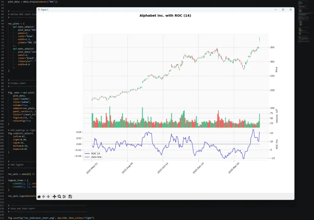
In this example, the ROC panel reacts sharply during the late-period rally in Alphabet. The price chart shows a strong move higher, and the 14-period ROC jumps because the latest close is much higher than the close 14 bars earlier. This is the indicator doing exactly what the formula says: measuring the percentage change over the lookback window.
The important point is that ROC does not explain why the move happened. It only shows that momentum has accelerated over the chosen period. The cause might be company news, a broader tech rally, geopolitical headlines, earnings expectations, or a mix of several things. The indicator tells us the move is strong; the trader still has to decide whether the chart, news backdrop and risk setup justify a trade.
Once the script works, try changing the inputs.
To change the market, edit:
ticker = "GOOGL"
chart_title = "Alphabet Inc."To change the date range, edit:
start_date = "2025-05-01"
end_date = "2026-05-01"To change the ROC lookback, edit:
roc_period = 14Try one change at a time. A shorter ROC period should react faster but look noisier. A longer ROC period should smooth out some of the flicker but react later.
Further Development
Once you can see the ROC line your code is producing, the next step would be to turn the idea into a small screener. For example, you could loop through a list of tickers and flag the ones where ROC has crossed above zero, moved below zero, reached an unusual extreme, or diverged from price.
I would still treat those alerts as prompts for closer inspection, not automatic trades. ROC is a momentum gauge, so it becomes more useful when paired with price structure, moving averages, volume, or candlestick patterns. We also have a separate Python guide on detecting candlestick formations if you want to take that route next.