Updated May 2026: I’ve refreshed this MACD guide with clearer formula explanations, more specific notes on signal-line and zero-line crosses, expanded histogram interpretation, and an updated Python chart tutorial.

What Is the MACD Indicator?
MACD stands for Moving Average Convergence Divergence. It is a momentum indicator built from moving averages.
The basic idea is to compare a faster exponential moving average (EMA) with a slower exponential moving average. In the standard version, MACD subtracts the 26-period EMA from the 12-period EMA. The result is the MACD line.
If the faster EMA is above the slower EMA, MACD is positive. If the faster EMA is below the slower EMA, MACD is negative. That makes the zero line an important reference point.
Most charting platforms also plot a signal line. This is usually a 9-period EMA of the MACD line. Traders watch the relationship between the MACD line and the signal line because it can show when momentum is improving or weakening.
The histogram is the third common part. It shows the difference between the MACD line and the signal line. When the bars grow, the gap between the two lines is widening. When the bars shrink, the gap is narrowing.
I would not treat every MACD cross as an automatic trade. Signal-line crosses, zero-line crosses and histogram turns can all be useful, but they need chart context. In sideways markets, MACD can produce repeated weak crosses.
In this guide I’ll walk through the MACD formula, the signal line, the histogram, divergence, common settings, mistakes to avoid, and how to build a MACD chart in Python.
Where MACD Comes From
MACD is usually credited to Gerald Appel, who developed it in the late 1970s.
The idea was a practical one. Moving averages were already popular trend tools, but traders wanted a way to read the relationship between a faster average and a slower average. MACD turned that relationship into an oscillator.
The standard settings most traders know today are 12, 26 and 9. The 12-period EMA is the faster average, the 26-period EMA is the slower average, and the 9-period EMA is the signal line.
Those defaults are still widely used, which is useful because many traders are looking at the same levels. But they are not set in stone. Shorter settings react faster and can be noisier. Longer settings are smoother and can react later.
That is why the best MACD settings for day trading depend on the market, the timeframe and the type of signal being tested.
How MACD Is Calculated
MACD is built from three parts: the MACD line, the signal line, and the histogram.
The MACD line is the difference between a faster exponential moving average and a slower exponential moving average. The standard setting uses a 12-period EMA and a 26-period EMA.
Before the formulas, here are the symbols:
t means the current bar.
EMA12,t means the 12-period EMA value at the current bar.
EMA26,t means the 26-period EMA value at the current bar.
MACDt means the MACD value at the current bar.
Signalt means the signal-line value at the current bar.
MACD_t = EMA_{12,t} - EMA_{26,t}MACD = 12-period EMA – 26-period EMA
If the 12-period EMA is above the 26-period EMA, MACD is positive. If the 12-period EMA is below the 26-period EMA, MACD is negative.
The signal line is usually a 9-period EMA of the MACD line.
Signal_t = EMA_9(MACD_t)
Signal line = 9-period EMA of the MACD line
The histogram is the difference between the MACD line and the signal line.
Histogram_t = MACD_t - Signal_t
MACD histogram = MACD line – signal line
The histogram is useful because it shows the gap between MACD and its signal line. If the histogram is above zero, MACD is above the signal line. If it is below zero, MACD is below the signal line.
When the histogram bars grow, the gap is widening. When the bars shrink, the gap is narrowing.
| MACD component | How it is calculated | What traders watch |
|---|---|---|
| MACD line | 12 EMA minus 26 EMA | Whether short-term momentum is above or below longer-term momentum |
| Signal line | 9 EMA of the MACD line | MACD crossovers and smoothing |
| Histogram | MACD line minus signal line | Whether the gap is widening or narrowing |
| Zero line | The point where MACD equals zero | Whether the fast EMA is above or below the slow EMA |
What MACD Is Good At
MACD is useful because it turns two moving averages into a momentum reading.
A normal moving-average crossover happens on the price chart. MACD takes the same basic idea and plots the difference between the fast EMA and the slow EMA as a separate line below the chart.
That makes it easier to see whether shorter-term momentum is improving or weakening compared with the slower trend.
MACD is often used for four jobs: signal-line crosses, zero-line crosses, histogram analysis, and divergence.
It is not a perfect trend detector. Because MACD is built from moving averages, it can lag. It can also give repeated weak signals when the market is sideways.
I would use MACD as a momentum and trend-context tool, not as a standalone trading system.
How Traders Read MACD Signals
Most MACD readings come down to the signal line, the zero line, the histogram, and divergence.
None of these should be read mechanically. A MACD signal in a clean trend is very different from a MACD signal in a choppy range.
MACD signal-line crosses
The signal line is an EMA of the MACD line. It acts as a smoother version of MACD.
When the MACD line crosses above the signal line, short-term momentum is improving relative to the MACD line’s recent average. Traders often read that as bullish confirmation.
When the MACD line crosses below the signal line, short-term momentum is weakening relative to the MACD line’s recent average. Traders often read that as bearish confirmation.
I would not treat a signal-line cross as an automatic entry. In sideways markets, MACD can cross back and forth several times without producing a useful move.
MACD zero-line crosses
The zero line shows where the 12-period EMA and 26-period EMA are equal.
When MACD crosses above zero, the faster EMA has moved above the slower EMA. That supports a bullish trend view.
When MACD crosses below zero, the faster EMA has moved below the slower EMA. That supports a bearish trend view.
Zero-line crosses are usually slower than signal-line crosses, but they can give cleaner trend context.
MACD histogram interpretation
The histogram shows the distance between the MACD line and the signal line.
If the histogram is rising above zero, bullish momentum is increasing. If it is falling toward zero, bullish momentum may be fading.
If the histogram is falling below zero, bearish momentum is increasing. If it is rising toward zero, bearish momentum may be fading.
Histogram shrinkage is not a reversal signal by itself. It only tells us that the gap between MACD and the signal line is narrowing.
MACD divergence
Divergence appears when price and MACD stop confirming each other.
A bullish divergence forms when price makes a lower low but MACD makes a higher low. That can suggest downside momentum is fading.
A bearish divergence forms when price makes a higher high but MACD makes a lower high. That can suggest upside momentum is fading.
Divergence is one of the more interesting MACD readings, but it is still a warning sign rather than a complete trade plan. Price has to confirm the turn.
MACD Divergence Cheat Sheet
| Divergence type | What price does | What MACD does | How I would read it |
|---|---|---|---|
| Bullish divergence | Lower low | Higher low | Downside momentum may be fading |
| Bearish divergence | Higher high | Lower high | Upside momentum may be fading |
| Hidden bullish divergence | Higher low | Lower low | Trend continuation may still be possible |
| Hidden bearish divergence | Lower high | Higher high | Downtrend continuation may still be possible |
The first two are the classic divergence patterns most traders learn first. Hidden divergence is more advanced and is usually read as a possible trend-continuation signal rather than a reversal warning.
In every case, I would still want price confirmation. A divergence can appear long before the market actually turns.
Choosing MACD Settings for Day Trading
The standard MACD setting is 12, 26, 9. That means a 12-period EMA, a 26-period EMA, and a 9-period signal line.
Those settings are widely used, which is useful in itself. If many traders are watching the same MACD structure, the signals become part of the shared chart language.
For day trading, some traders test faster settings. A faster MACD uses shorter EMAs and a shorter signal line, so it reacts more quickly to price changes. The trade-off is more noise.
For example, a trader might test something like 5, 15, 6 on an intraday chart. That does not mean it is better. It only means the indicator will react faster.
The timeframe does matter. A 12, 26, 9 MACD on a daily chart is not the same thing as a 12, 26, 9 MACD on a 5-minute chart. The calculation is the same, but the behaviour is very different.
I would change one thing at a time when testing MACD settings. If you change the fast EMA, slow EMA and signal line all at once, it becomes harder to know which change actually helped or hurt the chart.
| MACD setting choice | What usually happens | Main warning |
|---|---|---|
| Standard 12, 26, 9 | Widely watched and smoother | Can react late |
| Faster settings | Earlier crosses and quicker histogram turns | More false signals |
| Slower settings | Cleaner signals and fewer crosses | Later confirmation |
| Shorter signal line | MACD crosses signal line sooner | More twitchy signals |
| Longer signal line | Smooths the signal line | Slower entries and exits |
MACD Strengths and Weaknesses
MACD is useful because it gives traders several views of momentum in one indicator. The MACD line shows the gap between a fast EMA and a slow EMA. The signal line smooths that gap. The histogram shows whether the gap between MACD and the signal line is widening or narrowing.
That makes MACD more flexible than a single moving average. It can help with trend context, signal-line crosses, zero-line crosses, histogram shifts and divergence.
The weakness is that MACD is still built from moving averages. It reacts to price history. It does not know what the next candle will do.
MACD can also struggle in sideways markets. When price chops around without a clear trend, the MACD line and signal line can cross repeatedly without giving a useful move.
I would use MACD as a trend and momentum tool, not as a complete trading system.
| Strength | Why it helps |
|---|---|
| Combines trend and momentum | Shows the relationship between fast and slow EMAs |
| Clear signal line | Helps compare MACD with its own recent average |
| Useful histogram | Shows whether momentum is expanding or fading |
| Good divergence tool | Can warn when price and momentum stop confirming |
| Flexible settings | Can be tested on daily, swing and intraday charts |
| Weakness | Why it matters |
|---|---|
| Lag | MACD is built from moving averages |
| Whipsaws | Sideways markets can produce repeated weak crosses |
| Histogram can be overread | Shrinking bars do not guarantee a reversal |
| Settings are easy to overfit | A setup can look good on one chart and fail elsewhere |
| Needs price context | A MACD cross alone does not define risk or target |
MACD vs RSI
MACD and RSI are both momentum indicators, but they answer different questions.
MACD is built from moving averages. It compares a faster EMA with a slower EMA, then adds a signal line and histogram. It is often used to read trend momentum, signal-line crosses, zero-line crosses and divergence.
RSI measures the balance of recent gains and losses. It is bounded between 0 and 100, so traders often use it to look for stretched momentum, overbought and oversold zones, and divergence.
The biggest difference is the scale. MACD is unbounded. It can rise or fall as far as the moving-average gap allows. RSI is bounded, so it always stays inside its 0 to 100 range.
I would not treat one as automatically better. MACD is often more useful when I want trend and moving-average momentum context. RSI is often cleaner when I want a bounded oscillator showing whether recent gains or losses are stretched.
| Indicator | Built from | Bounded? | Common use |
|---|---|---|---|
| MACD | Fast EMA, slow EMA, signal EMA | No | Trend momentum, crossovers, histogram, divergence |
| RSI | Recent gains and losses | Yes | Overbought/oversold zones, momentum swings, divergence |
For a deeper breakdown, see our RSI trading guide.
Using MACD with DMI
One indicator I personally like alongside MACD is DMI, or the Directional Movement Index.
MACD is useful because it shows momentum through the relationship between moving averages. The DMI looks at directional movement more directly. Its two main lines, +DI and -DI, compare upward and downward directional pressure.
The way I use that pairing is not to wait for both indicators to say exactly the same thing. I find DMI more useful as an early read on conviction. When the +DI and -DI lines are both drifting lower, it often tells me the market is losing directional force and I would rather stay out. When the two lines start to separate, it can be an early sign that one side is taking control.
MACD then gives me the slower confirmation. If DMI is starting to diverge and MACD later confirms the same side, I am less interested in fighting that direction. In other words, DMI can help me read whether the break has energy, while MACD helps me judge whether the broader momentum picture is confirming it.
This is not a perfect sequence and it will not save every bad trade. DMI can chop around in weak markets, just like MACD can. But for me, the combination is useful because the two tools answer slightly different questions:
DMI asks whether upward or downward directional pressure is taking control.
MACD asks whether moving-average momentum is confirming that direction.
That is why I prefer the pair to using MACD by itself, especially around breakouts, failed breaks and exhaustion after a move has already run hard.
Common MACD Mistakes to Avoid
MACD is simple enough to add to a chart, but it is easy to misuse.
The first mistake is treating every signal-line cross as a trade. A MACD cross in a clean trend can be useful. A MACD cross in a sideways market can be noise.
The second mistake is assuming the histogram predicts reversals. A shrinking histogram means the gap between MACD and the signal line is narrowing. It does not mean price must reverse.
The third mistake is ignoring the zero line. A bullish signal-line cross below zero is not the same as a bullish cross above zero. The first may be an early momentum shift inside a weaker trend context. The second may have stronger trend support.
The fourth mistake is curve-fitting the settings. If you keep changing the MACD parameters until one old chart looks perfect, you may only be fitting the past.
The fifth mistake is forgetting price structure. MACD can support a trade idea, but support, resistance, trendlines, volatility, volume and risk still matter.
| Mistake | Why it causes problems |
|---|---|
| Trading every signal-line cross | Creates whipsaws in ranges |
| Treating histogram shrinkage as a reversal | Momentum can fade before price turns |
| Ignoring the zero line | Trend context gets lost |
| Over-optimising settings | Past-fit settings may fail live |
| Ignoring price structure | MACD does not define risk by itself |
Quick MACD Takeaways Before We Code
- MACD stands for Moving Average Convergence Divergence.
- The MACD line is usually the 12-period EMA minus the 26-period EMA.
- The signal line is usually a 9-period EMA of the MACD line.
- The histogram is MACD minus the signal line.
- MACD above zero means the fast EMA is above the slow EMA.
- MACD below zero means the fast EMA is below the slow EMA.
- A signal-line cross can show momentum changing relative to MACD’s recent average.
- A zero-line cross gives broader trend context.
- The histogram shows whether the gap between MACD and the signal line is widening or narrowing.
- MACD divergence can warn that price and momentum are no longer confirming each other.
- MACD is useful, but it can whipsaw badly in sideways markets.
- The Python tutorial below calculates the MACD line, signal line and histogram, then plots them under a candlestick chart.
Implementing it in Python with VSCode
Now we can build the MACD indicator in Python.
I am going to keep this as a step-by-step tutorial rather than dropping in one large script. Each Python-labelled block goes into the same file, in order. By the end, we will have downloaded market data, calculated the MACD line, signal line and histogram, and plotted them under a candlestick chart.
For this example I will use AMD stock.
Step 1: Install the Python libraries
This guide assumes you already have Python installed and are using Visual Studio Code.
Open a terminal in VS Code by clicking Terminal > New Terminal, then run:
python -m pip install pandas yfinance mplfinance matplotlibOn some Windows machines, this version works instead:
py -m pip install pandas yfinance mplfinance matplotlibStep 2: Create the file and import the libraries
Create a new Python file and save it as:
macd_indicator.py
At the top of the file, add:
import pandas as pd
import yfinance as yf
import mplfinance as mpf
import matplotlib.pyplot as plt
import matplotlib.lines as mlines
pandas stores the market data in a table and calculates the EMAs.
yfinance downloads the price data.
mplfinance draws the candlestick chart.
Line2D lets us create a clean legend for the MACD line, signal line and histogram.
Step 3: Add the settings
Next, add the settings near the top of the file. Keeping these values together makes the script easier to change later.
ticker = "AMD"
chart_title = "AMD"

start_date = "2025-05-01"
end_date = "2026-05-01"

fast_period = 12
slow_period = 26
signal_period = 9
ticker is the Yahoo Finance symbol.
chart_title is the title printed on the chart.
The dates use YYYY-MM-DD format. yfinance treats the end date as a cut-off, so you can push it one trading day later if you want the most recent available bar included.
fast_period is the faster EMA.
slow_period is the slower EMA.
signal_period is the EMA applied to the MACD line.
Step 4: Download the market data
data = yf.download(
    ticker,
    start=start_date,
    end=end_date,
    auto_adjust=True,
    progress=False,
    multi_level_index=False
)

if data.empty:
    raise RuntimeError("No data was downloaded. Check the ticker symbol and date range.")

if isinstance(data.columns, pd.MultiIndex):
    data.columns = data.columns.get_level_values(0)

data.index = pd.DatetimeIndex(data.index)This downloads open, high, low, close and volume data.
auto_adjust=True keeps the price series adjusted where applicable.
progress=False removes the download progress bar.
multi_level_index=False keeps the columns easier to work with.
The final line makes sure the index is treated as dates, which mplfinance expects when plotting.
Step 5: Define the MACD function
def calculate_macd(close, fast=12, slow=26, signal=9):
    fast_ema = close.ewm(span=fast, adjust=False).mean()
    slow_ema = close.ewm(span=slow, adjust=False).mean()

    macd_line = fast_ema - slow_ema
    signal_line = macd_line.ewm(span=signal, adjust=False).mean()
    histogram = macd_line - signal_line

return macd_line, signal_line, histogramfast_ema is the 12-period EMA in the standard MACD setup.
slow_ema is the 26-period EMA.
macd_line is the difference between those two EMAs.
signal_line is the 9-period EMA of the MACD line.
histogram is the MACD line minus the signal line.
Step 6: Calculate MACD
Now call the function and add the three MACD columns to the data table.
data["MACD"], data["Signal"], data["Histogram"] = calculate_macd(
    data["Close"],
    fast=fast_period,
    slow=slow_period,
    signal=signal_period
)

plot_data = data.dropna(subset=["MACD", "Signal", "Histogram"])
Think of data as a spreadsheet. It already has Open, High, Low, Close and Volume columns. This step adds MACD, Signal and Histogram.
dropna() removes early blank values before plotting.
Step 7: Define the MACD chart lines
Next we tell mplfinance which MACD lines to draw under the price chart.
macd_plots = [
    mpf.make_addplot(
        plot_data["MACD"],
        panel=2,
        color="blue",
        width=1.2,
        ylabel="MACD"
    ),
    mpf.make_addplot(
        plot_data["Signal"],
        panel=2,
        color="red",
        width=1.0
    ),
    mpf.make_addplot(
        plot_data["Histogram"],
        panel=2,
        type="bar",
        color="gray",
        alpha=0.5,
        secondary_y=False
    )
]The blue line is MACD.
The red line is the signal line.
The grey bars are the histogram.
panel=2 places the MACD panel below price and volume.
Step 8: Create the chart
Now create the candlestick chart.
fig, axes = mpf.plot(
    plot_data,
    type="candle",
    style="yahoo",
    volume=True,
    addplot=macd_plots,
    panel_ratios=(3, 1, 1.4),
    title=f"{chart_title} with MACD ({fast_period}, {slow_period}, {signal_period})",
    figsize=(11, 7),
    returnfig=True
)

fig.subplots_adjust(
    left=0.07,
    right=0.90,
    top=0.92,
    bottom=0.16,
    hspace=0.05
)
type="candle" gives us the candlestick chart.
volume=True adds the volume panel.
addplot=macd_plots adds the MACD line, signal line and histogram.
panel_ratios controls the relative size of the price, volume and MACD panels.
subplots_adjust gives the chart extra room so labels and angled dates are not clipped.
Step 9: Add the legend and show the chart
Finally, add a legend, save the image and show the chart.
macd_axis = axes[4] if len(axes) > 4 else axes[-1]

legend_items = [
    Line2D([], [], color="blue", label="MACD"),
    Line2D([], [], color="red", label="Signal"),
    Line2D([], [], color="gray", linewidth=4, alpha=0.5, label="Histogram")
]

macd_axis.legend(handles=legend_items, loc="upper left")

fig.savefig("macd_indicator_chart.png", dpi=150, bbox_inches="tight")

mpf.show()
fig.savefig() saves the chart as a PNG image in the same folder as the script.
mpf.show() opens the chart window.
Step 10: Run the script
Save macd_indicator.py by pressing Ctrl+S.
The easiest route is usually to click the play button in the top-right corner of VS Code. If that works, the chart window should open.
You can also run it from the terminal. Open Terminal > New Terminal, move into the folder where you saved the script, then run:
python macd_indicator.pyOn some Windows setups, use:
py macd_indicator.pyYour chart should show AMD candlesticks, volume, and a MACD panel with the MACD line, signal line and histogram below.
If all has gone to plan you should end up with the same as mine shown below:
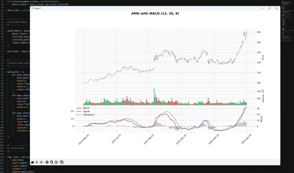
Once you can plot MACD in Python, the next step is not to assume the chart has produced a trading system. The useful part is that you now have the MACD line, signal line and histogram in a DataFrame, which means you can start testing ideas rather than just eyeballing them.
For example, you could screen a list of stocks, futures or ETFs for:
- MACD crossing above or below the signal line
- MACD crossing the zero line
- histogram bars expanding or shrinking
- possible bullish or bearish divergence
- MACD signals that agree with another filter, such as DMI, RSI or price structure
- forward returns after each signal, such as where price is 5, 10 or 20 bars later
That last check is important. It lets you ask whether a signal actually tended to lead anywhere on that market and timeframe, rather than just looking convincing on a finished chart. You could test whether price was higher or lower after the signal, how far it moved, how often it reversed, and whether the result changed when combined with filters such as DMI or RSI.
Make sure the forward-return test is done after the signal date only, otherwise you are accidentally letting future information leak into the test.
I would still treat those results as alerts for closer inspection, not automatic trades. A screener can tell you where something interesting may be happening. It cannot tell you whether the setup has clean price structure, sensible risk, or a news event sitting in the way.
This is where combining MACD with another tool can help. Personally, I like looking at DMI alongside MACD because DMI can give an earlier read on whether directional pressure is building or dying, while MACD gives a slower confirmation of the broader momentum picture.
Further Reading
For those interested in learning more about MACD and its applications, consider exploring the following resources:
For a broad technical-analysis reference, Technical Analysis from A to Z by Steven Achelis is useful as a catalogue-style guide to indicators, including MACD.
Technical Analysis of the Financial Markets by John J. Murphy is a broader market-technician reference and gives useful context on trend, momentum and chart interpretation.
For related AlphaSquawk guides, see our moving averages guide, RSI guide, TRIX guide and slow stochastics guide. Those help separate moving-average trend tools from bounded and unbounded momentum oscillators.