Updated May 2026: I’ve refreshed this guide with clearer Bollinger Bands formulas, better signal interpretation, and updated Python and Excel notes.

Introduction to Bollinger Bands
Bollinger Bands are a volatility-based chart overlay developed by John Bollinger in the 1980s.
The indicator has three parts: a middle moving average, an upper band and a lower band. The upper and lower bands are usually placed two standard deviations above and below the moving average.
That standard-deviation part is what makes Bollinger Bands different from fixed-percentage envelopes. The bands widen when volatility rises and contract when volatility falls.
Traders use Bollinger Bands to judge relative highs and lows, volatility compression, breakouts, failed moves and trend behaviour. A touch of the upper band is not automatically bearish. A touch of the lower band is not automatically bullish. In strong trends, price can keep walking the band.
This guide covers the Bollinger Bands formula, common settings, signal interpretation, squeeze patterns, Python code and Excel setup.
Bollinger Bands at a Glance
Bollinger Bands have three core parts.
The middle band is usually a 20-period moving average.
The upper band is usually two standard deviations above the middle band.
The lower band is usually two standard deviations below the middle band.
The bands expand when volatility rises.
The bands contract when volatility falls.
A narrow band range can warn that volatility has compressed. A wide band range can show that volatility has already expanded. Price touching a band only tells you where price sits relative to recent volatility; the chart still has to decide whether that touch is continuation, exhaustion or noise.
Origins
Trading bands existed well before Bollinger Bands. In 1960, Wilfrid Ledoux used curves connecting monthly highs and lows of the Dow Jones Industrial Average as a long-term market-timing tool.
Later, other band and channel approaches became common, including Keltner Channels, Donchian Channels and fixed-percentage moving average envelopes. Those tools framed price in different ways, but many required the trader to choose a fixed width or range method that did not automatically adapt as volatility changed.
John Bollinger’s contribution in the 1980s was to make the band width respond to volatility. Instead of placing the bands a fixed distance from the moving average, Bollinger Bands use standard deviation. When volatility rises, the bands widen. When volatility falls, the bands contract.
That is why Bollinger Bands remain useful. They combine a trend reference, through the middle moving average, with a volatility envelope around price.
Bollinger Bands Formula
Bollinger Bands are built from a moving average and a volatility measure.
The middle band is usually a simple moving average of closing prices. The upper and lower bands are then placed a chosen number of standard deviations above and below that moving average.
The common default is a 20-period moving average with bands set two standard deviations above and below it.
Formula key table
| Symbol | Meaning |
|---|---|
t | current bar |
n | lookback period, commonly 20 |
Cₜ | closing price at the current bar |
MBₜ | middle band |
SDₜ | standard deviation over the lookback period |
m | standard-deviation multiplier, commonly 2 |
UBₜ | upper Bollinger Band |
LBₜ | lower Bollinger Band |
1. Calculate the middle band
The middle band is usually a simple moving average of closing prices over the lookback period.
MB_t = \frac{C_t + C_{t-1} + \cdots + C_{t-n+1}}{n}The middle band equals the average of the closing prices over the chosen lookback period.
With the common 20-period setting, the middle band is the average of the last 20 closes.
2. Calculate standard deviation
Standard deviation measures how widely prices have been moving around the middle band. This is the volatility part of Bollinger Bands.
SD_t = \sqrt{\frac{\sum_{i=0}^{n-1}(C_{t-i} - MB_t)^2}{n}}Standard deviation measures the typical distance between the recent closes and the middle band.
When recent closes are spread far from the average, standard deviation rises. When recent closes cluster near the average, standard deviation falls.
3. Calculate the upper band
The upper band is the middle band plus a chosen number of standard deviations.
UB_t = MB_t + (m \times SD_t)
The upper band equals the middle band plus the multiplier times the standard deviation.
With the common two-standard-deviation setting, the upper band is two standard deviations above the moving average.
4. Calculate the lower band
The lower band is the middle band minus the same number of standard deviations.
LB_t = MB_t - (m \times SD_t)
The lower band equals the middle band minus the multiplier times the standard deviation.
With the common two-standard-deviation setting, the lower band is two standard deviations below the moving average.
Why Bollinger Bands expand and contract
The bands widen when standard deviation rises. That usually happens when price movement becomes more volatile.
The bands narrow when standard deviation falls. That usually happens when price movement becomes quieter.
This is the main difference between Bollinger Bands and fixed-percentage envelopes. Bollinger Bands adjust their width as volatility changes. A fixed-percentage envelope keeps the same percentage distance from the moving average unless the trader changes the setting.
Small differences can appear between charting platforms because they may handle price inputs, moving-average types, standard-deviation calculations or warm-up periods differently. The usual version uses closing prices, a simple moving average and a two-standard-deviation multiplier, but the platform settings are worth checking if you are trying to match values exactly.
How to Interpret Bollinger Band Signals
Bollinger Bands give a relative view of price.
The upper band shows where price is high relative to its recent average and volatility. The lower band shows where price is low relative to its recent average and volatility. The middle band gives the moving-average reference point.
A band touch is not a trading signal by itself. Price touching the upper band does not automatically mean sell. Price touching the lower band does not automatically mean buy.
In a strong uptrend, price can keep pressing or walking the upper band. In a strong downtrend, price can keep pressing or walking the lower band. The band touch only tells you where price is relative to recent volatility.
| Bollinger Band signal | Possible reading | Main caution |
|---|---|---|
| Price tags upper band | Price is high relative to recent volatility | Can show trend strength, not just overbought conditions |
| Price tags lower band | Price is low relative to recent volatility | Can show downside pressure, not just oversold conditions |
| Bands contract | Volatility is compressing | Breakout direction is still unknown |
| Bands expand | Volatility is rising | Expansion can happen after the easy part of the move |
| Price returns to middle band | Mean reversion or pullback toward average | Middle band may fail in a strong trend |
| Price walks a band | Persistent trend pressure | Fading the move too early can be costly |
The Bollinger Band squeeze is one of the better-known setups. When the bands contract, volatility is low relative to recent conditions. Traders often watch for a later breakout because quiet markets can lead to larger moves once volatility returns.
The squeeze does not tell you the breakout direction. Price can break higher, break lower, or fake out before choosing a direction. I would treat a squeeze as an alert that volatility has compressed, not as a standalone entry signal.
Band walks need the opposite mindset. If price keeps closing near the upper band, that can show persistent upside pressure. If price keeps closing near the lower band, that can show persistent downside pressure. Trying to fade every band touch in a trend is one of the common beginner mistakes.
| Market condition | Upper band touch | Lower band touch |
|---|---|---|
| Strong uptrend | Can show trend strength | May mark a deeper pullback rather than a reversal |
| Strong downtrend | May mark a relief bounce | Can show downside trend strength |
| Sideways range | May warn price is stretched | May warn price is stretched |
| Low-volatility squeeze | Less important until price breaks | Less important until price breaks |
| Volatility expansion | Can show breakout pressure | Can show breakdown pressure |
The safer habit is to read Bollinger Bands as context. They show where price sits relative to its recent average and volatility. The trade still needs price structure, trend context, volume, and risk control.
Bollinger Bands Settings and Parameters
The common Bollinger Bands setting is a 20-period moving average with the upper and lower bands set two standard deviations away from that average.
Those settings are a useful baseline, not a universal rule.
The moving-average period controls the middle band. A shorter period reacts faster to price. A longer period moves more slowly and gives a broader trend reference.
The standard-deviation multiplier controls band width. A higher multiplier pushes the bands farther from the middle band. A lower multiplier pulls the bands closer.
| Setting | Common value | What it changes | Main trade-off |
|---|---|---|---|
| Moving-average period | 20 | Speed of the middle band | Shorter reacts faster; longer smooths more |
| Standard-deviation multiplier | 2 | Distance of upper and lower bands from the middle band | Wider bands give fewer touches; tighter bands give more |
| Price input | Close | Price series used for the calculation | Other inputs can change signals |
| Moving-average type | SMA | How the middle band is calculated | EMA or WMA variants react differently |
| Standard-deviation method | Platform-dependent | How volatility is measured | Values may differ slightly between platforms |
Changing the period or multiplier changes the meaning of a band touch.
A tighter setup will create more touches and more signals. That can help short-term traders, but it can also create more false warnings.
A wider setup will produce fewer touches. That can filter noise, but it may also miss useful stretches away from the average.
The middle-band type matters too. The classic Bollinger Band uses a simple moving average. If you switch to an EMA, WMA or another moving-average type, you are creating a variant. That may be useful, but it should not be confused with the standard calculation.
| What you see | Possible issue | What to test |
|---|---|---|
| Price constantly touches both bands | Bands may be too tight or market may be volatile | Higher multiplier or longer period |
| Price rarely reaches the bands | Bands may be too wide | Lower multiplier or shorter period |
| Middle band lags too much | Period may be too long | Shorter moving-average period |
| Bands react too quickly | Period may be too short | Longer moving-average period |
| Values differ from another platform | Settings may not match exactly | Check price input, average type and standard-deviation method |
I would start with the classic 20 and 2 setup, then test any changes against that baseline. Changing the settings just to make past signals look cleaner can create a curve-fitted chart that fails when volatility changes.
Bollinger Band Squeeze and Band Walks
Two of the most common Bollinger Band ideas are the squeeze and the band walk.
A squeeze happens when the upper and lower bands contract around price. This shows that volatility has fallen. Traders often watch squeezes because low-volatility periods can be followed by larger moves.
The squeeze does not tell you the direction of the next move. It only says volatility is compressed.
A band walk is different. This happens when price keeps pressing or closing near one band. In an uptrend, price can walk the upper band. In a downtrend, price can walk the lower band.
| Pattern | What it shows | Main caution |
|---|---|---|
| Band squeeze | Volatility compression | Direction is unknown |
| Breakout after squeeze | Volatility returning | Breakouts can fail |
| Upper-band walk | Persistent upside pressure | Not automatically overbought |
| Lower-band walk | Persistent downside pressure | Not automatically oversold |
| Return to middle band | Pullback or mean reversion | Middle band may not hold |
The squeeze is often more useful as a preparation signal than as an entry signal. It tells you the market has gone quiet. The trade still needs a break, a hold, and a risk level.
Band walks are where many traders get trapped. A price touch at the upper band can look stretched, but in a strong uptrend it may simply show that buyers remain in control. The same applies to the lower band in a strong downtrend.
A useful Bollinger Bands strategy has to decide which market regime it is dealing with. In a range, the bands may help identify stretched prices. In a trend, the bands may show continuation pressure. The same chart feature can mean different things in different conditions.
Pros and Cons of Bollinger Bands
Bollinger Bands are useful because they combine trend and volatility in one chart overlay. The middle band gives a moving-average reference, while the upper and lower bands show how far price is trading from that average relative to recent volatility.
| Strength | Why it helps |
|---|---|
| Adapts to volatility | Bands widen when volatility rises and contract when volatility falls |
| Gives relative high/low context | Shows whether price is high or low compared with its recent average and volatility |
| Useful for squeeze setups | Contracting bands can warn that volatility has compressed |
| Useful for trend behaviour | Band walks can show persistent buying or selling pressure |
| Works across markets | Can be applied to stocks, futures, forex, indices and crypto |
The weaknesses come from overreading the bands. A touch of the upper band does not automatically mean price should fall. A touch of the lower band does not automatically mean price should rise.
The bands also do not predict breakout direction. A squeeze can warn that volatility is compressed, but it cannot tell you whether the next expansion will be upward or downward.
| Limitation | What can go wrong |
|---|---|
| No direction by itself | The bands show volatility and relative position, not future direction |
| Band touches are not signals | Price can walk the upper or lower band during strong trends |
| Squeeze direction is unknown | Low volatility can break either way |
| Sensitive to settings | Different periods, multipliers or moving averages can change the chart |
| Can lag fast changes | Moving averages and standard deviation are based on past data |
Used well, Bollinger Bands help traders judge volatility, trend behaviour, price extension and squeeze conditions. Used badly, they become a mechanical overbought and oversold tool that fights strong trends.
Bollinger Band Difference (BDIF)
Bollinger Band Difference, often shortened to BDIF, measures the distance between the upper and lower Bollinger Bands.
It is a band-width measure. When BDIF rises, the bands are widening and volatility is increasing. When BDIF falls, the bands are narrowing and volatility is contracting.
BDIF does not tell you direction. A rising BDIF can happen during a strong rally, a sharp selloff, or a volatile two-way market. It only shows that the gap between the bands is changing.
BDIF_t = UB_t - LB_t
BDIF equals the upper Bollinger Band minus the lower Bollinger Band.
With the standard formula, BDIF equals two times the standard-deviation multiplier times the standard deviation. With a two-standard-deviation setting, BDIF equals four times the standard deviation.
| BDIF behaviour | What it shows | Main caution |
|---|---|---|
| BDIF rising | Bands are widening; volatility is increasing | Direction is not specified |
| BDIF falling | Bands are narrowing; volatility is contracting | A squeeze does not tell breakout direction |
| Very low BDIF | Volatility is compressed | Breakout may still fail |
| Very high BDIF | Volatility has expanded | Move may already be mature |
| BDIF rising with price trend | Trend and volatility are expanding together | Entry may be late |
BDIF is useful because it turns the visual width of the bands into a line that can be plotted or tested.
For squeeze-style setups, traders may watch BDIF falling toward unusually low levels. That shows volatility has compressed. The trade still needs a breakout direction and confirmation.
For trend-style setups, traders may watch BDIF rising as price pushes away from the middle band. That can show volatility expanding with the move, but it can also warn that the move is already stretched.
The main thing to avoid is treating BDIF as a direction signal. It measures band width. Price structure decides whether widening bands are supporting a rally, confirming a selloff, or simply reflecting a volatile market.
Using Bollinger Bands in Python
Now we can calculate Bollinger Bands in Python and plot them on a candlestick chart. You can use VSCode which is free from Microsoft. I am assuming you have already installed Python.
The script below downloads price data, calculates the middle band, upper band, lower band and BDIF, then plots price, volume and BDIF in separate panels.
This version uses the standard Bollinger Bands setup: a 20-period moving average and a two-standard-deviation band.
Step 1: Install the Python libraries
python -m pip install pandas yfinance numpy matplotlib mplfinanceIf your Windows setup uses the py launcher, this version may work better:
py -m pip install pandas yfinance numpy matplotlib mplfinancePandas handles the data table, yfinance downloads the price data, NumPy helps with the calculations, matplotlib builds the chart, and mplfinance provides the candlestick plotting function.
Step 2: Create the file and import the libraries
Save a new file as bollinger_bands.py, then paste the following imports at the top.
import numpy as np
import pandas as pd
import yfinance as yf
import matplotlib.pyplot as plt
from mplfinance.original_flavor import candlestick_ohlcStep 3: Add the chart settings
ticker = "NVDA"
start_date = "2025-05-14"
end_date = "2026-05-14"

bb_period = 20
std_multiplier = 2This example uses Nvidia with a 20-period middle band and a two-standard-deviation multiplier. The same script can be reused with another ticker, date range or setting by changing these values.
Step 4: Download the price data
data = yf.download(
    ticker,
    start=start_date,
    end=end_date,
    auto_adjust=True,
    progress=False,
    multi_level_index=False
)

if isinstance(data.columns, pd.MultiIndex):
    data.columns = data.columns.get_level_values(0)

data.index = pd.DatetimeIndex(data.index)
data = data.dropna(subset=["Open", "High", "Low", "Close", "Volume"])

if data.empty:
raise ValueError("No price data downloaded. Check the ticker and date range.")The auto_adjust=True setting means the OHLC data is adjusted for splits and dividends. The MultiIndex fallback is included because yfinance can return multi-level columns depending on version and settings.
Step 5: Define the Bollinger Bands calculation
def calculate_bollinger_bands(price_data, period=20, multiplier=2):
    df = price_data.copy()

    df["Middle_Band"] = df["Close"].rolling(window=period).mean()

    rolling_std = df["Close"].rolling(window=period).std(ddof=0)

    df["Upper_Band"] = df["Middle_Band"] + (rolling_std * multiplier)
    df["Lower_Band"] = df["Middle_Band"] - (rolling_std * multiplier)

    df["BDIF"] = df["Upper_Band"] - df["Lower_Band"]

return dfThe BDIF column measures the distance between the upper and lower bands. It rises when the bands widen and falls when the bands contract.
The ddof=0 setting matches the population standard deviation used in the Excel STDEV.P example later.
Step 6: Add the Bollinger Bands columns
data = calculate_bollinger_bands(
    data,
    period=bb_period,
    multiplier=std_multiplier
)

plot_data = data.dropna(
    subset=["Middle_Band", "Upper_Band", "Lower_Band", "BDIF"]
).copy()

if plot_data.empty:
raise ValueError("Not enough valid data to calculate Bollinger Bands.")The first rows are removed because the moving average and standard deviation need enough data before they can be calculated.
Step 7: Prepare the chart data
plot_data["Bar"] = np.arange(len(plot_data))

ohlc = plot_data[["Bar", "Open", "High", "Low", "Close"]].values

volume_colors = np.where(
    plot_data["Close"] >= plot_data["Open"],
    "green",
    "red"
)This prepares the candlestick and volume data for the chart.
Step 8: Create the price, volume and BDIF panels
fig, (ax_price, ax_volume, ax_bdif) = plt.subplots(
    3,
    1,
    figsize=(12, 7),
    sharex=True,
    gridspec_kw={
        "height_ratios": [4, 1, 1.3],
        "hspace": 0.0
    }
)

fig.suptitle(
    f"{ticker} with Bollinger Bands ({bb_period}, {std_multiplier})",
    fontsize=12,
    fontweight="bold"
)

candlestick_ohlc(
    ax_price,
    ohlc,
    width=0.6,
    colorup="green",
    colordown="red",
    alpha=0.85
)

ax_price.plot(
    plot_data["Bar"],
    plot_data["Upper_Band"],
    label="Upper Band",
    color="green",
    linewidth=1.0
)

ax_price.plot(
    plot_data["Bar"],
    plot_data["Middle_Band"],
    label="Middle Band",
    color="blue",
    linewidth=1.0
)

ax_price.plot(
    plot_data["Bar"],
    plot_data["Lower_Band"],
    label="Lower Band",
    color="red",
    linewidth=1.0
)

ax_price.fill_between(
    plot_data["Bar"],
    plot_data["Upper_Band"],
    plot_data["Lower_Band"],
    alpha=0.08
)

ax_price.set_ylabel("Price")
ax_price.legend(loc="upper left", fontsize=8)
ax_price.grid(True, alpha=0.25)

ax_volume.bar(
    plot_data["Bar"],
    plot_data["Volume"],
    color=volume_colors,
    width=0.6,
    alpha=0.55
)

ax_volume.set_ylabel("Volume")
ax_volume.grid(True, alpha=0.25)

ax_bdif.plot(
    plot_data["Bar"],
    plot_data["BDIF"],
    label="BDIF",
    color="purple",
    linewidth=1.1
)

ax_bdif.set_ylabel("BDIF")
ax_bdif.legend(loc="upper left", fontsize=8)
ax_bdif.grid(True, alpha=0.25)The top panel shows price with the three Bollinger Band lines. The middle panel shows volume. The lower panel shows BDIF, which measures band width.
Step 9: Add date labels, save and show the chart
tick_count = 9
tick_positions = np.linspace(0, len(plot_data) - 1, tick_count, dtype=int)
tick_labels = plot_data.index[tick_positions].strftime("%Y-%m-%d")

ax_bdif.set_xticks(tick_positions)
ax_bdif.set_xticklabels(tick_labels, rotation=45, ha="right")

plt.setp(ax_price.get_xticklabels(), visible=False)
plt.setp(ax_volume.get_xticklabels(), visible=False)

fig.subplots_adjust(
    top=0.90,
    bottom=0.16,
    left=0.08,
    right=0.97,
    hspace=0.0
)

output_file = "bollinger_bands_python_chart.png"
fig.savefig(output_file, dpi=150, bbox_inches="tight")

print(f"Saved chart as {output_file}")

plt.show()The script saves the chart as bollinger_bands_python_chart.png and opens the chart window.
Step 10: Run the script
Run the file from VS Code, or use this command in the terminal:
python bollinger_bands.pyIf your Windows setup uses the py launcher, use:
py bollinger_bands.pyYou should get a three-panel chart with price, volume and BDIF. The Bollinger Bands will widen and contract as volatility changes.
Your chart hopefully looks similar to mine shown below:
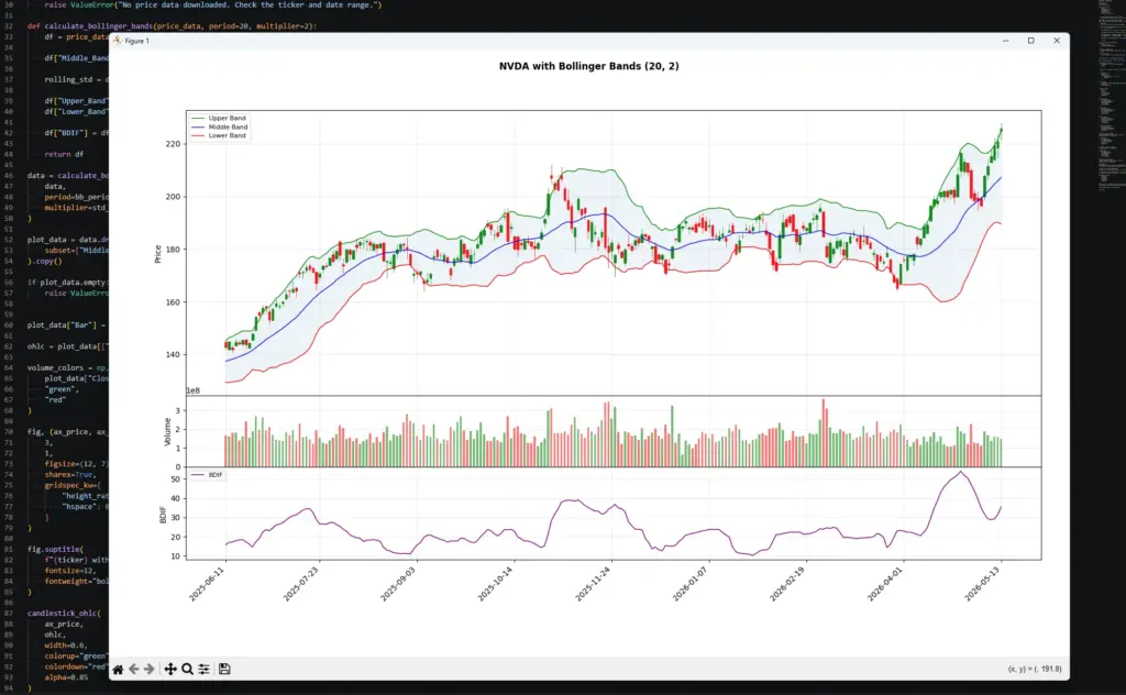
This chart shows why Bollinger Bands should not be read as simple overbought or oversold lines. During the strong move on the right, price pushes into the upper band while BDIF rises sharply, showing that volatility is expanding with the move rather than giving a clean sell signal.
Earlier in the chart, the bands narrow and BDIF falls during quieter trading. That kind of compression is the setup traders often call a squeeze. The squeeze itself does not predict direction, but it warns that volatility has contracted and may be worth watching for a later break.
The useful point is the relationship between price and band width. Price touching a band shows location relative to recent volatility. BDIF shows whether that volatility is expanding or contracting.
Bollinger Bands Strategy Examples
A Bollinger Bands strategy should start with the market condition.
In a range, the bands can help identify stretched prices near the upper or lower boundary. In a trend, the same band touch can show continuation pressure rather than reversal.
That is why I would separate Bollinger Band strategies into a few practical groups.
| Strategy idea | What the trader looks for | Main risk |
|---|---|---|
| Squeeze breakout | Bands contract, then price breaks from the range | Breakout direction can fail |
| Band walk continuation | Price keeps closing near one band | Entering late after a strong move |
| Range mean reversion | Price tags a band and returns toward the middle band | Dangerous if a new trend starts |
| Failed band break | Price moves outside a band, then returns inside | Needs price confirmation |
| Middle-band pullback | Price pulls back toward the moving average during a trend | Pullback can become reversal |
A squeeze breakout setup starts with compression. The bands narrow, showing that volatility has fallen. The trade idea only becomes clearer when price breaks and holds outside the compression area.
A band-walk setup is different. In a strong uptrend, price can keep pressing the upper band. In a strong downtrend, price can keep pressing the lower band. Fading every touch can mean trading against the trend.
A range mean-reversion setup works better when price is already rotating around the middle band. In that environment, a touch of the upper or lower band may warn that price is stretched. I would still want support, resistance, candle structure or another confirmation tool before acting.
Changing the Middle Band Moving Average
The standard Bollinger Band uses a simple moving average (SMA) as the middle band.
Some traders experiment with other moving-average types, such as EMA (exponential), WMA (weighted) or smoothed moving averages. That changes the behaviour of the middle line and therefore changes the upper and lower bands as well.
A faster middle band will usually make the whole structure more responsive. A slower middle band will usually make it smoother but later.
This can be useful, but it also means you are no longer looking at the standard Bollinger Band calculation. You are testing a variant.
| Middle band type | Behaviour | Main caution |
|---|---|---|
| SMA | Standard baseline | Best for platform comparison |
| EMA | Reacts faster to recent price | Can add noise |
| WMA | Weights recent data more heavily | More sensitive to recent candles |
| Smoothed MA | Slower and smoother | Later reaction |
| Custom average | Strategy-specific | Harder to compare with standard bands |
If you want a fuller explanation of the different moving-average types and how to code them, use the Moving Averages guide. For this article, the important point is that changing the middle band changes the indicator.
Bollinger Bands vs Keltner Channels, Moving Average Envelopes and ATR
Bollinger Bands are often compared with other volatility and band-style tools. The main difference is how the band width is calculated.
Bollinger Bands use standard deviation.
Keltner Channels usually use ATR.
Moving Average Envelopes use a fixed percentage above and below a moving average.
ATR itself is not a band, but it measures range and volatility directly.
| Tool | Band or measure | Width based on | Main use |
|---|---|---|---|
| Bollinger Bands | Price bands | Standard deviation | Volatility bands around a moving average |
| Keltner Channels | Price channels | ATR | Smoother volatility channels |
| Moving Average Envelopes | Price bands | Fixed percentage | Fixed-distance trend envelopes |
| ATR | Volatility measure | True Range | Stop distance and volatility context |
| BDIF | Bollinger width measure | Upper band minus lower band | Tracking band expansion and contraction |
The distinction is important. A Bollinger Band touch means price is stretched relative to recent standard deviation. A Keltner Channel touch means price is stretched relative to an ATR-based channel. A moving average envelope touch means price is a fixed percentage away from its moving average.
Those signals can look similar on a chart, but the logic behind them is different.
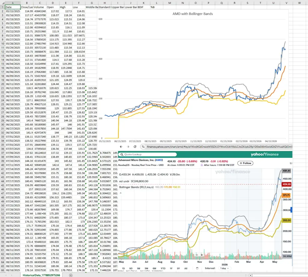
Bollinger Bands in Excel: Formula and Chart Setup
You can also calculate Bollinger Bands in Excel using a downloaded historical-price CSV.
For this example, I use the historical data download from Nasdaq. The file includes Date, Close/Last, Volume, Open, High and Low columns. We only need the Date and Close/Last columns for the basic Bollinger Bands calculation, although the other columns can be kept for later charting or analysis.
This Excel version uses the same assumptions as the Python example:
20-period simple moving average
2-standard-deviation bands
STDEV.P for population standard deviation
BDIF as upper band minus lower band
Step 1: Download the Nasdaq historical data
Go to the Nasdaq historical quotes page for the ticker you want to study, choose the one-year view, and download the historical data.
The downloaded CSV should contain columns similar to:
Date
Close/Last
Volume
Open
High
Low
Nasdaq usually lists the newest date first, so the first job is to sort the data from oldest to newest.
Step 2: Clean and sort the spreadsheet
Open the CSV in Excel.
If the price columns include dollar signs and Excel treats them as text, select the price columns and use Find & Replace to remove the $ symbol. Then format those columns as numbers.
Next, sort the Date column from oldest to newest. This is important because Bollinger Bands use rolling calculations based on previous prices.
For the simple version below, assume:
Column A = Date
Column B = Close/Last
Row 1 = headers
Row 2 = first historical price after sorting oldest to newest
Step 3: Add the calculation columns
| Column | Field |
|---|---|
| A | Date |
| B | Close/Last |
| C | Volume |
| D | Open |
| E | High |
| F | Low |
| G | Middle Band |
| H | Standard Deviation |
| I | Upper Band |
| J | Lower Band |
| K | BDIF |
| L | %B |
Step 4: Calculate the middle band
The first full 20-period calculation appears on row 21, because row 1 is the header and rows 2 to 21 contain the first 20 closing prices.
In cell G21, enter:
=AVERAGE(B2:B21)Drag the formula down.
This calculates the 20-period simple moving average, which is the middle Bollinger Band.
Step 5: Calculate standard deviation
In cell H21, enter:
=STDEV.P(B2:B21)Drag the formula down.
This calculates the population standard deviation of the same 20 closing prices used for the middle band. This matches the formula in this guide and the Python version when using std(ddof=0).
Step 6: Calculate the upper band
In cell I21, enter:
=G21+(2*H21)Drag the formula down.
This places the upper band two standard deviations above the middle band. To test a different multiplier, replace 2 with another value.
Step 7: Calculate the lower band
In cell J21, enter:
=G21-(2*H21)Drag the formula down.
This places the lower band two standard deviations below the middle band.
Step 8: Calculate BDIF
BDIF measures the distance between the upper and lower bands.
In cell K21, enter:
=I21-J21Drag the formula down.
When BDIF rises, the bands are widening. When BDIF falls, the bands are contracting.
Step 9: Calculate %B
%B shows where the close sits inside the bands.
In cell L21, enter:
=IFERROR((B21-J21)/(I21-J21),"")Drag the formula down.
A %B reading near 1 means price is near the upper band. A reading near 0 means price is near the lower band. A reading above 1 means price is above the upper band. A reading below 0 means price is below the lower band.
The IFERROR wrapper prevents a visible error if the upper and lower bands are ever identical.
Step 10: Plot the bands
Create a line chart using:
Date
Close/Last
Middle Band
Upper Band
Lower Band
This gives you a basic Bollinger Bands chart in Excel. You can then create a second chart for BDIF if you want to see volatility expansion and contraction separately.
The chart does not need to look perfect. Its first job is to check that the bands are calculating correctly. If the upper and lower bands widen during volatile periods and contract during quieter periods, the spreadsheet is behaving as expected.
If you compare the Excel chart with a broker or platform chart, as we have done with Yahoo Finance here, make sure the settings match. Use the same date range, same closing-price input, same 20-period middle band, same two-standard-deviation multiplier, and the same standard-deviation method if the platform exposes that setting.
Small differences can still appear because data vendors and charting platforms handle adjusted prices, missing sessions, warm-up periods and standard deviation differently. The goal is not always a pixel-perfect match; it is to confirm that your spreadsheet is using the same core calculation.
Frequently Asked Questions about Bollinger Bands
Q: What are Bollinger Bands?
Bollinger Bands are a volatility-based chart overlay. They usually consist of a 20-period moving average, an upper band two standard deviations above it, and a lower band two standard deviations below it.
Q: How are Bollinger Bands calculated?
The middle band is usually a simple moving average. The upper band is the moving average plus a standard-deviation multiple. The lower band is the moving average minus the same standard-deviation multiple.
Q: What are common Bollinger Band settings?
The common setting is 20 periods with a two-standard-deviation multiplier. This is a baseline, not a rule for every market.
Q: What does a Bollinger Band squeeze mean?
A squeeze means the bands have contracted and volatility has fallen. It can warn that a larger move may be developing, but it does not predict the breakout direction.
Q: What does it mean when price touches the upper band?
It means price is high relative to its recent average and volatility. It is not automatically a sell signal. In an uptrend, price can keep walking the upper band.
Q: What does it mean when price touches the lower band?
It means price is low relative to its recent average and volatility. It is not automatically a buy signal. In a downtrend, price can keep walking the lower band.
Q: What is BDIF?
BDIF is the distance between the upper and lower Bollinger Bands. It measures band width and can help show volatility expansion or contraction.
Q: Are Bollinger Bands better than Keltner Channels?
Neither is automatically better. Bollinger Bands use standard deviation. Keltner Channels usually use ATR. They answer similar but not identical volatility questions.
Q: Can Bollinger Bands be used for day trading?
Yes, but intraday bands can be noisy. I would use them to frame volatility, squeeze conditions and relative price location, not as mechanical entry signals.
Q: Can Bollinger Bands predict price direction?
No. Bollinger Bands show relative price location and volatility. Direction still needs price structure, trend context and risk control.
Final Thoughts
Bollinger Bands remain useful because they combine a moving-average reference with a volatility envelope.
The middle band gives a trend baseline. The upper and lower bands show where price sits relative to recent standard deviation. BDIF turns that band width into a separate volatility reading.
The trap is treating band touches as automatic trades. A touch of the upper band can show strength in an uptrend. A touch of the lower band can show pressure in a downtrend. The context matters.
I would use Bollinger Bands to judge volatility, compression, expansion and relative price location. The trade still needs price structure, confirmation and risk control.
Further Reading
Related AlphaSquawk guides:
Moving Averages, for the middle-band logic behind Bollinger Bands.
Keltner Channels, for ATR-based volatility channels.
Moving Average Envelopes, for fixed-percentage bands around a moving average.
Average True Range, for volatility and stop-distance context.
RSI, for momentum and stretched-condition analysis.
MACD, for moving-average momentum and crossover signals.
Books and references:
Bollinger on Bollinger Bands, John Bollinger, McGraw Hill (2001)
Technical Analysis of the Financial Markets, John J. Murphy.
Technical Analysis Explained, Martin J. Pring.