Updated May 2026: I’ve refreshed this guide to group the indicators by their actual job, added clearer links to the detailed AlphaSquawk tutorials, and removed some older generic signal language.
Day trading indicators are useful, but only if you know what job each one is supposed to do.
Some indicators help define trend direction. Others measure momentum, volatility, volume pressure or potential support and resistance. The mistake is to pile several indicators onto a chart without realising that many of them are repeating the same information in slightly different ways.
In this guide, I’ll group ten popular day trading indicators by purpose, explain what each one is trying to show, and link to the deeper AlphaSquawk tutorials where we have full formulas, Python examples or chart walkthroughs.
The aim is not to find one perfect indicator. It is to build a cleaner toolkit. A moving average, MACD and ADX do not answer the same question as VWAP, Bollinger Bands or OBV. Once you understand those differences, it becomes easier to combine indicators without turning your chart into a Christmas tree.
How to Choose Day Trading Indicators
A good day trading indicator should answer a specific question.
Is the market trending or ranging? Is momentum increasing or fading? Has volatility expanded? Is volume confirming the move? Are there obvious intraday support and resistance levels?
Those are different questions, so the indicators below are grouped by function rather than treated as ten interchangeable tools.
| Indicator | Main job | Most useful for | Weakness |
|---|---|---|---|
| Moving Averages | Trend direction | Smoothing noisy intraday price action | Lag in fast reversals |
| MACD | Trend momentum | Spotting momentum shifts and divergence | Can whipsaw in chop |
| Bollinger Bands | Volatility | Seeing expansions, contractions and band-walking | Band touches are not automatic reversal signals |
| RSI | Momentum oscillator | Overbought, oversold and divergence checks | Can stay extreme in strong trends |
| DMI / ADX | Trend strength | Filtering trend-following setups | Direction and strength are often misunderstood |
| VWAP | Intraday value | Benchmarking price against volume-weighted value | Less responsive late in the session |
| Stochastic Oscillator | Range momentum | Short-term overbought and oversold swings | Poor alone in strong trends |
| OBV | Volume confirmation | Checking whether volume supports price | Sensitive to noisy volume data |
| Fibonacci Retracement | Pullback levels | Mapping possible reaction zones | Subjective anchor points |
| Pivot Points | Intraday levels | Predefined support and resistance | Levels can fail in trend days |
Leading vs Lagging Indicators
The leading-versus-lagging distinction is helpful, but it is often oversold.
A moving average clearly lags because it smooths past prices. MACD also uses moving averages, so it cannot escape past data either. RSI and Stochastics are often called leading indicators because they can turn before price, but they are still calculated from previous bars.
For day trading, I would treat the distinction as a practical warning rather than a hard category. Some indicators react faster. Some react slower. Faster tools give earlier warnings but more noise. Slower tools filter noise but often react late.
The better question is what the indicator adds to your chart. If two indicators are both telling you that short-term momentum is stretched, you may not have confirmation. You may just have duplication.
Moving Averages
Moving averages are usually the first trend tool traders learn, and for good reason. They smooth price into a cleaner line, making it easier to see whether the market is rising, falling or chopping sideways.
On a day-trading chart, I would treat a moving average as a trend filter rather than a full trading system. Price above a rising average suggests buyers have control for now. Price below a falling average suggests sellers have control. When price keeps crossing back and forth through the average, the market may be too messy for a simple trend-following approach.
The settings are important. A short moving average reacts quickly but produces more noise. A longer moving average reacts more slowly but gives a cleaner view of the broader intraday trend. That is why many traders use more than one average, such as a short, medium and longer-term line on the same chart.
The main types are:
- Simple moving average (SMA). Each price in the lookback window has the same weight.
- Exponential moving average (EMA). Recent prices carry more weight, so the line reacts faster.
- Weighted moving average (WMA). Recent prices can be weighted even more directly, depending on the formula used.
These are different smoothing methods, not replacements for price analysis. A faster average may help you react sooner, but it will also whipsaw more often.
Moving averages are also useful because they sit underneath other indicators’ construction. MACD is built from exponential moving averages. Bollinger Bands normally use a moving average as the middle band. Ichimoku Cloud also uses averaged price ranges to frame trend and support or resistance.
The weakness is lag. A moving-average crossover often arrives after part of the move has already happened. In a choppy market, price can cross the average repeatedly and produce a string of poor signals. For that reason, I would usually pair moving averages with something that answers a different question, such as ADX for trend strength, VWAP for intraday value, or RSI for stretched momentum.
For the full formulas, moving-average types, Python examples and day-trading settings, see the dedicated AlphaSquawk guide to moving averages.
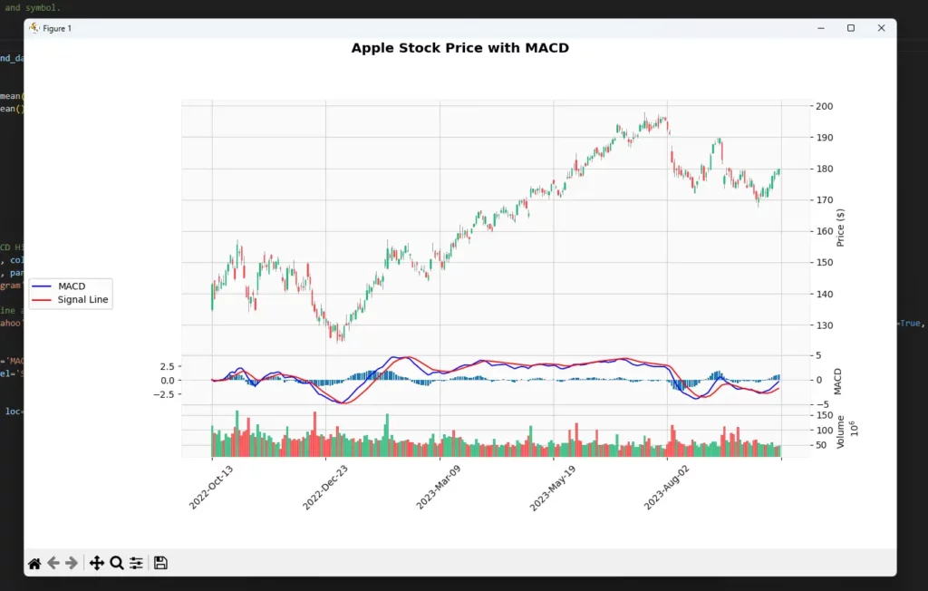
MACD
The MACD is a moving-average momentum indicator. It compares a faster exponential moving average with a slower one, then plots the difference as a line.
That makes it useful for day traders who want to see whether short-term momentum is improving or fading. It is not a pure trend-strength tool like ADX, and it is not a bounded overbought or oversold oscillator like RSI. It sits somewhere between trend and momentum.
The standard calculation uses three parts.
- MACD line – 12-period EMA minus 26-period EMA
- Signal line – 9-period EMA of the MACD line
- Histogram – MACD line minus signal line
For day trading, I would read MACD as a momentum check rather than a mechanical trigger. If price is pushing higher and MACD is also rising, the move has some momentum behind it. If price is making a new high but MACD is not confirming it, that can be an early warning that the move is losing force.
The main MACD readings are:
- MACD line above the signal line – short-term momentum is stronger than the signal average.
- MACD line below the signal line – short-term momentum is weaker than the signal average.
- MACD above zero – the faster EMA is above the slower EMA.
- MACD below zero – the faster EMA is below the slower EMA.
- MACD divergence – price and momentum are no longer moving together cleanly.
The chart still needs context. A MACD crossover inside a flat, messy range is much less interesting than a crossover that appears after a pullback inside a clear trend. A divergence can also persist for longer than expected, especially in a strong market.
For intraday use, MACD pairs well with tools that answer a different question. ADX can help judge whether the market is directional enough for trend-following. RSI can show whether momentum is stretched. Candlestick or price-structure analysis can help decide whether the entry location makes sense.
The weakness is lag. MACD is built from moving averages, so it cannot avoid reacting after price has already moved. It can also whipsaw badly when the market has no clean direction.
For the full MACD formula, divergence examples, Python code and chart walkthrough, see the dedicated AlphaSquawk guide to MACD and MACD divergence.
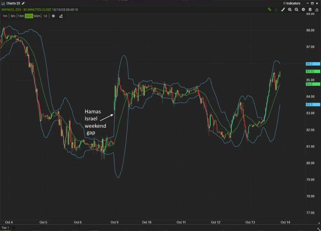
Bollinger Bands
Bollinger Bands are a volatility indicator built around a moving average. The usual setup uses a 20-period simple moving average as the middle band, then plots an upper and lower band two standard deviations away from that average.
For day trading, the bands help answer a simple question. Is price quiet and compressed, or is volatility expanding?
The three parts are:
- Middle band – usually a 20-period simple moving average.
- Upper band – middle band plus a standard-deviation multiple.
- Lower band – middle band minus the same standard-deviation multiple.
Bollinger Bands are useful because the bands adapt to volatility. When price action becomes quiet, the bands contract. When price becomes more volatile, the bands expand.
That makes them useful for two common intraday ideas.
- Squeeze conditions appear when the bands narrow. This can warn that volatility has compressed, although it does not predict the breakout direction.
- Band walks appear when price keeps pressing the upper or lower band. This can show persistent trend pressure rather than an immediate reversal.
A band touch should not be treated as an automatic trading signal. Price touching the upper band does not automatically mean sell. Price touching the lower band does not automatically mean buy. In a strong trend, price can keep pushing along one band for longer than expected.
For day trading, Bollinger Bands pair well with indicators that answer different questions. RSI or Stochastics can help judge whether momentum is stretched. VWAP can show where price is trading relative to intraday value. ADX can help decide whether a band touch is more likely to be part of a trend or a range.
The weakness is interpretation. Bollinger Bands show relative price location and volatility, but they do not decide direction by themselves. A squeeze can break higher or lower. A band walk can continue. A return to the middle band can fail if the trend is strong.
For the full Bollinger Bands formula, squeeze examples, BDIF, Python code and Excel setup, see the dedicated AlphaSquawk guide to Bollinger Bands.
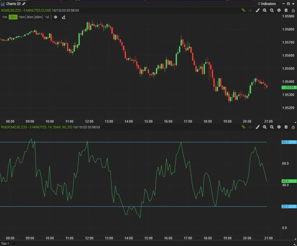
RSI
The Relative Strength Index, or RSI, is a momentum oscillator developed by J. Welles Wilder Jr. and introduced in his 1978 book New Concepts in Technical Trading Systems.
RSI compares recent average gains with recent average losses and converts that relationship into a reading between 0 and 100. The common setting is 14 periods.
The basic formula is:
RSI = 100 - 100 / (1 + RS)

RS = Average Gain / Average Loss
For day trading, RSI is useful because it gives a quick view of whether momentum is stretched. The familiar reference zones are 70 and 30, but I would not treat them as automatic sell or buy levels.
A high RSI reading means upside momentum has been strong. In a range, that can warn price is stretched. In a strong uptrend, it can simply confirm buying pressure.
A low RSI reading means downside momentum has been strong. In a range, that can warn price is stretched to the downside. In a strong downtrend, it can simply confirm selling pressure.
The main RSI readings are:
- RSI above 70 – upside momentum is strong or stretched.
- RSI below 30 – downside momentum is strong or stretched.
- RSI around 50 – momentum is more balanced.
- Bullish divergence – price makes a lower low while RSI makes a higher low.
- Bearish divergence – price makes a higher high while RSI makes a lower high.
RSI pairs well with tools that answer a different question. A moving average can help define trend direction. Bollinger Bands can show whether volatility is expanding or compressing. Support and resistance can help judge whether an RSI extreme is happening at a meaningful price level.
The weakness is that RSI can stay overbought or oversold for longer than expected. That is especially true during strong intraday trends. Fading every RSI extreme is one of the common ways traders get trapped against momentum.
For the full RSI formula, divergence examples, Python code and chart walkthrough, see the dedicated AlphaSquawk guide to RSI trading strategies.
DMI and ADX
The Directional Movement Index is one of Welles Wilder’s trend tools from New Concepts in Technical Trading Systems. It is usually discussed alongside ADX, because the two are part of the same indicator family.
DMI tries to show directional pressure. ADX tries to show trend strength.
The indicator has three main lines.
- +DI measures positive directional movement.
- -DI measures negative directional movement.
- ADX measures the strength of the trend, regardless of whether the trend is up or down.
For day trading, DMI and ADX are most useful as filters. They can help decide whether a trend-following idea deserves attention, or whether the market is too choppy for a clean breakout or pullback setup.
The common readings are:
- +DI above -DI suggests upside pressure is stronger than downside pressure.
- -DI above +DI suggests downside pressure is stronger than upside pressure.
- Rising ADX suggests trend strength is increasing.
- Falling ADX suggests the market may be losing directional force.
- Low ADX often points to chop, range trading or weak trend conditions.
A DI crossover can be useful, but I would not treat it as a mechanical entry. Crossovers happen frequently in sideways markets. ADX helps by showing whether there is enough trend strength behind the directional move.
DMI pairs naturally with moving averages and MACD because all three deal with trend behaviour in different ways. A moving average can show trend direction, MACD can show momentum changes, and ADX can help judge whether the market is trending strongly enough.
The weakness is complexity. DMI can look busy, and the DI lines can cross repeatedly when the market is not moving cleanly. ADX can also rise during a strong selloff or a strong rally, so it should not be read as bullish or bearish by itself.
For the full DMI formula, Wilder’s extreme point rule, DDIF, Python code and chart examples, see the dedicated AlphaSquawk guide to the Directional Movement Index.
VWAP
VWAP, or Volume Weighted Average Price, is an intraday value benchmark. It shows the average price traded during the session, weighted by volume.
That makes it different from a normal moving average. A moving average only looks at price. VWAP looks at where the volume has actually traded.
The basic formula is:
VWAP = ∑ (Price x Volume) / ∑ Volume
For day trading, VWAP is useful because it gives a live reference point for session value. If price is above VWAP, the market is trading above its volume-weighted average for the day. If price is below VWAP, the market is trading below it.
That does not make VWAP a buy or sell signal by itself. It is better used as a reference line.
Common intraday uses include:
- judging whether price is trading above or below session value
- looking for pullbacks toward VWAP in a trend
- watching whether price rejects VWAP or accepts back through it
- comparing trade location against a benchmark used by institutions
- checking whether a move is extending far from fair intraday value
VWAP can be useful for trend days and range days, but the interpretation changes. On a strong trend day, price may hold above or below VWAP for long stretches. On a range day, price may rotate around VWAP repeatedly.
The weakness is that VWAP is cumulative. As the session goes on, it becomes slower to react because more volume is already included in the calculation. A large opening period can also influence the line for much of the day.
VWAP pairs well with tools that answer different questions. Moving averages can show broader trend direction. RSI or Stochastics can show stretched momentum. Bollinger Bands can show volatility expansion or compression. Support and resistance can help judge whether VWAP is lining up with a meaningful price area.
VWAP vs Market Profile Value Area
VWAP and Market Profile both try to describe value, but they do it differently.
VWAP gives one volume-weighted average price for the session. Market Profile shows how trading activity is distributed across prices. It can highlight the Point of Control, where the market spent the most time or volume, and a value area around that central zone.
VWAP and Market Profile can be useful together. If VWAP sits close to the Point of Control or value area, it can mark an important session value zone. If price rejects that area, it may show that traders are refusing the previous value level. If price keeps accepting above or below it, the market may be building value somewhere else.
For day trading, that is often more useful than treating VWAP as a simple line to buy below or sell above. The better question is whether price is accepting, rejecting or repeatedly rotating around that value area.
Stochastic Oscillator
The Stochastic Oscillator is a momentum indicator developed by George Lane. It compares the latest close with the recent high-low range.
The idea is simple. In a strong upswing, price often closes near the top of its recent range. In a downswing, it often closes nearer the bottom. Stochastics turns that relationship into a reading between 0 and 100.
The main line is %K. The smoother signal line is %D.
%K = 100 × (Close - Lowest Low) / (Highest High - Lowest Low)

%D = moving average of %K
The common reference levels are 80 and 20. A reading above 80 shows that price is closing near the upper end of its recent range. A reading below 20 shows that price is closing near the lower end of its recent range.
For day trading, Stochastics can be useful when price is rotating inside a range or pulling back inside a broader trend. It is less reliable when the market is trending hard, because the oscillator can stay high or low for longer than expected.
The main readings are:
- %K crossing above %D can show improving short-term momentum.
- %K crossing below %D can show fading short-term momentum.
- Readings above 80 show price near the top of the recent range.
- Readings below 20 show price near the bottom of the recent range.
- Divergence can warn that price and short-term momentum are no longer moving together cleanly.
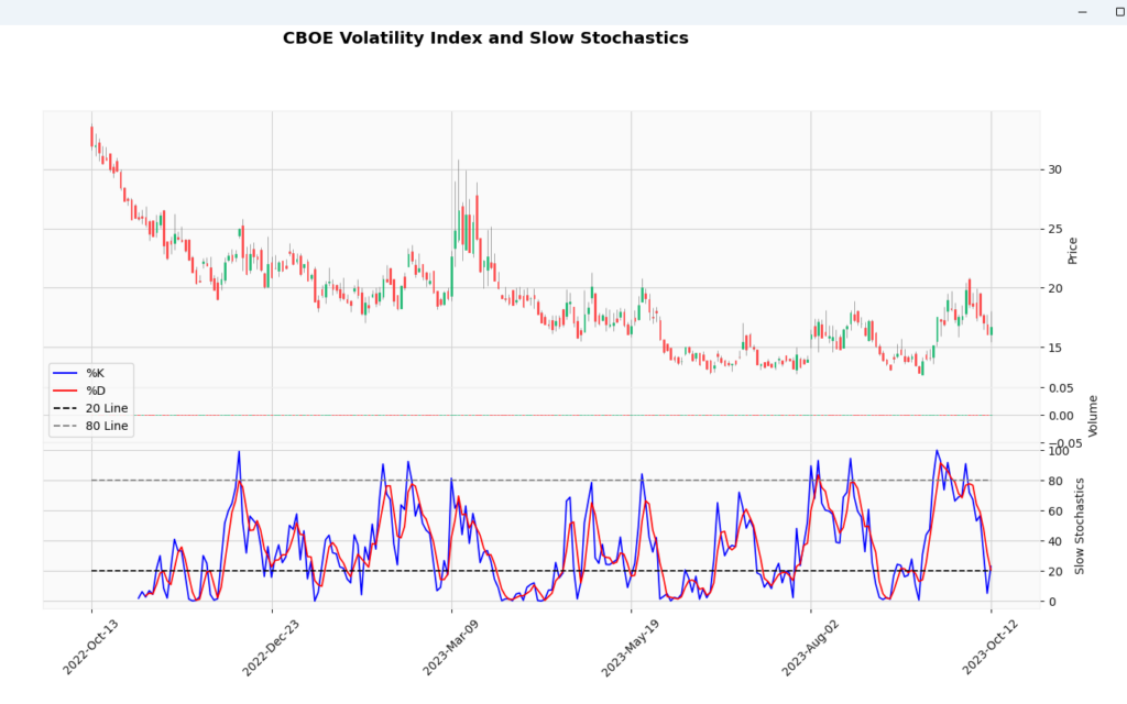
There are two common versions. Fast Stochastics is closer to the original calculation and reacts quickly. Slow Stochastics adds extra smoothing, which can make the chart easier to read but slower to turn.
Stochastics pairs well with support and resistance, pivot points, VWAP and Bollinger Bands. Those tools can help decide whether an overbought or oversold reading is happening at a meaningful price area.
The weakness is trend persistence. In a strong uptrend, Stochastics can stay overbought while price keeps rising. In a strong downtrend, it can stay oversold while price keeps falling. That is why I would use it as a timing and momentum tool, not as a standalone reversal system.
For the full formulas, settings and Python examples, see the dedicated AlphaSquawk guides to Fast Stochastics and Slow Stochastics.
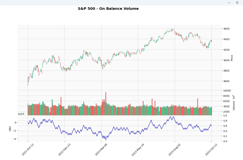
OBV
On Balance Volume, or OBV, is a volume-based momentum indicator developed by Joe Granville.
OBV tries to show whether volume is supporting the price move. It adds volume when price closes higher and subtracts volume when price closes lower. The result is a running volume line that can be compared with price.
The basic rules are:
If today’s close is above yesterday’s close, add today’s volume to OBV.

If today’s close is below yesterday’s close, subtract today’s volume from OBV.

If today’s close is unchanged, OBV stays the same.
For day trading, OBV can be useful when you want to know whether volume is confirming a move. If price is rising and OBV is also rising, volume is generally moving with the trend. If price is rising but OBV is flat or falling, the move may have less volume support.
The main readings are:
- Price rising with OBV rising suggests volume is confirming the advance.
- Price falling with OBV falling suggests volume is confirming the decline.
- Price making new highs while OBV lags can warn that buying pressure is fading.
- Price making new lows while OBV holds up can warn that selling pressure is weakening.
OBV pairs well with trendlines, support and resistance, moving averages and breakout setups. If price breaks a level and OBV confirms the move, the breakout has more volume support. If price breaks out while OBV does very little, the move may deserve more caution.
The weakness is that OBV only cares whether the close was up or down. A tiny up day adds the whole day’s volume. A huge up day also adds the whole day’s volume. That makes OBV simple, but also blunt.
For the full OBV formula, Python code and chart walkthrough, see the dedicated AlphaSquawk guide to On Balance Volume.
Fibonacci Retracement
The tool is named after Leonardo of Pisa, an Italian mathematician also known as Fibonacci. He introduced the Hindu-Arabic numeral system to Europe and found a sequence in which each subsequent number is the sum of the two preceding ones, starting from 0 and 1. This sequence, known as the Fibonacci sequence, and the ratios between the numbers, have been applied to finance and used to predict areas of support or resistance in the markets.
Fibonacci retracement is a support-and-resistance tool. Traders draw it between a swing high and swing low, then watch the retracement levels for possible reactions.
The common levels are:
23.6%
38.2%
50%
61.8%
78.6%
The 50% level is not a Fibonacci ratio, but traders often include it because markets frequently retrace around half of a prior move.
For day trading, Fibonacci retracement is most useful when the market has already made a clear impulse move. The tool then helps map possible pullback zones. It is not very useful if you are forcing it onto a messy chart with no obvious swing high or swing low.
The basic workflow is:
In an upswing, draw from the swing low to the swing high.

In a downswing, draw from the swing high to the swing low.

Then watch how price behaves around the retracement levels.
A Fibonacci level is not support or resistance just because it exists. The useful question is whether price reacts there. Does the pullback slow? Does volume change? Does a candle pattern appear? Does the level line up with VWAP, a moving average, a prior high, a prior low or a pivot level?
Fibonacci is also a good place to keep a little scepticism. I have seen traders draw retracements on almost anything, including individual 5-minute candles. If you draw enough lines on a chart, some of them will appear to work eventually.
That does not mean Fibonacci levels are useless. It means the anchor points matter. A retracement drawn from a meaningful swing high to a meaningful swing low is more useful than one drawn after the fact to explain a move that has already happened.
For intraday trading, Fibonacci can work best as a planning tool rather than a signal generator. You can mark likely pullback zones before the trade, then wait for price behaviour to confirm or reject the level.
Fibonacci pairs well with trend analysis, VWAP, pivot points, moving averages and candlestick patterns. If several tools point to the same area, that level deserves more attention than a Fibonacci line sitting alone in the middle of nowhere.
The weakness is subjectivity. Two traders can choose different swing points and end up with different levels. That makes Fibonacci less objective than something like VWAP or a standard moving average.
For a practical example of using Fibonacci around a breakout entry, see the AlphaSquawk breakout trading strategy guide.
Pivot Points
Pivot points are intraday support-and-resistance levels calculated from the previous session’s high, low and close.
They were popular with floor traders because the levels could be calculated before the market opened. That is still the main appeal. Unlike a moving average or RSI, pivot points do not move around during the session. They give traders a fixed map of possible reaction levels.
The central pivot is:
Pivot Point = (High + Low + Close) / 3The first support and resistance levels are:
R1 = (2 × Pivot Point) - Low

S1 = (2 × Pivot Point) - High
The second levels are:
R2 = Pivot Point + (High - Low)

S2 = Pivot Point - (High - Low)
For day trading, pivot points can help frame the session. If price opens above the central pivot and holds above it, traders may treat the session as having a bullish bias. If price opens below the pivot and keeps failing there, the tone may be weaker.
The main uses are:
- mapping predefined support and resistance
- planning possible entry and exit zones before the session
- watching how price reacts around the central pivot, R1, R2, S1 and S2
- comparing pivot levels with VWAP, prior highs/lows and moving averages
- judging whether price is accepting or rejecting a key intraday level
A pivot level is not a trade by itself. The useful part is the reaction. Does price stall there? Does it reject the level quickly? Does it break through and hold? Does volume support the move?
The weakness is that pivot points are based only on the prior session’s high, low and close. They do not know about today’s news, liquidity, sentiment or volatility. On a strong trend day, price can cut through several levels without respecting them.
Pivot points work best when combined with price action and another tool that answers a different question. VWAP can show session value. RSI or Stochastics can show stretched momentum. Moving averages can show broader direction. Fibonacci can sometimes line up with a pivot area and make the level more interesting.
For intraday traders, pivot points are useful because they give structure before the market starts moving. The mistake is treating each line as a guaranteed reversal point. They are reference levels, not instructions.
Key Takeaways
A good day trading indicator should have a job. Some tools help define trend direction, some measure momentum, some track volatility, some show volume pressure, and some map possible support or resistance.
The mistake is using several indicators that all say the same thing. A moving average, MACD and ADX can all help with trend behaviour, but they are still drawing from similar price information. Adding more lines does not always add more insight.
For a cleaner chart, try combining indicators that answer different questions.
- Trend direction. Moving averages or Ichimoku.
- Trend strength. DMI and ADX.
- Momentum. RSI, MACD or Stochastics.
- Volatility. Bollinger Bands.
- Volume and value. VWAP or OBV.
- Levels. Fibonacci retracements, pivot points, prior highs and prior lows.
Time frame matters too. A setup on a 5-minute chart can look very different if the hourly chart is pushing the other way. Before taking an intraday signal, it is worth checking whether the shorter-term chart agrees with the broader session structure.
I would also be careful with duplicated confirmation. If RSI and Stochastics are both stretched, that may be useful, but they are both momentum oscillators. It is not the same as getting confirmation from volume, volatility or a major price level.
No indicator removes the need for trade management. The useful part is not finding a perfect signal but building a toolkit that helps you read trend, momentum, volatility, volume and levels without cluttering the chart.
Final Thoughts
The best day trading indicators are the ones that help you make a clearer decision. A moving average can keep you aligned with trend. VWAP can show where price sits relative to session value. Bollinger Bands can show when volatility expands or contracts. RSI, MACD and Stochastics can help judge momentum. Pivot points and Fibonacci retracements can give you areas to watch before price gets there.
The real improvement comes from knowing what each tool is doing. Once you understand that, you can stop stacking indicators randomly and start building combinations that actually add something different.