Updated May 2026: I’ve refreshed this guide with clearer ADX and DMI formulas, more practical notes on crossover signals and settings, and an updated Python walkthrough for building the indicator from price data.
Introduction
The Average Directional Index, usually shortened to ADX, is a trend-strength indicator.
ADX measures strength, not direction. A rising ADX can appear during a strong rally or a hard sell-off. It does not care which side is winning. It only shows whether the market is becoming more directional.
The direction comes from the Directional Movement Index, or DMI, which sits behind the ADX calculation. DMI gives us the +DI and -DI lines. If +DI is above -DI, upward directional movement is stronger. If -DI is above +DI, downward directional movement is stronger.
I find ADX most useful as a filter. If ADX is rising, trend-following setups such as breakouts, moving-average systems or pullback entries may deserve more attention. If ADX is falling, the chart may be losing directional force, and the market may be drifting into chop.
ADX helps answer whether there is enough directional pressure behind a move to justify looking for follow-through.
ADX Indicator at a Glance
Before getting into the formula, it helps to separate the three moving parts of the indicator.
ADX measures the strength of the trend. It does not measure direction.
+DI measures positive directional movement. When +DI is above -DI, buyers have the stronger directional movement component.
-DI measures negative directional movement. When -DI is above +DI, sellers have the stronger directional movement component.
For me, the cleanest way to read ADX is this. +DI and -DI suggest which side is leading. ADX tells you whether that directional move is gaining enough strength to care about.
If both directional lines are drifting lower, conviction may be fading. If the two lines start to separate and ADX later begins rising, the market may be moving from noise into something more directional.
History and Origin
J. Welles Wilder Jr. introduced ADX in New Concepts in Technical Trading Systems in 1978, the same book that gave traders ATR, RSI, Parabolic SAR, and the Directional Movement Index.
Wilder was not building indicators for clean textbook charts. His tools were built around markets that gap, stall, reverse, and spend long periods going nowhere. ADX fits those scenarios because it tries to answer a practical question before the trader chooses a tactic.
Is this market showing enough directional strength to trade as a trend?
ADX comes from the DMI framework. The +DI and -DI lines compare upward and downward directional movement. ADX then smooths that directional information into a trend-strength reading.
That is why ADX can rise during a sell-off just as easily as during a rally. It is not a bullish or bearish indicator by itself. It is a strength gauge.
Used properly, ADX helps decide whether a trend-following approach has a decent backdrop. A low or falling ADX can warn that breakout signals may be more vulnerable to chop. A rising ADX suggests price is moving into a more directional phase, where trend tools may have more to work with.
ADX Indicator Formula
The ADX formula looks awkward at first because it is not built from closing prices alone. It starts with the high, low and previous close, then works out whether the latest bar made stronger upward or downward directional progress.
This is why ADX belongs with DMI rather than with simpler closing-price oscillators. The calculation first builds +DI and -DI. ADX then smooths the distance between those two lines into a trend-strength reading.
The standard setting is 14 periods, but “period” simply means the chart bar being used. On a daily chart, that means 14 days. On a five-minute chart, it means 14 five-minute candles.
Formula key
| Symbol | Meaning |
|---|---|
t | current bar |
t - 1 | previous bar |
n | lookback period, commonly 14 |
Ht | current high |
Lt | current low |
Ct | current close |
Ct-1 | previous close |
TR | True Range |
Ut | upward movement from the previous high |
Dt | downward movement from the previous low |
+DM | Positive Directional Movement |
-DM | Negative Directional Movement |
DI+ | Positive Directional Indicator, usually shown as +DI |
DI– | Negative Directional Indicator, usually shown as -DI |
DX | Directional Movement Index value before final ADX smoothing |
ADX | smoothed trend-strength reading |
1. Calculate True Range
True Range measures the largest of three possible ranges. This is important because a market can move meaningfully through a gap, not just through the distance between the current high and low. It is the same range concept used in ATR.
\text{TR}_t = \max \left( H_t - L_t,\ \left| H_t - C_{t-1} \right|,\ \left| L_t - C_{t-1} \right| \right)True Range is the largest of current high minus current low, current high minus previous close, or current low minus previous close. The last two use absolute values, so only the size of the move matters.
2. Calculate upward and downward movement
The next step compares the current high with the previous high, and the previous low with the current low. This tells us whether the bar made stronger upward or downward progress.
U_t = H_t - H_{t-1}Upward movement is current high minus previous high.
D_t = L_{t-1} - L_tDownward movement is previous low minus current low.
3. Calculate +DM and -DM
\text{+DM}_t =
\begin{cases}
U_t, & \text{if } U_t > D_t \text{ and } U_t > 0 \\
0, & \text{otherwise}
\end{cases}
+DM only counts upward movement when the current high extends more than the downside move.
\text{-DM}_t =
\begin{cases}
D_t, & \text{if } D_t > U_t \text{ and } D_t > 0 \\
0, & \text{otherwise}
\end{cases}
-DM only counts downward movement when the current low extends more than the upside move.
The minus sign in -DM is a label for downward directional movement. It does not mean the value is negative.
4. Smooth TR, +DM and -DM
Wilder did not use a simple rolling average for every step. After the first seed value, his smoothing updates the previous smoothed value with the latest value. This makes ADX slower than raw directional movement, but much less jumpy.
\text{WS}_t = \frac{\text{WS}_{t-1} \times (n - 1) + X_t}{n}Wilder’s smoothed value equals the previous smoothed value multiplied by n minus 1, plus the current value, all divided by n.
Here, X is whichever series is being smoothed. In the ADX calculation, the same smoothing idea is applied to True Range, +DM, -DM and later DX.
For the first smoothed value, charting platforms normally seed the calculation with a simple average over the first n periods. Different platforms may handle the early warm-up bars slightly differently, so small differences at the start of a chart are normal.
5. Calculate +DI and -DI
The smoothed directional movement values are then divided by the smoothed True Range. This normalises directional movement against the recent trading range, so a high-priced or volatile instrument is not automatically treated as having stronger trend movement.
\text{DI}^+_t = 100 \times \frac{\text{Smoothed +DM}_t}{\text{ATR}_t}+DI is smoothed positive directional movement divided by ATR, multiplied by 100.
\text{DI}^-_t = 100 \times \frac{\text{Smoothed -DM}_t}{\text{ATR}_t}-DI is smoothed negative directional movement divided by ATR, multiplied by 100.
When +DI is above -DI, upward directional movement is stronger. When -DI is above +DI, downward directional movement is stronger.
6. Calculate DX
DX measures the gap between +DI and -DI as a percentage of their combined value. A wide gap means one side is dominating directional movement. A narrow gap means the two sides are closer together.
\text{DX}_t = 100 \times \frac{\left| \text{DI}^+_t - \text{DI}^-_t \right|}{\text{DI}^+_t + \text{DI}^-_t}DX equals the absolute difference between +DI and -DI, divided by the sum of +DI and -DI, multiplied by 100.
This is where the direction is stripped out. DX cares about how far apart the two lines are, not whether +DI or -DI is on top.
7. Smooth DX to get ADX
ADX is the Wilder-smoothed version of DX. This final smoothing is why ADX reacts more slowly than the DI lines, but it also makes it more useful as a trend-strength filter.
\text{ADX}_t = \frac{\text{ADX}_{t-1} \times (n - 1) + \text{DX}_t}{n}ADX equals the previous ADX value multiplied by n minus 1, plus the current DX value, all divided by n.
The first ADX value is usually seeded with an average of the first n DX readings. After that, Wilder’s smoothing takes over.
The result is a line that rises when directional movement becomes more dominant and falls when directional movement fades. The line still needs context. A rising ADX during a sell-off does not make the chart bullish. It only says the move is becoming more directional.
How to Read ADX Values
ADX is usually plotted on a scale from 0 to 100, although readings near the top of that range are uncommon in normal liquid markets.
The first mistake is to read ADX as bullish or bearish. ADX does not care whether price is rising or falling. A rising ADX means directional movement is strengthening. The direction still has to come from price action, +DI and -DI, or another directional tool.
A common approach is to treat low ADX readings as a warning that the market may be ranging, and higher readings as evidence that a stronger trend may be developing. CQG, for example, describes ADX breaking through 20 or 25 as a breakout-style use of the study.
The exact threshold is not some particularly special setting. A slow-moving index, a high-volatility stock, a currency pair and an intraday futures chart can all behave differently. I would treat the levels as zones rather than hard laws.
| ADX area | Common reading | What I would watch |
|---|---|---|
| Below 20 | Weak trend or range-like movement | Breakouts may be more vulnerable to failure |
| Around 20 to 25 | Possible transition area | Watch whether price and DMI confirm the shift |
| Above 25 | Stronger directional conditions | Trend-following setups may deserve more attention |
| Above 45 | Very strong directional movement | Strong trend, but also watch for exhaustion if ADX turns down |
| Falling ADX | Directional force is fading | Trend systems may lose their edge; range tactics may become more relevant |
The slope of ADX is often as useful as the level. A rising line shows strengthening directional movement. A falling line shows weakening directional movement. A high but falling ADX can appear when a strong trend is still moving, but the force behind that trend is no longer increasing.
This is where traders often get caught. A falling ADX does not automatically mean price will reverse. It may only mean the trend is losing intensity. Price can still drift higher or lower after ADX rolls over, especially if the move had already become extended.
ADX Crossover Strategy Explained
The phrase ADX crossover strategy can mean two slightly different things, so it is worth separating them.
The first crossover is the DMI crossover. This happens when +DI crosses above -DI, or when -DI crosses above +DI. If +DI crosses above -DI, upward directional movement has taken the lead. If -DI crosses above +DI, downward directional movement has taken the lead.
The second crossover is the ADX confirmation idea. Some traders watch for ADX to rise above a threshold, or to cross above the higher of the two DMI lines. That is a way of asking whether the directional move has enough strength behind it.
A basic bullish ADX crossover setup might look like this.
| Step | What the trader checks | Why it matters |
|---|---|---|
| 1 | +DI crosses above -DI | Upward directional movement has taken the lead |
| 2 | ADX is rising | Trend strength is improving |
| 3 | ADX is above a chosen threshold, often around 20 or 25 | Helps avoid some low-strength chop |
| 4 | Price confirms with a breakout, pullback hold, or higher low | Prevents the indicator from replacing chart structure |
| 5 | Risk is defined before entry | ADX does not provide a stop-loss level |
A bearish version reverses the directional line logic. -DI crossing above +DI tells you that downward directional movement has taken the lead. A rising ADX then suggests that the bearish move is becoming more directional.
I would not treat the DI crossover by itself as a trade. In choppy markets, +DI and -DI can cross repeatedly without price making much progress. That is where ADX becomes useful as a filter. If the crossover happens while ADX is flat or falling, the signal may be too weak for a trend-following trade.
CQG describes four common ADX uses: a breakout-style reading when ADX rises through 20 or 25, trend exhaustion when ADX is above 45 and turns down, acceleration when ADX rises by more than 3 from the previous bar, and confirmation when ADX crosses above the higher-valued DMI line. Those are useful reference points, but I would still want price confirmation rather than trading the indicator mechanically.
| ADX / DMI condition | Possible interpretation | Main caution |
|---|---|---|
| +DI above -DI and ADX rising | Upward trend strength is improving | Late entries can chase an extended move |
| -DI above +DI and ADX rising | Downward trend strength is improving | Sharp sell-offs can reverse violently |
| DI crossover with low or falling ADX | Direction may be changing, but force is weak | Whipsaws are more likely |
| ADX above 45 and turning down | Strong trend may be losing intensity | Falling ADX does not automatically mean reversal |
| ADX rising by more than 3 from the prior bar | Directional movement is accelerating | Can arrive after a large bar, so entry location matters |
The best use of an ADX indicator strategy is usually to decide which type of setup deserves attention. Rising ADX favours trend-following logic. Falling ADX warns that range trading, mean reversion, or no trade at all may be the better choice. The indicator helps with market selection, but the trade still needs price structure, risk control, and awareness of news or earnings risk.
ADX Indicator Settings and Parameters
The standard ADX setting is 14 periods. That is the default many charting platforms use, and it is usually the best starting point when learning the indicator.
The period setting controls how quickly ADX responds. A shorter setting reacts faster, but it also produces more noise. A longer setting reacts more slowly, but it can give a cleaner view of broader trend strength.
For most traders, the question is not whether 14 is perfect. The better question is whether the setting matches the chart being traded. A five-minute futures chart, a daily stock chart and a weekly currency chart are not asking the same thing from the indicator.
I would treat the default 14-period ADX as the baseline. If I changed it, I would compare the new version against the default rather than assuming the faster line is better.
| ADX setting | Behaviour | Possible use | Main trade-off |
|---|---|---|---|
| Shorter than 14 | Faster and more reactive | Intraday testing, faster trend shifts, early warning | More whipsaws and false starts |
| 14 periods | Standard baseline | General chart reading, strategy testing, comparison across platforms | May lag sharp turns |
| Longer than 14 | Slower and smoother | Swing trading, broader trend filters, reducing noise | Later confirmation |
| Higher threshold | Fewer trend signals | Filtering for stronger directional moves | May miss earlier trend development |
| Lower threshold | More trend signals | Catching transitions earlier | More low-quality signals in chop |
Thresholds are settings too, even if they are not always listed in the platform inputs. A trader using 20 as the trend-strength line will see more possible signals than a trader waiting for 25 or 30. That does not make one approach necessarily better. It changes the balance between early signals and cleaner confirmation.
The same logic applies to day trading with ADX. A shorter setting may pick up intraday shifts more quickly, but it can also make the line twitchy. If the chart is already noisy, reducing the ADX period can make the problem worse.
I would avoid changing the smoothing method unless I were deliberately testing a custom indicator. Wilder’s smoothing is part of the standard ADX calculation. Replacing it with another smoothing method may produce something useful, but it is no longer the same standard ADX that most traders and charting platforms are comparing.
What Is ADXATR?
Some charting platforms show a value called ADXATR beside the ADX study. The name is confusing because it sounds like a special hybrid indicator, but it usually means the ATR value displayed alongside ADX.
ADX and ATR measure different things.
ADX measures trend strength. It comes from +DI, -DI and DX.
ATR measures volatility. It comes from True Range and shows how much the market has been moving over the selected period.
So ADXATR is not another version of ADX. It is normally the Average True Range value shown in the same indicator panel or data window.
| Value | What it measures | What it is useful for |
|---|---|---|
| ADX | Trend strength | Judging whether price movement is becoming more directional |
| +DI | Positive directional movement | Checking whether upward directional movement is leading |
| -DI | Negative directional movement | Checking whether downward directional movement is leading |
| ATR / ADXATR | Volatility | Estimating recent range, stop distance, and position-sizing context |
The distinction is important because a market can be volatile without trending. A stock can gap up and down violently while ADX stays weak if the movement is not directional. A quieter market can also build a strong ADX reading if price keeps moving consistently in one direction.
For trading, I would use ADX and ATR for different purposes. ADX helps decide whether a trend-following setup has a supportive backdrop. ATR helps with risk placement because it gives a sense of how much the market has been moving recently.
If your platform displays ADXATR, check the platform documentation to confirm exactly how it labels the value. In most cases, it is there to give volatility context beside the ADX trend-strength reading.
Pros and Cons of the ADX Indicator
ADX is useful because it separates trend strength from trend direction. That sounds like a small distinction, but it changes how the indicator should be used. ADX is usually better as a market-condition filter than as a direct entry signal.
| Strength | Why it helps |
|---|---|
| Measures trend strength directly | Helps identify when trend-following setups may have a better backdrop |
| Works with bullish and bearish moves | A rising ADX can confirm strengthening movement in either direction |
| Pairs naturally with DMI | +DI and -DI help with direction while ADX helps with strength |
| Helps avoid some range-bound trades | Low or falling ADX can warn that the market may be too choppy for breakout logic |
| Can be used across timeframes | The same concept applies to daily, intraday and weekly charts, although settings may need testing |
The limitations are just as important. ADX is smoothed, so it will usually lag sharp changes in price behaviour. By the time ADX confirms a strong trend, the best entry may already have passed.
ADX also does not tell you where to enter, where to place a stop, or whether the reward-to-risk is attractive. It can say that directional movement is strengthening, but it cannot tell you whether the next trade is worth taking.
The other common trap is reading falling ADX as a reversal signal. A falling ADX means trend strength is fading. It does not automatically mean the market is about to turn. Price can continue drifting in the same direction even while ADX moves lower.
| Limitation | What can go wrong |
|---|---|
| Lagging signal | ADX may confirm strength after the move is already extended |
| No direction by itself | A rising ADX needs price action or DMI to show whether buyers or sellers are leading |
| Weak in chop | DI crossovers can fire repeatedly when price is range-bound |
| No risk level | ADX does not provide a stop-loss, target, or position size |
| Settings are context-dependent | A useful setting on one market or timeframe may be poor on another |
Used well, ADX can keep a trader from forcing trend trades in a weak market. Used badly, it can become another lagging confirmation tool that encourages late entries. I would rather use it to decide whether the market environment suits the strategy, then let price structure and risk management decide the trade.
Coding the ADX Indicator with Python
Now we can turn the ADX formula into Python and plot it on a price chart.
We could use a technical-analysis library to calculate ADX in one line, but building it manually is more useful for this article. It shows where True Range, +DM, -DM, +DI, -DI, DX and ADX all enter the calculation.
The code below uses Yahoo Finance data, calculates ADX with Wilder-style smoothing, then plots price with ADX and the two DMI lines underneath.
Step 1: Install the Python libraries
I’ll assume you have Python installed and have downloaded a copy of VSCode which Microsoft offer for free. Once you have VSCode open and Python set up make sure you have the relevant libraries installed (also free) to work with, which can be done by adding the following command into the Terminal tab at the base of VSCode:
python -m pip install pandas yfinance numpy matplotlib mplfinanceIf your Windows setup uses the py launcher, this version may work better:
py -m pip install pandas yfinance numpy matplotlib mplfinancePandas handles the data table, NumPy helps with the conditional calculations, yfinance downloads the market data, and mplfinance gives us a cleaner candlestick chart.
Step 2: Create the file and import the libraries
Save a new file as adx.py then paste the following at the top of it (followed by the subsequent python blocks in sequence).
import numpy as np
import pandas as pd
import yfinance as yf
import matplotlib.pyplot as plt
from mplfinance.original_flavor import candlestick_ohlcThese imports give us the tools needed to download the data, calculate the indicator, and build a three-panel chart with price, volume and ADX/DMI.
Step 3: Add the chart settings
ticker = "AMZN"
start_date = "2025-05-10"
end_date = "2026-05-10"
adx_period = 14This example uses Amazon and a 14-period ADX. The same script can be reused with another ticker or timeframe by changing these settings.
Step 4: Download the price data
data = yf.download(
    ticker,
    start=start_date,
    end=end_date,
    auto_adjust=True,
    progress=False,
    multi_level_index=False
)

if isinstance(data.columns, pd.MultiIndex):
    data.columns = data.columns.get_level_values(0)

data.index = pd.DatetimeIndex(data.index)
data = data.dropna(subset=["Open", "High", "Low", "Close"])

if data.empty:
raise ValueError("No price data downloaded. Check the ticker and date range.")The auto_adjust=True setting means the downloaded OHLC data is adjusted for splits and dividends. The MultiIndex check is included because yfinance can sometimes return multi-level columns depending on version and settings.
Step 5: Define Wilder smoothing
def wilder_smoothing(series, period=14):
    """
    Wilder-style smoothing.

    The first smoothed value is seeded with a simple average.
    Later values use:
    previous smoothed value * (period - 1), plus the current value, divided by period.
    """
    series = series.astype(float)
    smoothed = pd.Series(np.nan, index=series.index)

    valid = series.dropna()

    if len(valid) < period:
        return smoothed

    first_valid_pos = series.index.get_loc(valid.index[0])
    seed_pos = first_valid_pos + period - 1

    if seed_pos >= len(series):
        return smoothed

    smoothed.iloc[seed_pos] = series.iloc[first_valid_pos:seed_pos + 1].mean()

    for i in range(seed_pos + 1, len(series)):
        smoothed.iloc[i] = (
            smoothed.iloc[i - 1] * (period - 1) + series.iloc[i]
        ) / period

return smoothedThis function follows the smoothing logic from the formula section. It also handles the warm-up period, which is why the early rows of the final ADX column will be blank.
Step 6: Calculate ADX, +DI and -DI
def calculate_adx(price_data, period=14):
    df = price_data.copy()

    # True Range
    previous_close = df["Close"].shift(1)

    tr_1 = df["High"] - df["Low"]
    tr_2 = (df["High"] - previous_close).abs()
    tr_3 = (df["Low"] - previous_close).abs()

    df["TR"] = pd.concat([tr_1, tr_2, tr_3], axis=1).max(axis=1)

    # Directional movement
    upward_move = df["High"] - df["High"].shift(1)
    downward_move = df["Low"].shift(1) - df["Low"]

    df["+DM"] = np.where(
        (upward_move > downward_move) & (upward_move > 0),
        upward_move,
        0.0
    )

    df["-DM"] = np.where(
        (downward_move > upward_move) & (downward_move > 0),
        downward_move,
        0.0
    )

    # Wilder smoothing
    df["ATR"] = wilder_smoothing(df["TR"], period)
    df["+DM_smooth"] = wilder_smoothing(df["+DM"], period)
    df["-DM_smooth"] = wilder_smoothing(df["-DM"], period)

    # Directional indicators
    df["+DI"] = 100 * (df["+DM_smooth"] / df["ATR"])
    df["-DI"] = 100 * (df["-DM_smooth"] / df["ATR"])

    # DX
    di_sum = df["+DI"] + df["-DI"]

    df["DX"] = np.where(
        di_sum != 0,
        100 * (df["+DI"] - df["-DI"]).abs() / di_sum,
        np.nan
    )

    # ADX
    df["ADX"] = wilder_smoothing(df["DX"], period)

return dfThe +DM and -DM lines only count movement when that side is both larger than the other side and positive. This avoids treating a smaller or negative movement as directional strength.
The final ADX line is a Wilder-smoothed version of DX, not a basic rolling average.
Step 7: Add the calculated columns
data = calculate_adx(data, adx_period)

plot_data = data.dropna(subset=["ADX", "+DI", "-DI"]).copy()

if plot_data.empty:
raise ValueError("Not enough valid data to calculate ADX. Try a longer date range.")The dropna line removes the warm-up rows before the chart is plotted. Those early blank values are expected because ADX needs enough bars to build the first smoothed readings. The empty-data check stops the script with a clear message if there are not enough valid rows to build the indicator.
Step 8: Prepare the compressed chart data
plot_data["Bar"] = np.arange(len(plot_data))

ohlc = plot_data[["Bar", "Open", "High", "Low", "Close"]].values

volume_colors = np.where(
    plot_data["Close"] >= plot_data["Open"],
    "green",
    "red"
)This creates a simple bar number for each trading session. It gives the chart a cleaner trading-platform style layout while still letting us add readable date labels later.
Step 9: Create the price, volume and ADX panels
fig, (ax_price, ax_volume, ax_adx) = plt.subplots(
    3,
    1,
    figsize=(12, 7),
    sharex=True,
    gridspec_kw={
        "height_ratios": [4, 1, 1.25],
        "hspace": 0.0
    }
)

fig.suptitle(
    f"Amazon Stock Price with {adx_period}-Period ADX Indicator",
    fontsize=12,
    fontweight="bold"
)

candlestick_ohlc(
    ax_price,
    ohlc,
    width=0.6,
    colorup="green",
    colordown="red",
    alpha=0.85
)

ax_price.set_ylabel("Price ($)")
ax_price.grid(True, alpha=0.25)

ax_volume.bar(
    plot_data["Bar"],
    plot_data["Volume"],
    color=volume_colors,
    width=0.6,
    alpha=0.55
)

ax_volume.set_ylabel("Volume")
ax_volume.grid(True, alpha=0.25)

ax_adx.plot(
    plot_data["Bar"],
    plot_data["ADX"],
    label="ADX",
    color="blue",
    linewidth=1.2
)

ax_adx.plot(
    plot_data["Bar"],
    plot_data["+DI"],
    label="+DI",
    color="green",
    linewidth=1.0
)

ax_adx.plot(
    plot_data["Bar"],
    plot_data["-DI"],
    label="-DI",
    color="red",
    linewidth=1.0
)

ax_adx.axhline(25, color="gray", linestyle="--", linewidth=0.7, alpha=0.7)
ax_adx.axhline(45, color="gray", linestyle=":", linewidth=0.7, alpha=0.7)

ax_adx.set_ylabel("+DI / -DI / ADX")
ax_adx.legend(loc="upper left", fontsize=8)
ax_adx.grid(True, alpha=0.25)This creates the three chart panels: price at the top, volume in the middle, and ADX with +DI and -DI underneath. The 25 and 45 lines are reference levels only, so they are not added to the legend.
Step 10: Add date labels
tick_count = 9
tick_positions = np.linspace(0, len(plot_data) - 1, tick_count, dtype=int)
tick_labels = plot_data.index[tick_positions].strftime("%Y-%m-%d")

ax_adx.set_xticks(tick_positions)
ax_adx.set_xticklabels(tick_labels, rotation=45, ha="right")

plt.setp(ax_price.get_xticklabels(), visible=False)
plt.setp(ax_volume.get_xticklabels(), visible=False)The x-axis labels show dates, but the spacing is based on trading bars rather than calendar days. That keeps the chart compact and avoids blank weekend gaps.
Step 11: Save and show the chart
fig.subplots_adjust(
    top=0.91,
    bottom=0.16,
    left=0.08,
    right=0.97,
    hspace=0.0
)

output_file = "adx_python_chart.png"
fig.savefig(output_file, dpi=150, bbox_inches="tight")

print(f"Saved chart as {output_file}")

plt.show()This saves the chart as adx_python_chart.png and then opens the chart window. The subplot spacing keeps the three panels stacked tightly, closer to the layout used by many trading platforms.
Step 10: Run the script
Save then run the file from VS Code – top right of the open file has a play button which will do it – else do it from the terminal:
python adx.pyIf your Windows setup uses the py launcher, use:
py adx.pyYou should get a candlestick chart with ADX, +DI and -DI in the lower panel. When +DI is above -DI, upward directional movement is stronger. When -DI is above +DI, downward directional movement is stronger. ADX shows whether that directional movement is gaining or losing strength.
You should end up with something looking like mine here:
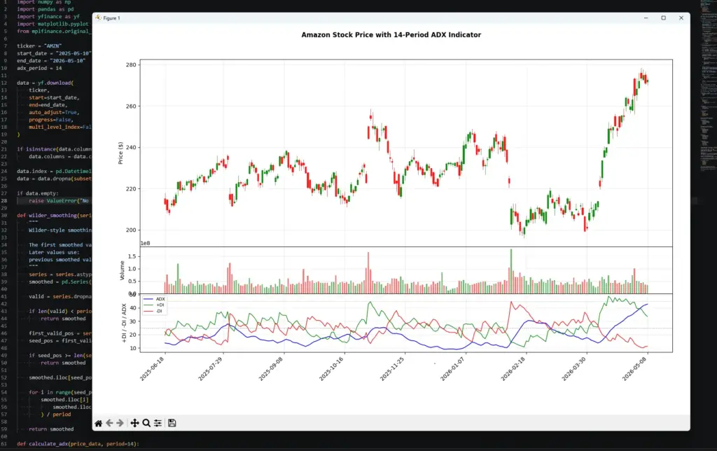
The right side of the chart shows why ADX is useful as a filter. Price is rising, +DI is above -DI, and ADX is climbing from a lower base. That combination gives a cleaner trend-strength backdrop than a price move where the DMI lines are tangled and ADX is flat.
It still does not make trade execution an immediate instruction. A trader would still need to check the entry location, stop placement, earnings dates, broader market conditions and risk size. ADX can confirm that directional movement is strengthening, but it does not know whether the next candle offers a good trade.
Small differences can appear between platforms because of adjusted data and warm-up handling, but the structure of the calculation should be the same.
How to Use ADX for Day Trading
Day trading with ADX needs a slightly different mindset from using it on a daily or weekly chart. Intraday charts move faster, but they also produce more noise. A small burst of directional movement can look important for a few candles and then disappear.
I would still start with the standard 14-period ADX before changing anything. Shorter settings can make ADX react faster, but they can also turn it into a twitchy line that confirms every small push and pull. Faster is not automatically better.
For day trading, ADX is usually most useful as a filter for the type of trade you should be looking for.
If ADX is low or falling, I would be cautious with breakout trades. The market may be rotating inside a range, even if one or two candles look energetic. In that environment, false breaks and quick reversals are more common.
If ADX is rising and the DMI lines are separating, the market may be moving into a cleaner directional phase. That does not tell you where to enter, but it does suggest that trend-following setups deserve more attention than random range trades.
| Day-trading situation | What ADX can help with | What still needs checking |
|---|---|---|
| Market is flat before the open | Shows whether directional force is weak | Opening range, liquidity, scheduled news |
| Price breaks out of a range | Helps judge whether the breakout has strength behind it | Breakout level, volume, failed-break risk |
| +DI and -DI keep crossing | Warns that direction may be unclear | Whether the market is simply chopping |
| ADX rises after DI separation | Suggests directional movement is strengthening | Entry location and stop distance |
| ADX is high but rolling over | Warns that the trend may be losing intensity | Whether price is reversing or only pausing |
The DMI lines are still important. If +DI is above -DI and ADX is rising, upside directional movement is stronger. If -DI is above +DI and ADX is rising, downside directional movement is stronger. If the lines are tangled together, the chart may not have enough directional clarity for a clean trend trade.
A simple intraday process might be to ask three questions.
Is ADX rising or falling?
Which DMI line is leading?
Does the price chart offer a sensible entry and risk level?
That last question is where many indicator-only strategies fall down. ADX can tell you that the market is becoming more directional, but it does not know whether you are buying into resistance, shorting into support, or entering just before a scheduled release.
For day trading, I would be especially careful around fundamental releases such as earnings, central-bank announcements, inflation data, jobs reports and major company news. ADX reads price movement after it appears. It cannot warn you that a news event is about to change the character of the market.
| Mistake | Better habit |
|---|---|
| Taking every DI crossover | Wait for ADX and price structure to support the signal |
| Lowering the ADX period until it “looks good” | Test settings against the default 14-period version |
| Treating falling ADX as a short signal | Read it as fading trend strength, not automatic reversal |
| Ignoring scheduled news | Check the calendar before relying on an intraday technical setup |
| Using ADX for stops | Use price structure, volatility, or predefined risk rules instead |
Used this way, ADX does not need to predict the next candle. It helps decide whether the market is better suited to trend-following, range tactics, or sitting out until the chart becomes clearer.
ADX vs Other Indicators
ADX does one job. It measures trend strength.
That makes it different from indicators that measure momentum, volatility, overbought conditions, volume pressure or price position inside a range. The easiest way to decide whether ADX belongs on a chart is to ask what problem you are trying to solve.
If the question is “is this market directional enough for a trend trade?”, ADX is relevant. If the question is “is price stretched?”, “where could I place a stop?”, or “is volume confirming the move?”, another indicator may be doing a better job.
| Indicator | Main job | How it differs from ADX | Useful pairing idea |
|---|---|---|---|
| RSI | Measures momentum and overbought or oversold conditions | RSI is bounded and direction-sensitive; ADX measures strength without direction | RSI can flag stretched conditions while ADX shows whether the move still has trend strength |
| MACD | Tracks moving-average momentum and trend shifts | MACD gives directional momentum signals; ADX checks whether directional movement is strong | MACD can suggest direction, while ADX filters weak trend conditions |
| ATR | Measures volatility | ATR shows range size, not trend strength | ATR can help with stop distance while ADX judges trend backdrop |
| Moving averages | Smooth price direction and trend slope | Moving averages show direction more directly; ADX shows whether directional movement is strengthening | A moving average can define trend direction while ADX filters chop |
| Bollinger Bands | Show price relative to a volatility envelope | Bollinger Bands expand and contract with volatility; ADX measures directional strength | Bands can show compression or extremes while ADX checks whether a breakout has strength |
| Keltner Channels | Use ATR-based bands around a moving average | Keltner Channels combine trend and volatility; ADX focuses on strength | Keltner breakouts can be filtered with ADX |
| Parabolic SAR | Tracks trend-following stop and reversal points | Parabolic SAR gives price-based trailing points; ADX does not provide stops | SAR can help manage a trend once ADX supports the trend environment |
| OBV | Tracks volume pressure | OBV uses volume, while ADX uses high, low and close | OBV can help check whether volume supports a trend-strength reading |
This is why ADX often works better as part of a small toolkit than as the only indicator on the screen. I would not use it to decide whether a market is overbought. I would not use it to calculate a stop. I would not use it to confirm volume.
I would use it to decide whether a trend-following idea has enough directional backing to be worth a closer look.
For example, a moving-average breakout with ADX rising may deserve more attention than the same breakout with ADX flat and +DI and -DI tangled together. A MACD bullish crossover may also carry more weight if +DI is leading and ADX is rising from a low base.
The opposite is also useful. If RSI is flashing short-term strength but ADX is falling, the move may be more of a bounce inside a range than the start of a clean trend. That does not make the trade impossible, but it changes the type of trade you are looking at.
Frequently Asked Questions about ADX
Q: What does the ADX indicator tell you?
ADX tells you whether directional movement is strengthening or weakening. It does not tell you whether price is rising or falling. Direction comes from price action, +DI and -DI.
Q: Is ADX bullish or bearish?
ADX is neither bullish nor bearish by itself. A rising ADX can appear during a rally or during a sell-off. It only shows that the move is becoming more directional.
Q: What does an ADX value above 25 mean?
Many traders treat an ADX reading above 25 as a sign that trend strength is becoming more meaningful. I would treat it as a context zone rather than a hard rule. Some markets regularly produce higher or lower ADX readings than others.
Q: What does a rising ADX mean?
A rising ADX means directional movement is strengthening. If +DI is above -DI, that strength is linked to upward directional movement. If -DI is above +DI, the stronger movement is to the downside.
Q: What is an ADX crossover strategy?
An ADX crossover strategy usually refers to using +DI and -DI crossovers for direction, then using ADX as a strength filter. A +DI cross above -DI can support a bullish view if ADX is rising. A -DI cross above +DI can support a bearish view if ADX is rising. The crossover still needs price confirmation and risk control.
Q: What is the best ADX setting?
The standard ADX setting is 14 periods. That is the best starting point because it matches what many charting platforms use. Shorter settings react faster but create more false starts. Longer settings are smoother but slower.
Q: Can ADX be used for day trading?
Yes, but intraday charts are noisier. I would use ADX as a filter for trend conditions rather than as a direct entry signal. If ADX is flat or falling, breakout trades may be more vulnerable. If ADX is rising and the DMI lines are separating, the chart may have a cleaner trend backdrop.
Q: Is ADX better than RSI or MACD?
ADX is not better or worse. It answers a different question. RSI helps judge momentum and stretched conditions. MACD tracks moving-average momentum. ADX measures trend strength. They can be useful together, but only if each one has a clear job.
Final Thoughts
ADX is most useful when it is applied for a specific purpose.
I would not use it to predict the next candle, call a top, or tell me where to put a stop. I would use it to judge whether the chart has enough directional strength for a trend-following idea to be worth studying.
The mistake is treating ADX as a trading system. It is better as a filter. Rising ADX can push a trader toward breakouts, pullbacks and trend-continuation setups. Falling ADX can warn that the market is losing directional force and may be more vulnerable to chop.
The DMI lines fill in the missing direction. +DI above -DI points to stronger upward directional movement. -DI above +DI points to stronger downward directional movement. ADX then tells you whether that directional movement is gaining strength.
Used with price structure, volatility, scheduled news awareness and sensible risk control, ADX can be a useful way to decide when a trend strategy has a better backdrop and when the chart is probably not worth forcing.
Further Reading
Related AlphaSquawk guides:
Directional Movement Index, for a closer look at +DI and -DI.
Average True Range, for the volatility side of Wilder’s work and stop-distance context.
RSI, for a different Wilder indicator focused on momentum and stretched conditions.
MACD, for moving-average momentum and crossover signals.
Moving averages, for trend direction and baseline trend filters.
Bollinger Bands and Keltner Channels, for volatility-band approaches that can be combined with ADX trend filters.
Parabolic SAR, for a Wilder trend-following tool that focuses more directly on trailing stops and reversal points.
Books and references:
“New Concepts in Technical Trading Systems” J. Welles Wilder (1978)
“Technical Analysis of the Financial Markets: A Comprehensive Guide to Trading Methods and Applications” John J Murphy (1999)
“Technical Analysis Explained, Fifth Edition: The Successful Investor’s Guide to Spotting Investment Trends and Turning Points” Pring Martin J (2014)