Updated May 2026: I’ve refreshed this guide with clearer moving average envelope formulas, practical notes on settings and signal interpretation, and an updated Python walkthrough for plotting the indicator.

Introduction
The moving average envelope indicator plots two bands around a moving average. The upper band sits a fixed percentage above the moving average, and the lower band sits the same percentage below it.
That fixed-percentage design is the key difference between moving average envelopes and volatility-based bands such as Bollinger Bands or Keltner Channels. The envelope does not expand automatically because volatility has risen. It only moves because the moving average moves, or because the trader changes the percentage setting.
Traders use the envelope indicator in two main ways. In a trending market, a break above the upper band can show strength rather than an immediate sell signal. In a sideways market, a move outside the band may warn that price is stretched and vulnerable to a return toward the average.
So the moving average envelope is best treated as a context tool. It can help show trend direction, price extension, and possible overbought or oversold areas, but the signal depends heavily on market conditions and settings.
Moving Average Envelope Indicator at a Glance
A moving average envelope has three parts.
The middle line is the moving average. Many examples use a simple moving average, but some platforms allow other moving-average types.
The upper envelope is the moving average shifted upward by a fixed percentage.
The lower envelope is the moving average shifted downward by the same fixed percentage.
If price keeps riding the upper envelope, that can be a sign of trend strength. If price briefly spikes outside the band and quickly returns, the envelope may be acting more like an overextension warning. The chart decides which reading is more useful.
Why Traders Use Moving Average Envelopes
Moving average envelopes are useful because they give price movement a frame.
A moving average by itself tells you where the average is. The envelope adds a fixed upper and lower boundary around that average. That makes it easier to see when price is staying close to its trend, when it is pressing into the upper or lower part of the range, and when it is moving unusually far away from the average.
The key point is that moving average envelopes are not volatility-adjusted. If the setting is 3%, the bands stay 3% above and below the moving average. If the setting is 10%, the bands stay 10% above and below it. The bands do not automatically widen just because the market has become more volatile.
That fixed design can be useful, but it also creates the main trade-off. A quiet market may rarely touch the bands unless the percentage is small. A volatile market may keep breaking outside them unless the percentage is wide enough.
I would use a moving average envelope to answer three practical questions.
Is price trading mostly above, below, or around its moving average?
Is price stretching far enough from the average to deserve attention?
Is a move outside the envelope showing trend strength, or is it more likely to be a short-term overextension?
| Question | What the envelope helps show | What it does not decide |
|---|---|---|
| Is the market trending? | Whether price is spending more time near the upper or lower band | Whether the trend will continue |
| Is price stretched? | Whether price has moved far from its moving average | Whether reversal is immediate |
| Is a breakout strong? | Whether price can hold outside or near the band | Whether the entry has good risk-reward |
| Is the setting suitable? | Whether the bands are too tight or too wide for the market | The “perfect” setting for every instrument |
| Is the market changing character? | Whether touches and breaks are becoming more frequent | Whether volatility itself has changed |
The beginner mistake is to treat every touch of the upper envelope as a sell signal and every touch of the lower envelope as a buy signal. In a strong uptrend, price can ride the upper envelope for longer than expected. In a strong downtrend, price can keep pressing the lower envelope. The envelope shows extension; it does not guarantee reversal.
Moving Average Envelope Formula
The moving average envelope formula starts with a moving average and then shifts it up and down by a fixed percentage.
The centre line is the moving average. The upper envelope is the moving average shifted higher by the chosen percentage. The lower envelope is the moving average shifted lower by the same percentage.
CQG labels the top envelope as MATE and the bottom envelope as MABE so I will use that for our example. Its formula uses PERCENT as a whole-number percentage, so a 5% envelope is entered as 5, not 0.05.
| Symbol | Meaning |
|---|---|
MAt | moving average value at the current bar |
n | moving average lookback period |
p | envelope percentage, written as a whole number such as 5 for 5% |
MATEt | moving average top envelope at the current bar |
MABEt | moving average bottom envelope at the current bar |
Ct | closing price at the current bar, if close is used as the input price |
| t | current bar |
Calculate the moving average
Most examples use a simple moving average, although some platforms allow other moving-average types. If close is used as the input price, the simple moving average is calculated from the last n closing prices.
MA_t = \frac{C_t + C_{t-1} + \cdots + C_{t-n+1}}{n}The moving average is the average of the selected price over the chosen lookback period. A 20-period simple moving average on a daily chart averages the last 20 daily closes.
Calculate the upper envelope
MATE_t = MA_t \times \left(\frac{100 + p}{100}\right)The upper envelope equals the moving average multiplied by 100 plus the envelope percentage, divided by 100.
For a 5% envelope, the upper band is the moving average multiplied by 1.05.
Calculate the lower envelope
MABE_t = MA_t \times \left(\frac{100 - p}{100}\right)The lower envelope equals the moving average multiplied by 100 minus the envelope percentage, divided by 100.
For a 5% envelope, the lower band is the moving average multiplied by 0.95.
Decimal version of the formula
In Python, it is usually easier to convert the percentage into a decimal. In that version, 5% becomes 0.05.
\text{Upper Envelope}_t = MA_t \times (1 + d)\text{Lower Envelope}_t = MA_t \times (1 - d)Here, d is the decimal version of the percentage. If the envelope is 5%, d equals 0.05. If the envelope is 2.5%, d equals 0.025.
The fixed-percentage design is what makes moving average envelopes different from volatility bands. Bollinger Bands and Keltner Channels change width as volatility or average range changes. A moving average envelope only changes width when the moving average changes or when the trader changes the percentage setting.
The moving average will still lag price because it is calculated from previous bars. The envelope therefore works better for trend identification, price extension and trend-following context than for predicting the next turn.
How to Interpret Envelope Indicator Signals
Moving average envelope signals depend on the market regime.
A touch of the upper envelope does not always mean price is overbought. In a strong uptrend, price can keep pushing into the upper band as buyers remain in control. A touch of the lower envelope does not always mean price is oversold either. In a strong downtrend, price can keep pressing the lower band for longer than a mean-reversion trader expects.
The first question is whether price is trending or ranging.
If price is moving sideways and repeatedly returning toward the moving average, the envelope can help identify stretched areas near the upper and lower bands. If price is trending strongly, the envelope can behave more like a trend-following guide, with price holding near one side of the band.
| Envelope signal | Possible reading | Main caution |
|---|---|---|
| Price closes above the upper envelope | Upside strength or overextension | In a strong trend, this may be continuation rather than reversal |
| Price closes below the lower envelope | Downside strength or overextension | In a strong downtrend, this may not be a buy signal |
| Price returns inside the envelope after a brief break | Failed extension or loss of momentum | Needs confirmation from price structure |
| Price rides the upper envelope | Strong upside trend pressure | Late entries can chase an extended move |
| Price rides the lower envelope | Strong downside trend pressure | Short entries can arrive after the easy move |
| Price keeps crossing the moving average | Range-like or indecisive conditions | Envelope signals may become noisy |
For me, the most useful envelope signal is not the first touch of a band. It is how price behaves after the touch.
If price breaks above the upper envelope and then keeps holding near the upper band, the move may have trend strength behind it. If price breaks above the upper envelope and quickly falls back below it, the move may have been a short-lived extension.
The same logic applies on the downside. A clean break below the lower envelope can show strong selling pressure. A quick return back inside the envelope can warn that the downside push failed.
This is why the moving average itself still matters. In a strong uptrend, pullbacks toward the moving average may be more useful than trying to short every upper-band touch. In a strong downtrend, rallies toward the moving average may be more useful than trying to buy every lower-band touch.
| Market condition | Upper envelope touch | Lower envelope touch |
|---|---|---|
| Strong uptrend | Can show trend strength | May mark a deeper pullback, not necessarily a trend change |
| Strong downtrend | May mark a relief rally or failed recovery | Can show trend strength to the downside |
| Sideways range | May warn price is stretched | May warn price is stretched |
| High volatility | More false breaks are likely | More false breaks are likely |
| Quiet market | Band touches may be rare | Band touches may be rare |
The safer habit is to read envelope signals as warnings or filters rather than instructions. A move outside the envelope says price has stretched away from its average. The trade still needs a reason, such as a breakout hold, a failed break, a pullback, a support or resistance level, or confirmation from another tool.
Envelope Indicator Settings and Parameters
The moving average envelope has two main settings: the moving average period and the envelope percentage.
The moving average period controls the centre line. A shorter period follows price more closely. A longer period moves more slowly and gives a broader trend view.
The envelope percentage controls the band width. A smaller percentage puts the bands closer to the moving average. A larger percentage pushes the bands farther away.
Those two settings have to work together. A short moving average with tight envelopes will create frequent touches and breaks. A long moving average with wide envelopes will produce fewer signals, but the signals may arrive much later.
| Setting | What it changes | Common effect | Main trade-off |
|---|---|---|---|
| Shorter moving average period | Centre line reacts faster | More responsive to recent price action | More noise and more false breaks |
| Longer moving average period | Centre line reacts more slowly | Cleaner broad trend view | Later signals |
| Smaller envelope percentage | Bands sit closer to the moving average | More band touches | More false overextension signals |
| Larger envelope percentage | Bands sit farther from the moving average | Fewer band touches | May miss useful stretches |
| Different moving average type | Changes the centre-line behaviour | EMA reacts faster than SMA | Less direct comparison with standard examples |
There is no single best envelope indicator setting. The right setting depends on the market, timeframe, volatility level and trading style.
A short-term trader might want tighter bands because small moves matter more. A position trader may prefer wider bands because the aim is to ignore smaller swings and focus on bigger stretches away from the average.
The danger is tuning the settings until the chart looks perfect in hindsight. If the bands are adjusted only to fit the last few trades, the indicator may fail badly when the market changes character.
A better approach is to start with a simple baseline, then test changes deliberately. For example, compare a 20-period moving average with a modest percentage band against wider and narrower versions. Look at how often price touches the bands, how often those touches lead to useful signals, and how often they become noise.
| Market behaviour | Possible setting response | What to watch |
|---|---|---|
| Price rarely reaches either band | Percentage may be too wide | Signals may arrive too late |
| Price constantly breaks both bands | Percentage may be too tight | Indicator may be reading normal noise as extension |
| Moving average flips direction too often | Period may be too short | Trend reading may be unstable |
| Envelope reacts too slowly | Period may be too long | Entries may lag too far behind price |
| Upper and lower touches both fail often | Market may be choppy | Envelope may need a range-trading interpretation or no trade |
I would treat envelope settings as part of the strategy, not a cosmetic chart choice. Changing the percentage changes what counts as stretched. Changing the moving average period changes the trend baseline. Any backtest or visual review should record both settings, otherwise the signal has no clear definition.
Envelope Indicator Strategy Examples
A moving average envelope strategy usually starts with one question: is the market trending or ranging?
The same band touch can mean different things in different conditions. In a trend, price pushing through the upper or lower envelope may show strength. In a range, the same move may show overextension.
That is why I would separate envelope strategies into a few basic types rather than using one rule for every chart.
| Strategy idea | What the trader looks for | Main risk |
|---|---|---|
| Trend continuation | Price holds near the upper envelope in an uptrend or lower envelope in a downtrend | Entering after the move is already stretched |
| Pullback to the moving average | Price returns toward the centre line during a trend | The pullback may become a full reversal |
| Failed envelope break | Price moves outside a band, then quickly returns inside | False failure if the trend resumes |
| Range mean reversion | Price reaches one envelope and turns back toward the moving average | Dangerous if a new trend begins |
| Breakout confirmation | Price closes outside the envelope and keeps moving | The breakout may be late or overextended |
For a trend-continuation approach, the upper envelope is not automatically a sell zone. If price is above the moving average and repeatedly pressing the upper band, the envelope may be showing persistent upside pressure. A trader might then look for pullbacks, consolidation breaks, or continuation patterns instead of trying to fade every band touch.
For a downtrend, the logic is reversed. If price is below the moving average and repeatedly pressing the lower envelope, the lower band may be showing selling pressure rather than a clean oversold buy signal.
A mean-reversion approach needs a different market. It works better when price is rotating around the moving average and neither side is holding control for long. In that environment, an upper-band touch may warn that price is stretched above its average, while a lower-band touch may warn that price is stretched below it.
The failed-break idea sits between those two styles. Price moves outside the envelope, but then returns back inside. That can warn that the move away from the average did not hold. I would still want price confirmation, such as a failed breakout candle, a lower high after an upper-band break, or a higher low after a lower-band break.
| Setup | Possible trigger | Confirmation to look for |
|---|---|---|
| Bullish continuation | Price holds above the moving average and pushes into the upper envelope | Pullback holds above the moving average or prior support |
| Bearish continuation | Price holds below the moving average and presses the lower envelope | Rally fails below the moving average or prior resistance |
| Upper-band failed break | Price closes above the upper envelope, then returns inside | Weak follow-through, rejection candle, lower high |
| Lower-band failed break | Price closes below the lower envelope, then returns inside | Weak follow-through, rejection candle, higher low |
| Range rotation | Price touches a band and turns back toward the average | Clear sideways structure and no strong trend pressure |
The main thing I would avoid is using the envelope as a mechanical reversal system. A move above the upper band can be a warning, but it can also be the start of a stronger trend. A move below the lower band can look oversold, but in a weak market it can keep falling. The envelope is useful because it frames the move; it does not replace the trade plan.
Moving Average Envelopes vs Bollinger Bands and Keltner Channels
Moving average envelopes are often compared with Bollinger Bands and Keltner Channels because all three draw bands around price. The difference is how those bands are built.
A moving average envelope uses a fixed percentage above and below the moving average. If the setting is 5%, the bands stay 5% away from the moving average.
Bollinger Bands use standard deviation, so their width changes as price volatility changes.
Keltner Channels usually use ATR, so their width responds to the market’s recent average range.
That difference is important to be aware of. A moving average envelope does not widen by itself because the market has become more volatile. The trader has to actually choose the percentage setting.
| Indicator | Centre line | Band width | What it responds to best |
|---|---|---|---|
| Moving Average Envelope | Moving average | Fixed percentage above and below the average | Price extension from a chosen average |
| Bollinger Bands | Moving average | Standard deviation | Volatility expansion and contraction |
| Keltner Channels | Moving average or EMA | ATR-based range | Average range and smoother trend channels |
The fixed design makes envelopes easy to understand. If price is outside a 5% envelope, it is more than 5% away from the moving average. That direct reading is one of the indicator’s strengths.
The weakness is that a fixed percentage can become stale. A percentage that works well in a quiet market may be too tight once volatility rises. A percentage that works well on a volatile stock may be too wide for a slow-moving currency pair or index.
Bollinger Bands and Keltner Channels solve part of that problem by adapting their width. The trade-off is that their signals mean something different. A Bollinger Band touch is not simply “price is X percent away from average.” It is price relative to recent standard deviation. A Keltner Channel touch is price relative to an ATR-based channel.
For me, moving average envelopes are best when I want a clean fixed-distance frame around a trend. Bollinger Bands are better when the question is about volatility expansion or compression. Keltner Channels are often cleaner when I want a smoother ATR-based trend channel.
| Question | Better fit |
|---|---|
| How far is price from its moving average in percentage terms? | Moving Average Envelope |
| Is price stretched relative to recent standard deviation? | Bollinger Bands |
| Is price pushing beyond an ATR-based trend channel? | Keltner Channels |
| Do I want a simple fixed band for visual trend context? | Moving Average Envelope |
| Do I want bands that adapt automatically to changing volatility? | Bollinger Bands or Keltner Channels |
Pros and Cons of Moving Average Envelopes
Moving average envelopes are useful because they are easy to understand. The bands are a fixed percentage above and below a moving average, so the chart gives a direct visual frame for price extension.
That simplicity is also the main limitation. The bands do not know whether the market has become more volatile, quieter, more news-driven, or more range-bound. The trader has to choose settings that make sense for the instrument and timeframe.
| Strength | Why it helps |
|---|---|
| Simple construction | The upper and lower bands are easy to calculate and explain |
| Clear visual frame | Price extension from the moving average is easy to see |
| Useful for trend context | Price holding near one band can show persistent directional pressure |
| Useful for range context | Band touches can highlight stretched areas in sideways markets |
| Easy to test | Period and percentage settings are straightforward to change and compare |
The weaknesses mostly come from treating that fixed frame as if it were smarter than it is.
A band touch does not automatically mean reversal. In a strong trend, price can keep riding the upper or lower envelope. A setting that works well on one stock may be useless on another. A percentage that looks sensible on a daily chart may be far too wide or too tight on an intraday chart.
| Limitation | What can go wrong |
|---|---|
| Fixed band width | Bands do not automatically adjust when volatility changes |
| Lagging centre line | The moving average follows price rather than predicting it |
| Easy to overtune | Traders may fit the percentage to old price action too perfectly |
| Weak in messy chop | Price can cross the average and bands without producing useful signals |
| No risk level | The envelope does not provide a stop-loss, target, or position size |
Used well, the envelope indicator helps decide whether price is close to, stretched from, or persistently pressing away from its moving average. Used badly, it becomes a mechanical overbought and oversold tool that fights strong trends.
Coding the Moving Average Envelope Indicator with Python
Now we can build the moving average envelope indicator in Python and plot it on a chart.
The calculation is straightforward: create the moving average, convert the envelope percentage into a decimal, then multiply the moving average by one plus or minus that percentage.
The example below downloads price data, calculates a 20-period moving average envelope, then plots the price candles, moving average, upper envelope, lower envelope and volume. This tutorial assumes you have python already downloaded and installed and are using VSCode which you can get for free from Microsoft.
Step 1: Install the Python libraries
python -m pip install pandas yfinance numpy matplotlib mplfinanceIf your Windows setup uses the py launcher, this version may work better:
py -m pip install pandas yfinance numpy matplotlib mplfinancePandas handles the data table, yfinance downloads the price data, NumPy helps with chart preparation, matplotlib builds the figure, and mplfinance provides the candlestick plotting function.
Step 2: Create the file and import the libraries
Save a new file as moving_average_envelope.py, then paste the following imports at the top.
import numpy as np
import pandas as pd
import yfinance as yf
import matplotlib.pyplot as plt
from mplfinance.original_flavor import candlestick_ohlc
Step 3: Add the chart settings
ticker = "NVDA"
start_date = "2025-05-01"
end_date = "2026-05-01"

ma_period = 20
envelope_pct = 8This example uses Nvidia with a 20-period moving average and an 8% envelope. The percentage is written as a whole number, so 8 means 8%, not 0.08.
Step 4: Download the price data
data = yf.download(
    ticker,
    start=start_date,
    end=end_date,
    auto_adjust=True,
    progress=False,
    multi_level_index=False
)

if isinstance(data.columns, pd.MultiIndex):
    data.columns = data.columns.get_level_values(0)

data.index = pd.DatetimeIndex(data.index)
data = data.dropna(subset=["Open", "High", "Low", "Close", "Volume"])

if data.empty:
raise ValueError("No price data downloaded. Check the ticker and date range.")The auto_adjust=True setting means the OHLC data is adjusted for splits and dividends. The MultiIndex fallback is included because yfinance can return multi-level columns depending on version and settings.
Step 5: Define the moving average envelope function
def calculate_moving_average_envelope(price_data, period=20, pct=8):
    df = price_data.copy()

    df["Moving_Average"] = df["Close"].rolling(window=period).mean()

    pct_decimal = pct / 100

    df["Upper_Envelope"] = df["Moving_Average"] * (1 + pct_decimal)
    df["Lower_Envelope"] = df["Moving_Average"] * (1 - pct_decimal)

return dfThe pct value is converted into a decimal inside the function. An 8% envelope becomes 0.08, so the upper band is the moving average multiplied by 1.08 and the lower band is the moving average multiplied by 0.92.
Step 6: Add the envelope columns
data = calculate_moving_average_envelope(
    data,
    period=ma_period,
    pct=envelope_pct
)

plot_data = data.dropna(
    subset=["Moving_Average", "Upper_Envelope", "Lower_Envelope"]
).copy()

if plot_data.empty:
raise ValueError("Not enough valid data to calculate the moving average envelope.")The first rows are removed because the moving average needs enough price bars before it can be calculated.
Step 7: Prepare the chart data
plot_data["Bar"] = np.arange(len(plot_data))

ohlc = plot_data[["Bar", "Open", "High", "Low", "Close"]].values

volume_colors = np.where(
    plot_data["Close"] >= plot_data["Open"],
    "green",
    "red"
)This prepares the candlestick and volume data for the chart.
Step 8: Create the price and volume panels
fig, (ax_price, ax_volume) = plt.subplots(
    2,
    1,
    figsize=(12, 7),
    sharex=True,
    gridspec_kw={
        "height_ratios": [4, 1],
        "hspace": 0.0
    }
)

fig.suptitle(
    f"{ticker} with {ma_period}-Period Moving Average Envelope ({envelope_pct}%)",
    fontsize=12,
    fontweight="bold"
)

candlestick_ohlc(
    ax_price,
    ohlc,
    width=0.6,
    colorup="green",
    colordown="red",
    alpha=0.85
)

ax_price.plot(
    plot_data["Bar"],
    plot_data["Moving_Average"],
    label=f"{ma_period}-Period Moving Average",
    color="blue",
    linewidth=1.2
)

ax_price.plot(
    plot_data["Bar"],
    plot_data["Upper_Envelope"],
    label="Upper Envelope",
    color="red",
    linewidth=1.0
)

ax_price.plot(
    plot_data["Bar"],
    plot_data["Lower_Envelope"],
    label="Lower Envelope",
    color="purple",
    linewidth=1.0
)

ax_price.set_ylabel("Price")
ax_price.legend(loc="upper left", fontsize=8)
ax_price.grid(True, alpha=0.25)

ax_volume.bar(
    plot_data["Bar"],
    plot_data["Volume"],
    color=volume_colors,
    width=0.6,
    alpha=0.55
)

ax_volume.set_ylabel("Volume")
ax_volume.grid(True, alpha=0.25)The upper and lower envelope lines are plotted around the moving average. Volume sits underneath the price chart so the finished image has more trading context than a simple closing-price line chart.
Step 9: Add date labels, save and show the chart
tick_count = 9
tick_positions = np.linspace(0, len(plot_data) - 1, tick_count, dtype=int)
tick_labels = plot_data.index[tick_positions].strftime("%Y-%m-%d")

ax_volume.set_xticks(tick_positions)
ax_volume.set_xticklabels(tick_labels, rotation=45, ha="right")

plt.setp(ax_price.get_xticklabels(), visible=False)

fig.subplots_adjust(
    top=0.90,
    bottom=0.16,
    left=0.08,
    right=0.97,
    hspace=0.0
)

output_file = "moving_average_envelope_python_chart.png"
fig.savefig(output_file, dpi=150, bbox_inches="tight")

print(f"Saved chart as {output_file}")

plt.show()The script saves the chart as moving_average_envelope_python_chart.png and opens the chart window.
Step 10: Run the script
Run the file from VS Code, or use this command in the terminal:
python moving_average_envelope.pyIf your Windows setup uses the py launcher, use:
py moving_average_envelope.pyYou should get a two-panel chart with candlesticks, volume, the moving average and the two envelope bands similar to mine shown below:
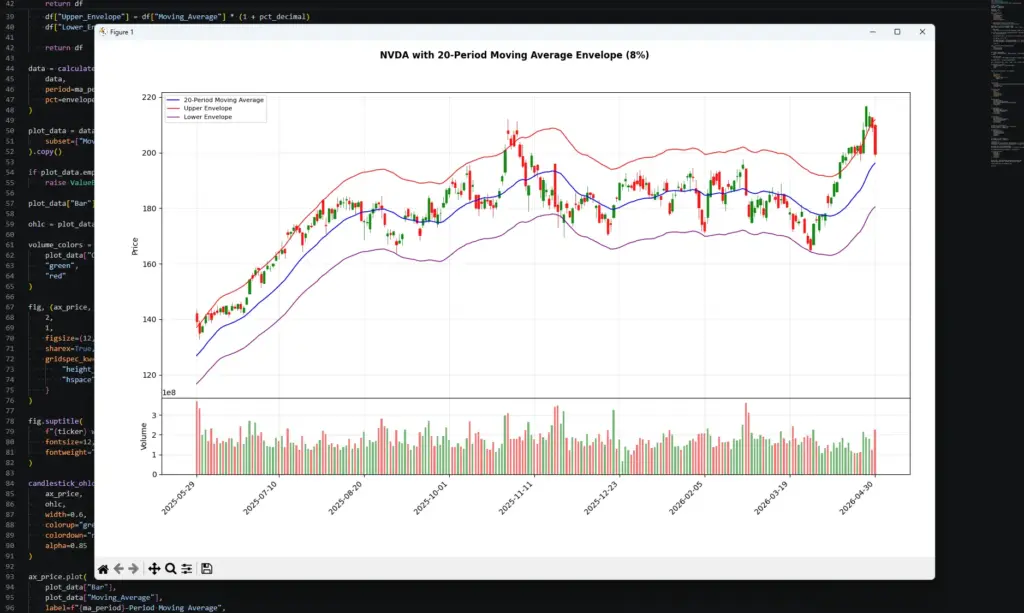
The chart shows why envelope signals need context. During the earlier advance, price spent time pressing toward the upper envelope without immediately reversing, which is more consistent with trend strength than a simple overbought signal. Later, price moved back toward the moving average and spent a long stretch inside the bands, where envelope signals would have been less decisive.
On the right of the chart, price pushes sharply back toward the upper envelope again. That can show renewed upside pressure, but it is not a trade by itself. A trader would still need to check the entry location, earnings or fundamental news risk, volume, and whether the move is already stretched relative to the chosen envelope setting.
How to Use the Envelope Indicator for Day Trading
Day trading with the envelope indicator needs careful settings. Intraday price action is noisier than a daily chart, so a band that looks useful on a swing-trading chart may become too tight or too wide on a five-minute chart.
I would not start by hunting for the perfect envelope percentage. I would start with the market condition.
If price is rotating around the moving average and repeatedly returning inside the bands, the envelope may be useful as a range or mean-reversion guide. If price is holding above the moving average and pressing the upper band, the same indicator may be showing trend strength rather than an overbought sell signal.
For day trading, the moving average envelope is usually most useful as a filter. It can show whether price is close to its average, stretched from its average, or persistently pressing one side of the envelope.
| Day-trading situation | What the envelope can help show | What still needs checking |
|---|---|---|
| Price is chopping around the moving average | Direction is unclear | Spread, liquidity, and whether there is a real setup |
| Price presses the upper envelope | Upside pressure or overextension | Trend context, resistance, and entry location |
| Price presses the lower envelope | Downside pressure or overextension | Trend context, support, and entry location |
| Price breaks outside a band and returns inside | Possible failed extension | Candle structure and follow-through |
| Price holds near one band | Possible trend strength | Whether the trade is already late |
The main day-trading mistake is fading every envelope touch. In a strong intraday trend, that can mean repeatedly trading against the move. A price push above the upper envelope can be a warning that price is stretched, but it can also show buyers are still in control.
For day trading, I would make the process more specific.
First, decide whether the session is actually liquid and active enough to trade. Thin conditions can make envelope touches look more meaningful than they are.
Second, watch what happens after price reaches a band. A candle that briefly pokes outside the envelope and snaps back inside is different from a move that holds near the band for several candles.
Third, check whether the trade can be managed cleanly. The envelope can show that price is stretched, but it does not tell you where your invalidation level should be or whether the stop is too wide for the setup.
Scheduled news matters as well. Earnings, inflation data, jobs reports, central-bank decisions and major company headlines can all change the character of the chart quickly. The envelope only reacts to price. It does not know why the move is happening.
Frequently Asked Questions about the Moving Average Envelope Indicator
Q: What is the moving average envelope indicator?
The moving average envelope indicator plots an upper and lower band around a moving average. The bands are usually set a fixed percentage above and below the moving average.
Q: How is a moving average envelope calculated?
The upper envelope is the moving average multiplied by one plus the chosen percentage. The lower envelope is the moving average multiplied by one minus the chosen percentage. If the setting is 5%, the upper band is 1.05 times the moving average and the lower band is 0.95 times the moving average.
Q: What is the best moving average envelope setting?
There is no single best setting. The moving average period and percentage band need to match the market, timeframe and trading style. A tight envelope creates more signals. A wide envelope creates fewer signals but may react too late.
Q: Is the envelope indicator the same as Bollinger Bands?
No. Moving average envelopes use fixed-percentage bands. Bollinger Bands use standard deviation, so their width changes with volatility.
Q: Is the envelope indicator the same as Keltner Channels?
No. Keltner Channels usually use ATR to set the channel width. A moving average envelope uses a fixed percentage instead.
Q: Does touching the upper envelope mean sell?
Not automatically. In a range, an upper-band touch can warn that price is stretched. In a strong uptrend, price can keep riding the upper envelope. The trend context matters.
Q: Does touching the lower envelope mean buy?
Not automatically. In a range, a lower-band touch can warn that price is stretched to the downside. In a strong downtrend, price can keep pressing the lower envelope.
Q: Can the moving average envelope be used for day trading?
Yes, but intraday charts are noisy. I would use it as a price-extension and trend-context tool rather than as a mechanical buy or sell signal.
Final Thoughts
The moving average envelope indicator is useful because it keeps the idea simple. It places a fixed-percentage frame around a moving average and lets the trader see when price is close to, stretched from, or pressing away from its average.
The fixed design is both the strength and the weakness. It makes the bands easy to understand, but it also means they do not adapt automatically when volatility changes.
That is why envelope signals need context. A move above the upper band can show overextension in a range, but it can also show strength in an uptrend. A move below the lower band can warn that price is stretched, but it can also show persistent downside pressure.
I would treat the envelope as a framing tool rather than a full strategy. It can help identify trend pressure, stretched prices, failed breaks and pullbacks toward the average. The trade still needs price structure, risk control, and awareness of what is happening outside the chart.
Further Reading
Related AlphaSquawk guides:
Moving Averages, for the centre-line logic behind the envelope indicator.
Bollinger Bands, for volatility bands based on standard deviation.
Keltner Channels, for ATR-based trend channels.
Average True Range, for understanding the volatility input used in Keltner-style bands.
RSI, for a different way to judge momentum and stretched conditions.
MACD, for moving-average momentum and crossover signals.
On-Balance Volume, for checking whether volume supports a price move.
Books and references:
- “Technical Analysis of the Financial Markets” by John J. Murphy: This book provides an in-depth look at various technical analysis tools, including the Envelope indicator. In particular, refer to the section that discusses the use of percentage envelopes around moving averages to identify overextended trends (see Figures 9.8a-b).
- “Technical Analysis: The Complete Resource for Financial Market Technicians” Charles Kirkpatrick II & Julie Dahlquist (3rd Edition)