Updated May 2026: This Congestion Count guide has been refreshed with clearer Last and Group definitions, breakout warnings, and a practical Python demo with shaded zones and breakout markers.
Introduction
The Congestion Count Indicator helps traders identify periods where recent bars are sharing overlapping price ranges. Put simply, it tries to spot when the market is repeatedly trading inside a similar area rather than breaking cleanly higher or lower.
That can matter because congestion often reflects balance, hesitation or short-term agreement between buyers and sellers. When that balance finally breaks, the move can sometimes be sharp.
The indicator is not designed to predict breakout direction by itself. It is better thought of as a setup alert: “this market has been compressing or overlapping for several bars; now watch what happens if price escapes the range.”
This guide explains the CQG-style idea behind Congestion Count, the difference between Last and Group methods, how traders interpret the signal, and how to build a simplified Python version that highlights congestion zones and potential breakouts.
Origins
The Congestion Count study is associated with CQG, a professional trading, market data and charting platform founded in 1980 used by many futures and institutional traders.
CQG describes the study as a way to identify areas of congestion using two methods: Last and Group. In the Last method, the focus is on the last bar sharing price-range values with previous bars. In the Group method, every bar in the group must share price-range values. When the sharing stops, the counter resets.
That makes the indicator different from a simple moving average, oscillator or volatility band. It is not measuring momentum or trend strength. It is counting how long price has remained in overlapping range behaviour.
In this article, we are not recreating CQG’s proprietary implementation exactly. We are building a practical Python version inspired by the same idea: count bars that remain inside or overlap a recent range, then mark when price breaks away from that congestion.
Mathematical Construction
The Congestion Count concept is based on overlapping price ranges.
A bar has a high and a low. If the next bar’s range overlaps with a previous bar or group of bars, it can be treated as part of the same congestion area. If price no longer shares that range, the congestion count resets.
CQG describes two methods:
Last: the latest bar shares price-range values with previous bars.
Group: every bar in the group shares price-range values.
When the shared price-range condition stops, the count resets to one. When sharing continues, the count increases.
A simplified version can be described like this:
- Choose a lookback period.
- Find the recent overlapping or shared high-low range.
- If the current bar remains inside or overlaps that range, increase the count.
- If the current bar breaks outside the range, reset the count.
- If the break is above the congestion range, mark a possible upside breakout.
- If the break is below the congestion range, mark a possible downside breakout.
The exact implementation can vary. A strict version tries to match CQG’s Last or Group definitions more closely. A practical custom version may simply count bars that remain inside a recent high-low range. The important thing is to be consistent, test the logic, and understand what your version is actually counting.
Purpose and Design
The purpose of the Congestion Count Indicator is to highlight markets that have stopped making clean directional progress.
A high count suggests that several bars have continued to share overlapping price ranges. That does not mean a breakout is guaranteed. It means the market has spent time in a compressed or balanced state.
For traders, this can be useful because many strategies depend on recognising market state. A trend-following trader may want to avoid the middle of congestion but pay attention when price breaks out of it. A mean-reversion trader may do the opposite and trade the edges of the range until the congestion fails.
The indicator does not tell you which direction the breakout will go. It also does not tell you whether the breakout will follow through. It simply highlights the setup: price has been trapped or overlapping, and a move away from that area may deserve attention.
Interpreting Signals
A rising congestion count means more bars are continuing to share or overlap a similar price range.
A low count means price is not spending much time in overlapping range behaviour.
A high count can suggest that the market is coiling, balancing or waiting for fresh information. Traders often watch these areas because a breakout from a long congestion period may be worth closer attention.
The basic interpretation is:
- rising count: congestion is building;
- high count: the market has spent time in balance;
- count reset after a break: price may be leaving the congestion zone;
- close above the congestion high: possible upside breakout;
- close below the congestion low: possible downside breakout.
The close matters. A wick outside the range that immediately falls back inside is weaker evidence than a close outside the range.
The larger warning is that congestion breaks can fail. Price can break out, attract traders, then reverse back into the range. That is why Congestion Count is best used with other tools, such as volume, trend, volatility bands, market profile, moving linear regression, or support and resistance.
Pros and Cons
Like any trading indicator, Congestion Count has its strengths and weaknesses.
Pros
- Highlights compression: It helps identify when price has spent several bars overlapping in a similar range.
- Useful for breakout traders: Long congestion periods can help traders focus on markets that may be preparing for a directional move.
- Works as a setup filter: The indicator can help traders decide when to watch a market more closely, rather than forcing trades in the middle of noise.
- Clear visual logic: Counting overlapping bars is easier to understand than many formula-heavy indicators.
- Useful for alerts and screeners: A custom Python version can scan for markets where congestion is building instead of requiring you to watch every chart manually.
Cons
- No breakout direction: The indicator can show congestion, but it does not know whether the break will be up or down.
- False breakouts: Price can break out of congestion and then reverse back into the range.
- Implementation differences: CQG has its own Last and Group methods. A custom Python version may behave differently unless carefully designed.
- Parameter sensitivity: A short lookback may create too many signals. A long lookback may miss shorter tradable consolidations.
- Needs context: Congestion before a major data release, earnings report or central bank event is not the same as ordinary quiet trading.
Practical Tips for Using the Indicator in Trading
Congestion Count is best used as a setup tool, not a complete trading system.
A useful workflow might be:
- Use Congestion Count to identify markets that have been overlapping for several bars.
- Mark the high and low of the congestion area.
- Wait for a close outside that range.
- Check whether volume, volatility or market context supports the breakout.
- Define the trade risk before entering.
- Avoid assuming that every congestion break will follow through.
The indicator can also be combined with other tools. For example, CQG’s own material discusses using Congestion Count with Moving Linear Regression R Squared. In that example, a high Congestion Count and low MLR R-squared can identify sideways behaviour before a breakout condition is considered.
For discretionary traders, the key is not just the count. It is the context around the count. Is the market coiling before a scheduled announcement? Is volume drying up? Are buyers or sellers repeatedly defending the same level? Is the breakout happening into obvious resistance or support?
The Python version that follows in this article is a starting point. It can be extended into a screener, alert system or backtest, but it should be tested carefully before being used for live trading.
Building Your Own Congestion Count Indicator in Python
The Python example below builds a practical Congestion Count demo with two modes.
The first mode is Last mode. This checks how many previous bars overlap the current bar’s high-low range.
The second mode is Group mode. This checks how many consecutive bars share a common overlapping range. In other words, the group remains congested only while there is still a shared price zone between the bars.
This is inspired by CQG’s description of Last and Group, but it is not intended to be an exact replica of CQG’s internal study. The aim is to create a useful trader-friendly version: count congestion, highlight congestion zones, and mark possible breakout candles.
We will use:
yfinanceto download market data;pandasto organise the data;numpyfor array calculations;mplfinanceto plot candlesticks and volume;matplotlibto add custom markers and legends.
Create a new Python file in VSCode and call it something like congestion_count_demo.py.
If you have more than one Python version installed, use python -m pip install rather than plain pip install. This helps make sure the packages are installed into the same Python environment that VSCode is using.
python -m pip install pandas numpy yfinance mplfinance matplotlib
Step 1: Import the libraries
Paste this at the top of your Python file.
import numpy as np
import pandas as pd
import yfinance as yf
import mplfinance as mpf
import matplotlib.pyplot as plt
from matplotlib.lines import Line2DThese libraries do the following:
numpyhelps with array calculations and marker placement.pandasstores the OHLC data and new indicator columns.yfinancedownloads market data from Yahoo Finance.mplfinancecreates the candlestick, volume and indicator panels.matplotlib.pyplotdisplays the finished plot.Line2Dlets us create custom legend items.
Step 2: Fetch and prepare the data
For this example, we’ll use Tesla because it gives us plenty of movement, congestion and breakout behaviour to inspect.
You can replace TSLA with another Yahoo Finance ticker.
# Choose a ticker
ticker = "TSLA"

# Download recent daily data
data = yf.download(
    ticker,
    start="2024-01-01",
    auto_adjust=False,
    progress=False
)

# yfinance can sometimes return MultiIndex columns, so flatten them if needed.
if isinstance(data.columns, pd.MultiIndex):
    data.columns = data.columns.get_level_values(0)

# Remove empty rows
data = data.dropna()
The auto_adjust=False setting keeps the standard open, high, low and close columns visible, which makes the example easier to follow.
The MultiIndex check is included because newer versions of yfinance can sometimes return columns in a slightly different format.
Step 3: Define a range-overlap helper
Congestion Count is built around one simple idea: do price ranges overlap?
If two bars share any common price area between their high and low, we treat them as overlapping.
def ranges_overlap(high_a, low_a, high_b, low_b):
    """
    Return True if two high-low ranges overlap.
    """
return max(low_a, low_b) <= min(high_a, high_b)For example, if one candle traded between 100 and 105, and the next traded between 103 and 108, those ranges overlap between 103 and 105.
If one candle traded between 100 and 105, and the next traded between 106 and 110, they do not overlap.
Step 4: Calculate Last-mode Congestion Count
It asks: how many previous bars overlap the current bar’s high-low range?
The current bar itself is included in the count.
def congestion_count_last(data):
    """
    Last mode:
    Count how many consecutive previous bars overlap the current bar's range.
    The current bar is included in the count.
    """

    highs = data["High"].to_numpy()
    lows = data["Low"].to_numpy()

    counts = np.ones(len(data), dtype=int)

    for i in range(len(data)):
        current_high = highs[i]
        current_low = lows[i]

        count = 1

        for j in range(i - 1, -1, -1):
            if ranges_overlap(current_high, current_low, highs[j], lows[j]):
                count += 1
            else:
                break

        counts[i] = count

return pd.Series(counts, index=data.index, name="ConCnt Last")This is useful if you want to know how many recent bars still overlap the bar you are looking at now.
Step 5: Calculate Group-mode Congestion Count
Group mode is stricter.
It asks: how many consecutive bars still share a common overlapping price zone?
This means every bar in the group must still have some shared price area with the group. Once that shared price zone disappears, the count stops.
def congestion_count_group(data):
    """
    Group mode:
    Count how many consecutive bars share a common overlapping price zone.
    The group remains valid while max(lows) <= min(highs).
    """

    highs = data["High"].to_numpy()
    lows = data["Low"].to_numpy()

    counts = np.ones(len(data), dtype=int)
    shared_highs = np.full(len(data), np.nan)
    shared_lows = np.full(len(data), np.nan)
    group_highs = np.full(len(data), np.nan)
    group_lows = np.full(len(data), np.nan)

    for i in range(len(data)):
        shared_low = lows[i]
        shared_high = highs[i]

        group_low = lows[i]
        group_high = highs[i]

        count = 1

        for j in range(i - 1, -1, -1):
            new_shared_low = max(shared_low, lows[j])
            new_shared_high = min(shared_high, highs[j])

            if new_shared_low <= new_shared_high:
                shared_low = new_shared_low
                shared_high = new_shared_high
                group_low = min(group_low, lows[j])
                group_high = max(group_high, highs[j])
                count += 1
            else:
                break

        counts[i] = count
        shared_lows[i] = shared_low
        shared_highs[i] = shared_high
        group_lows[i] = group_low
        group_highs[i] = group_high

    return pd.DataFrame(
        {
            "ConCnt Group": counts,
            "Shared Low": shared_lows,
            "Shared High": shared_highs,
            "Group Low": group_lows,
            "Group High": group_highs,
        },
        index=data.index
)This mode is closer to the idea of a true congestion area because the whole group must keep sharing a common price zone.
Step 6: Add breakout signals
Now we mark possible breaks from congestion.
The idea is simple:
- if the previous bar had enough congestion and the current close breaks above the previous congestion range, mark a possible bullish break;
- if the previous bar had enough congestion and the current close breaks below the previous congestion range, mark a possible bearish break.
In this example, we use a threshold of 5 bars. That is not magical. It is just a starting point.
def add_congestion_signals(data, min_count=5):
    """
    Add congestion and breakout signals.

    A breakout is marked when the previous bar had enough congestion
    and the current close breaks above or below that previous congestion range.
    """

    data = data.copy()

    previous_count = data["ConCnt Group"].shift(1)
    previous_high = data["Group High"].shift(1)
    previous_low = data["Group Low"].shift(1)

    data["In Congestion"] = data["ConCnt Group"] >= min_count

    data["Bull Break"] = (
        (previous_count >= min_count) &
        (data["Close"] > previous_high)
    )

    data["Bear Break"] = (
        (previous_count >= min_count) &
        (data["Close"] < previous_low)
    )

    data["Bull Marker"] = np.where(
        data["Bull Break"],
        data["Low"] * 0.98,
        np.nan
    )

    data["Bear Marker"] = np.where(
        data["Bear Break"],
        data["High"] * 1.02,
        np.nan
    )

    return data
These markers are alerts, not automatic trades. A breakout still needs context: volume, trend, news, support/resistance and risk.
Step 7: Calculate the indicator columns
Now we apply the functions to the downloaded data.
# Calculate Last mode
data["ConCnt Last"] = congestion_count_last(data)

# Calculate Group mode and add its columns to the DataFrame
group_data = congestion_count_group(data)
data = data.join(group_data)

# Add breakout signals
data = add_congestion_signals(data, min_count=5)At this point, the data table contains:
- the original OHLCV data;
- the Last-mode count;
- the Group-mode count;
- the shared congestion zone;
- the full group high and low;
- bullish and bearish breakout markers.
This is the point where the idea becomes useful for a future screener or alert system.
Step 8: Prepare a charting function
Instead of building only one chart, we’ll define a reusable chart function. This lets us make:
- one full chart showing the whole dataset;
- one zoomed chart showing the congestion zones and breakout markers more clearly.
This version keeps the lower-panel congestion count, but also brings back the more visual elements from the original article: shaded congestion areas, count labels and larger arrows after longer congestion periods.
Paste this code below the Step 7 calculation code.
def plot_congestion_chart(data, ticker, start=None, end=None, min_count=5, title_suffix=""):
    """
    Plot price, volume, Group Congestion Count, congestion shading,
    count labels and breakout markers.

    start/end:
        Optional date strings such as "2024-01-01" and "2024-06-01"
        for creating a zoomed chart.

    min_count:
        Minimum Group Count used as the congestion threshold.
    """

    plot_data = data.copy()

    if start is not None:
        plot_data = plot_data.loc[plot_data.index >= pd.to_datetime(start)]

    if end is not None:
        plot_data = plot_data.loc[plot_data.index <= pd.to_datetime(end)]

    if plot_data.empty:
        raise ValueError("No data available for the selected chart date range.")

    # Lower-panel congestion count and threshold line
    add_plots = [
        mpf.make_addplot(
            plot_data["ConCnt Group"],
            panel=2,
            color="b",
            ylabel="ConCnt",
            secondary_y=False
        ),
        mpf.make_addplot(
            pd.Series(min_count, index=plot_data.index),
            panel=2,
            color="black",
            linestyle="dashed",
            secondary_y=False
        ),
    ]

    # Main chart panel, volume panel, Congestion Count panel.
    # These are relative sizes, not exact pixel heights.
    panel_sizes = (5, 1.5, 2)

    fig, axes = mpf.plot(
        plot_data,
        type="candle",
        style="yahoo",
        title=f"{ticker} Congestion Count Demo{title_suffix}",
        ylabel="Price",
        volume=True,
        volume_panel=1,
        addplot=add_plots,
        panel_ratios=panel_sizes,
        figratio=(12, 8),
        figscale=1.1,
        returnfig=True
    )

    price_ax = axes[0]
    count_ax = axes[-1]

    # Map dates to x-axis positions used by mplfinance
    x_lookup = {date: i for i, date in enumerate(plot_data.index)}

    # Shade congestion zones where Group Count is above the threshold.
    # This helps readers see where the overlapping range was on the price chart.
    in_zone = False
    zone_start = None

    for i, (date, row) in enumerate(plot_data.iterrows()):
        if row["In Congestion"] and not in_zone:
            in_zone = True
            zone_start = i

        if in_zone and (not row["In Congestion"] or i == len(plot_data) - 1):
            zone_end = i if row["In Congestion"] else i - 1

            if zone_start is not None and zone_end >= zone_start:
                price_ax.axvspan(
                    zone_start - 0.5,
                    zone_end + 0.5,
                    color="gold",
                    alpha=0.12,
                    zorder=0
                )

            in_zone = False
            zone_start = None

    # Add count labels to the price chart for meaningful congestion counts.
    # To avoid clutter, only label counts at or above the threshold.
    for i, (date, row) in enumerate(plot_data.iterrows()):
        count = int(row["ConCnt Group"])

        if count >= min_count:
            price_ax.text(
                i,
                row["Low"] * 0.985,
                str(count),
                color="blue",
                fontsize=8,
                ha="center",
                va="top"
            )

    # Plot breakout arrows manually so their size can reflect the prior congestion count.
    for i, (date, row) in enumerate(plot_data.iterrows()):
        prior_count = plot_data["ConCnt Group"].shift(1).iloc[i]

        if pd.isna(prior_count):
            continue

        # Scale arrow size by the previous congestion count.
        # The multiplier is deliberately strong so the difference is visible on the chart.
        arrow_size = 35 + (prior_count ** 2 * 3)

        if row["Bull Break"]:
            price_ax.scatter(
                i,
                row["Low"] * 0.97,
                marker="^",
                s=arrow_size,
                color="green",
                zorder=5
            )

        if row["Bear Break"]:
            price_ax.scatter(
                i,
                row["High"] * 1.03,
                marker="v",
                s=arrow_size,
                color="red",
                zorder=5
            )

    # Legend
    legend_lines = [
        Line2D([0], [0], color="b", lw=1.5),
        Line2D([0], [0], color="black", lw=1.2, linestyle="dashed"),
        Line2D([0], [0], color="gold", lw=6, alpha=0.4),
        Line2D([0], [0], marker="^", color="w", markerfacecolor="green", markersize=8),
        Line2D([0], [0], marker="v", color="w", markerfacecolor="red", markersize=8),
    ]

    count_ax.legend(
        legend_lines,
        ["Group Count", "Threshold", "Congestion Zone", "Bull Break", "Bear Break"],
        loc="upper left"
    )

return fig, axesStep 9: Create the full overview chart
Now create the full chart. This gives a broad view of how the Group Count behaves over the full downloaded dataset.
plot_congestion_chart(
    data,
    ticker,
    min_count=5,
    title_suffix=" - Full View"
)

plt.show()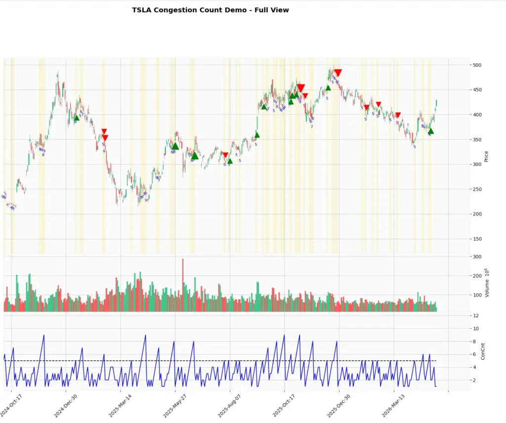
Step 10: Create a zoomed chart
The full chart is useful for seeing the system across a longer period, but it can be busy. A zoomed chart is better for understanding the logic candle by candle.
You can either create a zoomed chart by changing the date range in the Python function, or simply use the magnifying-glass tool in the chart window and drag a rectangle around the area you want to inspect.
If you prefer to do it in the code then replace the Step 9 code with the code here for your preferred date range to zoom in:
plot_congestion_chart(
    data,
    ticker,
    start="2025-08-01",
    end="2026-05-01",
    min_count=5,
    title_suffix=" - Zoomed View"
)
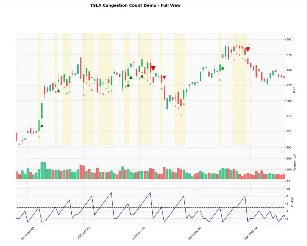
plt.show()What the chart is showing
The yellow shaded areas show where the Group-style congestion count reached the threshold. In this example, the threshold is five bars. That means the market had spent several candles sharing an overlapping price zone.
The blue line in the lower panel shows the same count as a time series. The shaded areas make it easier to see where those higher-count periods occurred on the price chart itself.
The arrows are separate breakout markers. A green arrow appears when price closes above the previous congestion range after the count has reached the threshold. A red arrow appears when price closes below the previous congestion range.
That is why not every yellow shaded zone immediately produces an arrow. Congestion tells us that price has been overlapping. A breakout marker only appears when price then closes outside the prior congestion range.
Screener uses
Once you can calculate Congestion Count in Python, the same idea can be extended into a screener.
For example, instead of watching one Tesla chart, you could scan a list of stocks or futures symbols and flag only those where Group Count is above a chosen threshold. You could then alert yourself when price closes above or below the previous congestion range.
The useful part is that the screener can separate two events: congestion building and congestion breaking. You may not want to trade every high count, but you may want to know when a high-count setup finally breaks.
The human eye can spot congestion easily on one chart, but it cannot watch hundreds of markets all day. A screener can narrow the field and tell you which charts deserve attention.
The important warning is that a congestion break is not automatically a trade. It is a setup. Before acting on it, check the broader trend, volume, news, support and resistance, and the risk-reward of the actual entry.
Conclusion
The Congestion Count Indicator is useful because it focuses on market state. It tries to identify when price has been overlapping in a tight range, then helps traders watch for a break away from that area.
The Python version in this article is not a certified CQG clone, but it captures the practical idea: count overlapping ranges, highlight congestion, and mark possible breakout candles.
That makes it a useful foundation for traders who want to build their own alerts or screeners. Just remember that congestion is only the setup. The trade still needs confirmation, risk management and market context.
References and Further Reading
For more information on the Congestion Count Indicator and technical analysis in general, consider the following resources: