Updated May 2026: I’ve refreshed this MLRR2 guide to clarify what R-squared does and does not show, separate trend direction from fit quality, and modernise the Python walkthrough.

What Is Moving Linear Regression R Squared?
Moving Linear Regression R Squared, usually shortened here to MLRR2, is a fit-quality indicator. It measures how closely recent prices line up with a straight regression line.
That makes it different from the Moving Linear Regression line itself. MLR shows the fitted line. MLRR2 asks how well the recent price window fits that line.
The value runs from 0 to 1.
A value near 1 means the recent prices fit a straight line closely. That line could be rising or falling. R-squared does not tell you direction by itself.
A value near 0 means the recent prices do not fit a straight line well. The window may be choppy, curved, noisy, or changing direction.
That distinction is worth paying attention to. MLRR2 can tell you that the recent move is clean or messy, but you still need another tool, such as the MLR slope, price action, or a breakout signal, to tell you direction.
In this article, I’m mostly interested in using MLRR2 beside the Congestion Count indicator. The idea is to see whether a congestion breakout is happening with a cleaner linear structure behind it, or whether the chart may be producing another weak break from a messy range.
MLR vs MLRR2
Moving Linear Regression and Moving Linear Regression R Squared are related, but they are not the same thing.
MLR plots the rolling fitted regression line. It helps show whether the recent price window is leaning up, leaning down, or flattening.
MLRR2 measures the quality of that fit. It asks whether prices in the window are lining up cleanly with a straight line or scattering around it.
A rising MLR line with high MLRR2 may show a cleaner upward trend. A falling MLR line with high MLRR2 may show a cleaner downward trend. A high MLRR2 reading alone does not tell you whether the trend is up or down.
That is why I would not read MLRR2 as a direction signal. I would read it as a confidence or cleanliness measure for the regression fit.
| Tool | What it shows | What it does not show |
|---|---|---|
| MLR | Direction and level of the fitted rolling regression line | How good the fit is |
| MLRR2 | How closely prices fit the rolling regression line | Whether the line is rising or falling |
| Congestion Count | How long price has been overlapping inside a range | Whether the breakout will follow through |
How MLRR2 Is Calculated
MLRR2 uses the same rolling price window as Moving Linear Regression. For each window, we fit a straight line through the recent prices and then measure how well that line explains the prices in that window.
Before the formula, here are the symbols:
yᵢ means an actual price in the window.
ŷᵢ means the fitted price from the regression line.
ȳ means the average price in the window.
SSres means the residual sum of squares.
SStot means the total sum of squares.
The common regression version of R-squared is:
R^2 = 1 - \frac{SS_{res}}{SS_{tot}}R-squared = 1 – unexplained variation / total variation
SSres measures the squared errors between the actual prices and the fitted regression line.
SS_{res} = \sum (y_i - \hat{y}_i)^2Unexplained variation = sum of squared gaps between actual prices and fitted prices
SStot measures the squared distance between the actual prices and their average.
SS_{tot} = \sum (y_i - \bar{y})^2Total variation = sum of squared gaps between actual prices and their average
If the fitted line explains most of the price movement in the window, R-squared is close to 1. If the fitted line explains very little, R-squared is closer to 0.
A high MLRR2 value does not automatically mean “buy” or “sell.” It means the recent prices fit a straight line well. The line could be rising, falling, or flat. Direction has to come from the MLR line, price action, or another signal.
For a congestion-breakout setup, the useful question is whether MLRR2 is rising as price leaves the range. If it is, the breakout may be developing into a cleaner directional move. If MLRR2 stays low, the breakout may be less convincing.
Why Combine MLRR2 with Congestion Count?
The Congestion Count indicator looks for overlapping price action. It is trying to spot when price has spent several bars trapped inside a shared range.
That can be useful, but a congestion break is not automatically a good trade. Some breaks follow through. Some fail almost immediately. Some only move sideways into a new small range.
MLRR2 gives us a different piece of information. It does not count the congestion. It measures whether recent prices are lining up cleanly with a straight regression line.
The idea in this article is to combine the two. Congestion Count marks the build-up and break. MLRR2 helps judge whether price action around that break is becoming more linear and directional.
This is not a finished trading system. It is a way to add another diagnostic layer to the congestion-breakout idea.
Coding MLRR2 and Congestion Count in Python
Now we can build the chart in Python.
This tutorial adds MLRR2 to the Congestion Count chart. The Congestion Count gives us the overlapping-price-range idea, while MLRR2 tells us whether recent prices are fitting a straight line cleanly.
I am going to keep this as a step-by-step build rather than one large code dump. Each Python-labelled block goes into the same file, in order.
Step 1: Install the Python libraries
This guide assumes you already have Python installed and are using Visual Studio Code.
Open a terminal in VS Code by clicking Terminal > New Terminal, then run:
python -m pip install pandas yfinance mplfinance matplotlib numpyOn some Windows machines, this version works instead:
py -m pip install pandas yfinance mplfinance matplotlib numpyStep 2: Create the file and import the libraries
Create a new Python file and save it as:
congestion_mlrr2.py
At the top of the file, add:
import pandas as pd
import yfinance as yf
import mplfinance as mpf
import numpy as np
from matplotlib.lines import Line2Dpandas stores the price data in a table.
yfinance downloads the market data.
mplfinance draws the candlestick chart.
numpy helps with the regression and R-squared calculations.
Line2D lets us create a clean legend for the chart.
Step 3: Add the settings
Next, add the settings near the top of the file. Keeping these values together makes the script easier to change later.
ticker = "TSLA"
chart_title = "Tesla"

start_date = "2025-05-01"
end_date = "2026-05-01"

lookback = 7
ticker is the Yahoo Finance symbol.
chart_title is the title printed on the chart.
The dates use YYYY-MM-DD format. yfinance treats the end date as a cut-off, so you can push it one trading day later if you want the most recent available bar included.
lookback controls both the Congestion Count window and the MLRR2 regression window in this example.
Step 4: Download the market data
df = yf.download(
    ticker,
    start=start_date,
    end=end_date,
    auto_adjust=True,
    progress=False,
    multi_level_index=False
)

if df.empty:
    raise RuntimeError("No data was downloaded. Check the ticker symbol and date range.")

if isinstance(df.columns, pd.MultiIndex):
    df.columns = df.columns.get_level_values(0)

df.index = pd.DatetimeIndex(df.index)
This downloads open, high, low, close and volume data.
auto_adjust=True keeps the price series adjusted where applicable.
progress=False removes the download progress bar.
multi_level_index=False keeps the columns easier to work with.
The final line makes sure the index is treated as dates, which mplfinance expects when plotting.
Step 5: Define the Congestion Count function
For this tutorial I’m using a simplified Congestion Count proxy. It checks whether the current bar remains inside the recent lookback range. The dedicated Congestion Count article uses the fuller overlapping-zone logic, so treat this version as a compact teaching example rather than a perfect duplicate of that script.
Now define the Congestion Count function.
This version checks whether the current high and low remain inside the recent high-low range. If they do, the congestion count increases. If price breaks outside that range, the count resets.
def congestion_count(data, lookback=7):
    count = pd.Series(0, index=data.index, dtype="int64")

    for i in range(lookback, len(data)):
        recent_low = data["Low"].iloc[i - lookback:i].min()
        recent_high = data["High"].iloc[i - lookback:i].max()

        current_low = data["Low"].iloc[i]
        current_high = data["High"].iloc[i]

        if current_low >= recent_low and current_high <= recent_high:
            count.iloc[i] = count.iloc[i - 1] + 1
        else:
            count.iloc[i] = 0

return countrecent_low and recent_high define the recent range.
If the current bar stays inside that range, the count rises.
If price breaks outside the range, the count goes back to zero.
Step 6: Define the MLRR2 function
Next we calculate MLRR2.
For each rolling window, the function fits a straight line through the closing prices and then calculates R-squared. A higher value means the prices in that window fit a straight line more cleanly.
def calculate_mlrr2(data, lookback=7, price="Close"):
    values = pd.Series(np.nan, index=data.index, dtype="float64")

    x = np.arange(lookback)

    for i in range(lookback - 1, len(data)):
        y = data[price].iloc[i - lookback + 1:i + 1].values

        slope, intercept = np.polyfit(x, y, 1)
        fitted = intercept + slope * x

        ss_res = np.sum((y - fitted) ** 2)
        ss_tot = np.sum((y - y.mean()) ** 2)

        if ss_tot == 0:
            values.iloc[i] = np.nan
        else:
            values.iloc[i] = 1 - (ss_res / ss_tot)

return values.clip(lower=0, upper=1)x is the bar number inside the rolling window.
y is the group of closing prices inside that same window.
np.polyfit fits the straight line.
ss_res measures the squared gaps between actual prices and the fitted line.
ss_tot measures the squared gaps between actual prices and their average.
The final value is R-squared, clipped between 0 and 1.
Step 7: Add the indicators to the DataFrame
Now add both indicators to the price table.
df["Congestion Count"] = congestion_count(df, lookback=lookback)
df["MLRR2"] = calculate_mlrr2(df, lookback=lookback)

plot_data = df.dropna(subset=["MLRR2"])Think of df as a spreadsheet. It already has Open, High, Low, Close and Volume columns. This step adds Congestion Count and MLRR2 as two new columns.
Step 8: Define the indicator plots
Next we tell mplfinance which extra lines to draw below the price chart.
indicator_plots = [
    mpf.make_addplot(
        plot_data["Congestion Count"],
        panel=2,
        color="blue",
        width=1.0,
        secondary_y=False,
        ylabel="Congestion Count"
    ),
    mpf.make_addplot(
        plot_data["MLRR2"],
        panel=2,
        color="red",
        width=1.0,
        secondary_y=True
    )
]The blue line is the Congestion Count.
The red line is MLRR2.
They are plotted in the same lower panel, but MLRR2 uses a secondary y-axis because its values run from 0 to 1 while the congestion count can rise above that.
Step 9: Create the chart
Now create the candlestick chart.
fig, axes = mpf.plot(
    plot_data,
    type="candle",
    style="yahoo",
    volume=True,
    addplot=indicator_plots,
    panel_ratios=(3, 1, 1.4),
    title=f"{chart_title} with Congestion Count and MLRR2",
    figsize=(11, 7),
    returnfig=True
)

fig.subplots_adjust(
    left=0.07,
    right=0.90,
    top=0.92,
    bottom=0.16,
    hspace=0.05
)type="candle" gives us the candlestick chart.
volume=True adds the volume panel.
addplot=indicator_plots adds the Congestion Count and MLRR2 lines.
panel_ratios controls the relative size of the price, volume and indicator panels.
subplots_adjust gives the chart extra room so labels and angled dates are not clipped.
Step 10: Add congestion shading and breakout arrows
The next block adds the visual annotations. It shades congestion bars and marks breaks from congestion with arrows.
price_axis = axes[0]

for i in range(len(plot_data)):
    count_value = int(plot_data["Congestion Count"].iloc[i])

    if count_value > 0:
        x_pos = plot_data.index.get_loc(plot_data.index[i])
        low = plot_data["Low"].iloc[i]
        high = plot_data["High"].iloc[i]

        # Shade the bar while congestion is active
        price_axis.fill_between(
            [x_pos - 0.5, x_pos + 0.5],
            low,
            high,
            color="black",
            alpha=0.15
        )

        # Add the count label only when the count increases
        if i > 0 and count_value > plot_data["Congestion Count"].iloc[i - 1]:
            price_axis.text(
                x_pos,
                low,
                str(count_value),
                color="blue",
                fontsize=7,
                ha="center",
                va="top"
            )

    # If congestion just ended, check whether price broke above or below the range
    if i > 0:
        previous_count = int(plot_data["Congestion Count"].iloc[i - 1])
        current_count = int(plot_data["Congestion Count"].iloc[i])

        if previous_count > 0 and current_count == 0:
            x_pos = plot_data.index.get_loc(plot_data.index[i])

            start = max(i - previous_count, 0)
            congestion_low = plot_data["Low"].iloc[start:i].min()
            congestion_high = plot_data["High"].iloc[start:i].max()

            close = plot_data["Close"].iloc[i]
            low = plot_data["Low"].iloc[i]
            high = plot_data["High"].iloc[i]
            bar_range = high - low if high != low else 1

            if close > congestion_high:
                # Breakout above congestion
                arrow_y = low
                arrow_dy = -0.08 * bar_range
                arrow_color = "green"
            elif close < congestion_low:
                # Breakdown below congestion
                arrow_y = high
                arrow_dy = 0.08 * bar_range
                arrow_color = "red"
            else:
                continue

            arrow_size = max(previous_count / 8, 0.6)

            price_axis.annotate(
                "",
                xy=(x_pos, arrow_y),
                xytext=(x_pos, arrow_y + arrow_dy),
                arrowprops=dict(
                    facecolor=arrow_color,
                    edgecolor=arrow_color,
                    shrink=0.05,
                    headlength=10 * arrow_size,
                    headwidth=10 * arrow_size
                )
)This block is the most visual part of the script.
When Congestion Count is above zero, the bar is shaded.
When congestion ends, the code checks whether price closed above or below the congestion range.
A green arrow marks an upside break.
A red arrow marks a downside break.
The arrow size grows with the previous congestion count.
Step 11: Add the legend and show the chart
Finally, add a legend, save the image and show the chart.
legend_items = [
    Line2D([], [], color="blue", label="Congestion Count"),
    Line2D([], [], color="red", label="MLRR2"),
    Line2D([], [], color="black", alpha=0.3, linewidth=6, label="Congestion zone"),
    Line2D([], [], color="green", marker="^", linestyle="None", label="Upside break"),
    Line2D([], [], color="red", marker="v", linestyle="None", label="Downside break")
]

fig.legend(handles=legend_items, loc="center left", bbox_to_anchor=(0.04, 0.5))

fig.savefig("congestion_mlrr2_chart.png", dpi=150, bbox_inches="tight")

mpf.show()fig.legend() adds a chart legend.
fig.savefig() saves the chart as a PNG image in the same folder as the script.
mpf.show() opens the finished chart window.
Step 12: Run the script
Save congestion_mlrr2.py by pressing Ctrl+S.
The easiest route is usually to click the play button in the top-right corner of VS Code. If that works, the chart window should open.
You can also run it from the terminal. Open Terminal > New Terminal, move into the folder where you saved the script, then run:
python congestion_mlrr2.pyOn some Windows setups, use:
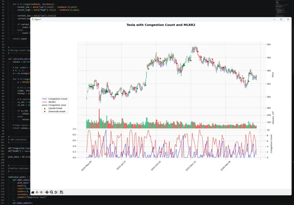
py congestion_mlrr2.pyYour chart should show Tesla candlesticks, volume, congestion shading, breakout arrows, and a lower panel with Congestion Count and MLRR2.
How to Interpret the MLRR2 and Congestion Count Chart
The red line in the lower panel is MLRR2. It runs from 0 to 1. Higher readings mean recent prices are fitting a straight regression line more closely. Lower readings mean the recent price action is messier or less linear.
The blue line is the Congestion Count. It rises when price keeps overlapping inside the recent range, and resets when price breaks outside that range.
The useful part is comparing the two. A high congestion count tells us price has been coiling or overlapping. A rising MLRR2 reading can suggest price is beginning to move in a cleaner straight-line path. A low or erratic MLRR2 reading warns that the break may not have much structure behind it.
A high MLRR2 value is not bullish or bearish by itself. It can rise during a rally or a sell-off. Direction still has to come from price action, the breakout, or the MLR slope.
Reading the MLRR2 and Congestion Count Chart
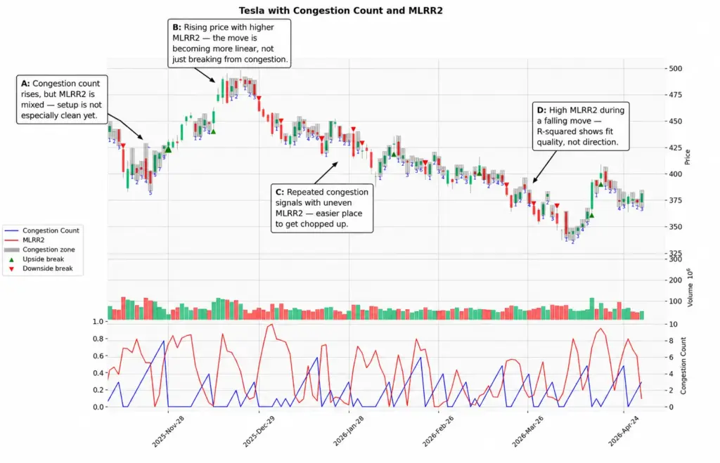
This chart is useful, but not because it gives us a perfect textbook signal. It shows the messier reality of combining Congestion Count with MLRR2.
On the left, the Congestion Count starts to appear, but MLRR2 is uneven. That suggests price is overlapping, but the recent closes are not yet fitting a clean linear move.
During the stronger rally, MLRR2 rises while price is moving higher. In that section, the red line suggests the move is becoming more linear, rather than just breaking from congestion.
In the middle of the chart, the count and MLRR2 both become more erratic. This is the kind of area where a congestion-breakout trader could get chopped up if every break is treated as equal.
On the right, MLRR2 rises again during a falling move. This is the key reminder: a high MLRR2 reading is not bullish or bearish by itself. It means the recent prices fit a straight line more cleanly. Direction still has to come from price action, the MLR slope, or the breakout itself.
Key Takeaways
- MLRR2 measures how closely recent prices fit a straight regression line.
- A high MLRR2 reading means the recent price window is more linear. It does not tell you whether the move is up or down.
- A low MLRR2 reading means the recent prices are not fitting a straight line well.
- Congestion Count and MLRR2 answer different questions. Congestion Count looks for overlapping price action. MLRR2 looks at fit quality.
- Combining the two can help judge whether a congestion break is becoming cleaner or whether the chart remains messy.
- This article uses a simplified Congestion Count proxy for the Python tutorial. The fuller overlapping-zone version is covered in the dedicated Congestion Count guide.
- The examples are deliberately mixed. MLRR2 can add context, but it does not turn every congestion break into a clean trade.
- Python makes it possible to test the idea across more tickers, timeframes and parameter settings.