Updated May 2026: I’ve refreshed this Moving Linear Regression guide with a clearer explanation of the rolling regression calculation, better notes on lag and prediction, and an updated Python walkthrough.

What Is the Moving Linear Regression Indicator?
The Moving Linear Regression indicator, often shortened to MLR, fits a straight regression line to a rolling window of price data.
For example, a 20-period MLR looks at the most recent 20 bars, fits the best straight line through those prices, and then plots the value of that line at the latest bar. On the next bar, the window rolls forward and the process repeats.
That creates a connected line on the chart. It can look a little like a moving average, but it is built differently. A moving average averages the prices in the window. MLR fits a line through them.
The slope of that fitted line is the useful part. If the rolling regression line is rising, recent price action has an upward bias. If it is falling, recent price action has a downward bias. If it is flattening, the trend may be slowing, pausing, or becoming more range-bound.
I would not treat MLR as a prediction machine. It uses recent historical data to estimate the current regression line. That can be useful, but it does not know what the next candle will do.
Bands can also be placed around the MLR line, often using standard error. Those bands are a separate layer of analysis, so I will keep the main focus here on the MLR line itself.
Where Moving Linear Regression Comes From
Moving Linear Regression is the charting version of a much older statistical idea: fitting a straight line through a set of data points.
The method behind it is least squares. In plain terms, least squares finds the line that produces the smallest overall squared distance between the line and the data points. The line will not touch every point. It is the best fit through the group.
That method is associated with early work by mathematicians such as Carl Friedrich Gauss and Adrien-Marie Legendre. Traders did not invent the maths. They borrowed the idea and applied it to rolling windows of market data.
On a chart, this gives us a constantly updating regression line. Each new bar drops the oldest data point, adds the newest one, and fits a new line to the latest window.
That is why MLR is useful for trend work. It gives a cleaner view of the recent direction of price, while still responding to the shape of the latest window. It can be helpful, but it is still built from historical prices and should be treated as a trend guide rather than a forecast.
How Moving Linear Regression Is Calculated
Moving Linear Regression starts with ordinary linear regression, but applies it repeatedly to a rolling price window.
For each bar, the indicator takes the most recent group of prices, fits a straight line through them, and then plots the fitted value at the end of that window. On the next bar, the window rolls forward and the calculation is done again.
That is why the MLR line can look like a moving average. It is still a connected line on the chart. The difference is that MLR is not averaging the prices. It is fitting a line through them.
Before the formula, here are the symbols:
y means price.
x means the bar number inside the rolling window.
m means the slope of the fitted line.
b means the intercept of the fitted line.
ŷ means the fitted value from the regression line.
Regression line formula
\hat{y} = mx + bFitted price = slope × bar number + intercept
The slope tells us the direction of the line. A positive slope means the fitted line is rising. A negative slope means it is falling. A slope near zero means the fitted line is almost flat.
Slope formula
m = \frac{\sum (x_i - \bar{x})(y_i - \bar{y})}{\sum (x_i - \bar{x})^2}Slope = how price and time move together / how much the time values vary
The numerator measures how the price values and bar numbers move together. The denominator scales that by the spread of the bar numbers in the window.
On a chart, this calculation is handled automatically for each rolling window. What matters for interpretation is whether the fitted line is rising, falling, or flattening.
Intercept formula
b = \bar{y} - m\bar{x}Intercept = average price – slope × average bar number
Once we have the slope and intercept, we have the fitted line for that window.
Rolling MLR value
MLR_t = m_t x_t + b_t
MLR value = fitted regression-line value at the latest bar in the rolling window
This is the value plotted on the chart. The indicator is not plotting every full regression line. It plots the endpoint of each rolling regression line and connects those endpoints together.
This is also why the word “prediction” needs care. Some code examples project the fitted line one step forward. Other charting platforms plot the fitted value at the latest bar in the window. Either way, the calculation is based on recent historical prices. It is a regression estimate, not a guarantee about the next candle.
A simple way to picture it:
Take the last 20 closing prices.
Fit the best straight line through those 20 prices.
Plot the line’s value at the newest bar.
Move forward one bar and repeat.
The final MLR line is the connected series of those plotted values.
| Component | What it means | Trader translation |
|---|---|---|
| Rolling window | The group of recent bars used in the calculation | The lookback period |
| Slope | Direction and steepness of the fitted line | Is recent price action rising, falling, or flat? |
| Intercept | The level part of the fitted line | Needed to place the line correctly |
| Fitted value | The value of the regression line at a chosen bar | The MLR point plotted on the chart |
| Residuals | Distance between actual prices and the fitted line | How messy the fit is |
This article focuses on the MLR line itself. If you want to measure how well the regression line fits the recent prices, that is where Moving Linear Regression R-Squared comes in. R-squared is a separate companion indicator, and we cover it in the dedicated MLRR2 guide.
How Traders Read Moving Linear Regression Signals
The first thing I look at with Moving Linear Regression is the direction of the line.
If the MLR line is rising, the fitted regression line is pointing higher over the lookback window. If it is falling, the fitted line is pointing lower. If it is flattening, the recent trend may be slowing or losing direction.
That makes MLR useful as a trend guide, but I would not treat every turn in the line as a trade signal. A change in slope can show that the recent price window has changed character. It does not prove that the next move will continue in that direction.
One useful reading is the slope shift. If MLR has been rising and then starts flattening, the prior upward pressure may be weakening. If MLR has been falling and then turns up, downside pressure may be fading.
The line can also be used as a price reference. If price is above a rising MLR line, the chart has a different feel from price chopping around a flat MLR line. The chart context still matters: trend, volatility, support, resistance and volume all affect how useful the signal is.
I would use MLR to answer one main question: is the recent price window still leaning up, leaning down, or going sideways?
| MLR behaviour | What it shows | How I would read it |
|---|---|---|
| MLR rising | Rolling regression line points higher | Recent trend bias is upward |
| MLR falling | Rolling regression line points lower | Recent trend bias is downward |
| MLR flattening | Slope is losing direction | Trend may be slowing or range-bound |
| MLR turns up after falling | Recent downside pressure is fading | Possible early improvement, needs confirmation |
| MLR turns down after rising | Recent upside pressure is fading | Possible early weakness, needs confirmation |
| Price chops around flat MLR | Regression line has little direction | Likely poor trend-following environment |
Moving Linear Regression Strengths and Weaknesses
Moving Linear Regression is useful because it reacts to the shape of the recent price window rather than simply averaging the prices inside it. That can make the line feel more responsive than a simple moving average.
The strength is the fitted-line approach. MLR gives traders a cleaner view of whether recent price action has an upward, downward or flat bias.
The weakness is that the calculation is still based on past prices. MLR can turn more quickly than some smoothing tools, but it does not remove uncertainty and it does not forecast the next candle with certainty.
It can also struggle in noisy, range-bound markets. When price is jumping around without a clean direction, the rolling regression line may keep changing slope without producing a useful trade.
| Strength | Why it helps |
|---|---|
| Fits a line instead of averaging | Captures the direction of the recent price window |
| Responsive to slope changes | Can show when recent trend pressure is changing |
| Useful trend guide | Helps separate rising, falling and flat conditions |
| Works across timeframes | Can be applied to daily, intraday or weekly data |
| Pairs well with fit measures | MLRR2 can help judge whether the line fits the data well |
| Weakness | Why it matters |
|---|---|
| Still based on historical data | It cannot know the next candle |
| Can flip in noisy ranges | Slope changes may not lead to tradeable moves |
| Sensitive to window length | Short settings can be jumpy; long settings can react late |
| Easy to overread | A fitted line can look more precise than it really is |
| Needs context | Slope alone does not define risk, target or entry |
MLR vs Moving Averages and EPMA
Moving Linear Regression can look similar to a moving average on a chart, but the calculation is different.
A moving average takes the prices inside a window and averages them. A simple moving average gives each price equal weight. An exponential moving average gives more influence to recent prices.
MLR does not average the prices. It fits a straight line through the prices in the window and plots the fitted value from that line. The line’s slope is the key reading.
That makes MLR useful when you care about the direction of the recent price window rather than only the average price level.
EPMA, or End Point Moving Average, is another source of confusion. MLR and EPMA are sometimes described in similar ways because both use a rolling window and plot an end-point style value. The important distinction is the method. MLR uses linear regression to fit a line. EPMA is normally described as a weighted moving-average approach where the end point receives the most weight.
So I would not use the names interchangeably. MLR is a regression-line tool. Moving averages and EPMA are smoothing or weighting tools.
| Tool | What it does | Main reading |
|---|---|---|
| SMA | Averages prices equally | Smoothed price level |
| EMA | Gives more weight to recent prices | Faster smoothed price level |
| MLR | Fits a regression line to the rolling window | Direction and slope of fitted line |
| EPMA | Weights the window toward the end point | End-weighted smoothed value |
| MLRR2 | Measures how well the regression line fits | Strength of the fit |
Using Moving Linear Regression in Trading
Moving Linear Regression works best when it has a specific job on the chart.
The most obvious job is trend direction. If the line is rising, the recent window has an upward slope. If the line is falling, the recent window has a downward slope. If the line is flat, the market may not be trending cleanly.
The second job is slope change. A line that has been rising but starts to flatten can warn that upside pressure is cooling. A falling line that starts to turn up can show that downside pressure is easing.
For day trading, the period setting matters. A shorter window will react faster, but it can also become jumpy. A longer window gives a steadier line, but it may react later when the chart turns.
I would test MLR on the timeframe being traded rather than assume that one period works everywhere. A 20-period MLR on a daily chart is not the same trading tool as a 20-period MLR on a 5-minute chart.
MLR can be paired with other tools, but I would avoid stacking indicators that all say the same thing. A moving average may help with broader trend context. RSI, Stochastics or ROC may help with momentum. MLRR2 can help judge whether the regression line actually fits the recent prices well.
The key mistake is treating the line as a forecast. MLR gives a fitted value based on the recent window. It is useful context, not a predictor.
When I look at MLR, I want to know:
Is the line rising, falling or flat?
Is the slope getting steeper or flattening?
Is price respecting the line or chopping around it?
Does MLRR2 show a strong fit or a messy one?
Does the wider chart support the same idea?
MLR vs MLR R-Squared
Moving Linear Regression and Moving Linear Regression R-Squared are related, but they answer different questions.
MLR shows the fitted regression line. It tells you the direction and level of the rolling regression estimate.
MLR R-Squared asks how well that fitted line explains the prices in the window. A rising MLR line with weak R-squared may be less convincing than a rising MLR line with a strong fit.
That distinction is useful. The MLR line can tell you where the fitted trend is pointing. MLRR2 can help you decide whether the recent prices are actually lining up with that trend or just bouncing around it.
We cover that fit-quality question in the dedicated Moving Linear Regression R-Squared guide.
Implementing the MLR Indicator in Python with VS Code
Now we can build the Moving Linear Regression line in Python.
I am going to keep this as a step-by-step tutorial rather than dropping in one large script. Each Python-labelled block goes into the same file, in order. By the end, we will have downloaded market data, calculated the rolling regression endpoint, and plotted the MLR line on a candlestick chart.
For this example I use SPY so the chart has clean daily price and volume data from Yahoo Finance. The calculation itself works the same way on other markets and timeframes.
Step 1: Install the Python libraries
python -m pip install pandas yfinance mplfinance matplotlib numpy scikit-learn
On some Windows machines, this version works instead:
py -m pip install pandas yfinance mplfinance matplotlib numpy scikit-learnStep 2: Create the file and import the libraries
Create a new Python file and save it as:
mlr_indicator.py
At the top of the file, add:
import pandas as pd
import yfinance as yf
import mplfinance as mpf
import numpy as np
from sklearn.linear_model import LinearRegression
from matplotlib.lines import Line2D
pandas stores the market data in a table.
yfinance downloads the price data.
mplfinance draws the candlestick chart.
numpy helps create the bar-number array used in the regression.
LinearRegression fits the line for each rolling window.
Line2D lets us create a clean legend for the MLR line.
Step 3: Add the settings
Next, add a small settings section near the top of the file.
ticker = "SPY"
chart_title = "SPDR S&P 500 ETF"

start_date = "2025-05-01"
end_date = "2026-05-01"

mlr_period = 20
ticker is the Yahoo Finance symbol.
chart_title is the title printed on the chart.
The dates use YYYY-MM-DD format. yfinance treats the end date as a cut-off, so you can push it one trading day later if you want the most recent available bar included.
mlr_period controls how many bars are used in each rolling regression window. With 20, each fitted line uses the latest 20 closes.
Step 4: Download the market data
Now download the market data.
data = yf.download(
    ticker,
    start=start_date,
    end=end_date,
    auto_adjust=True,
    progress=False,
    multi_level_index=False
)

if data.empty:
    raise RuntimeError("No data was downloaded. Check the ticker symbol and date range.")

if isinstance(data.columns, pd.MultiIndex):
    data.columns = data.columns.get_level_values(0)

data.index = pd.DatetimeIndex(data.index)This downloads open, high, low, close and volume data.
auto_adjust=True keeps the price series adjusted where applicable.
progress=False removes the download progress bar.
multi_level_index=False keeps the columns easier to work with.
The final line makes sure the index is treated as dates, which mplfinance expects when plotting.
Step 5: Define the MLR function
Now define the function that calculates the Moving Linear Regression line.
The key detail is that we are not forecasting a far-off future price. For each rolling window, the function fits a straight regression line and plots the value of that fitted line at the final bar of the window.
def calculate_mlr(close, window=20):
    mlr_values = pd.Series(index=close.index, dtype="float64")

    # x is simply the bar number inside the rolling window:
    # 0, 1, 2, ... window - 1
    x = np.arange(window).reshape(-1, 1)

    for i in range(window - 1, len(close)):
        y = close.iloc[i - window + 1:i + 1].values.reshape(-1, 1)

        model = LinearRegression()
        model.fit(x, y)

        # Plot the fitted line's value at the final bar of the window.
        # This is the endpoint of the rolling regression line.
        endpoint = model.predict(np.array([[window - 1]]))[0][0]

        mlr_values.iloc[i] = endpoint

    return mlr_values
The function takes the closing-price series as its input.
x is a simple count of the bars inside each rolling window.
y is the group of closing prices inside the same window.
LinearRegression() fits the best straight line through those prices.
The endpoint is the value of that fitted line at the newest bar in the window. Those endpoints are what become the MLR line on the chart.
Step 6: Calculate the MLR line
Now call the function and add the result to the data table.
data["MLR"] = calculate_mlr(data["Close"], window=mlr_period)

plot_data = data.dropna(subset=["MLR"])Think of data as a spreadsheet. It already has Open, High, Low, Close and Volume columns. This step adds a new column called MLR.
dropna() removes the early blank rows before plotting. Those blanks appear because the function needs enough bars to fill the first regression window.
Step 7: Define the chart line
Next we tell mplfinance how to draw the MLR line.
mlr_plot = [
    mpf.make_addplot(
        plot_data["MLR"],
        panel=0,
        color="blue",
        width=1.2,
        ylabel="Price"
    )
]panel=0 puts the MLR line on the main price chart.
The blue line is the connected series of rolling regression endpoints.
Step 8: Create the chart
Now create the candlestick chart and overlay the MLR line.
fig, axes = mpf.plot(
    plot_data,
    type="candle",
    style="yahoo",
    volume=True,
    addplot=mlr_plot,
    title=f"{chart_title} with Moving Linear Regression ({mlr_period})",
    figsize=(11, 7),
    returnfig=True
)

fig.subplots_adjust(
    left=0.07,
    right=0.90,
    top=0.92,
    bottom=0.16,
    hspace=0.05
)type="candle" gives us the candlestick chart.
volume=True adds the volume panel.
addplot=mlr_plot adds the MLR line.
subplots_adjust gives the chart extra room so the right-hand labels and angled dates are not clipped.
Step 9: Add the legend and show the chart
Finally, add a legend and show the chart.
price_axis = axes[0]

legend_items = [
    Line2D([], [], color="blue", label=f"MLR {mlr_period}")
]

price_axis.legend(handles=legend_items, loc="upper left")

fig.savefig("mlr_indicator_chart.png", dpi=150, bbox_inches="tight")

mpf.show()fig.savefig() saves the chart as a PNG image in the same folder as the script.
mpf.show() opens the chart window.
Step 10: Run the script
Save mlr_indicator.py by pressing Ctrl+S.
The easiest route is usually to click the play button in the top-right corner of VS Code. If that works, the chart window should open.
You can also run it from the terminal. Open Terminal > New Terminal, move into the folder where you saved the script, then run:
python mlr_indicator.pyOn some Windows setups, use:
py mlr_indicator.pyYour chart should show SPY candlesticks, volume underneath, and a blue Moving Linear Regression line over price. The exact shape will depend on the ticker, date range and MLR period.
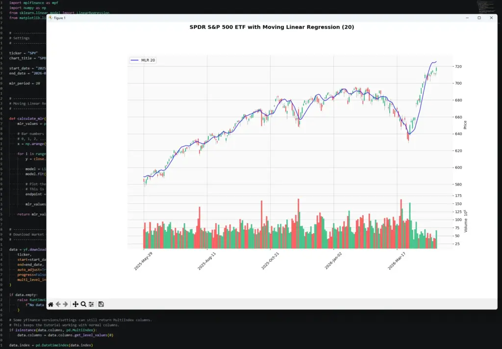
Notice how the MLR line rises quickly during the strong move on the right of the chart, but also bends and flattens through the earlier consolidation. That is the slope-change behaviour we are trying to make visible.
Once the script works, start changing the inputs.
To change the market, edit:
ticker = "SPY"
chart_title = "SPDR S&P 500 ETF"To change the date range, edit:
start_date = "2025-05-01"
end_date = "2026-05-01"To change the MLR period, edit:
mlr_period = 20A shorter MLR period should react faster, but it can also look jumpier. A longer period should look smoother, but it may react later when the chart changes direction.