Updated May 2026: I’ve refreshed this Keltner Channel guide with clearer formula explanations, more practical notes on settings, breakouts and risk management, and an updated Python chart tutorial.
What Is a Keltner Channel?
A Keltner Channel is a volatility band drawn around a moving average.
The middle line is usually a moving average of price. The upper and lower bands sit a chosen distance above and below that middle line. In most modern versions, that distance is based on ATR, or Average True Range.
That means the channel expands when volatility rises and contracts when volatility falls.
Traders use Keltner Channels in a few different ways. A close above the upper band can suggest a strong upside breakout. A move back toward the middle line can act as a pullback reference in a trend. A narrow channel can show quiet conditions before volatility expands.
I would not treat every touch of the upper or lower band as a trade. In a strong trend, price can keep riding the outer band. In a choppy market, breakouts can fail quickly.
This guide covers where Keltner Channels came from, how the modern formula works, how traders read breakouts and pullbacks, how Keltner Channels compare with Bollinger Bands, and how to plot the indicator in Python.
Where Keltner Channels Come From
Keltner Channels are named after Chester W. Keltner, a grain trader and market technician who described the idea in his 1960 book How to Make Money in Commodities.
Keltner’s original version was not the same as the modern version most traders see on platforms today. The original “10-Day Moving Average Trading Rule” used a moving average of typical price and channel lines based on a range calculation.
Modern Keltner Channels are usually built differently. The middle line is often an EMA (exponential moving average) or SMA (simple moving average) of the close, and the bands are set using ATR. A common setup is a 20-period moving average with bands two ATRs above and below it.
That modern version is why Keltner Channels are often compared with Bollinger Bands. Both draw bands around price, but Keltner Channels usually use ATR, while Bollinger Bands use standard deviation.
How Keltner Channels Are Calculated
Before the formulas:
CL means centre line.
ATR means Average True Range.
m means the ATR multiplier.
UCL means upper channel line.
LCL means lower channel line.
t means the current bar.
Ct means the close at the current bar.
CL_t = MA_n(C_t)
Centre line = moving average of the close
UCL_t = CL_t + (m \times ATR_t)
Upper channel = centre line + multiplier × ATR
LCL_t = CL_t - (m \times ATR_t)
Lower channel = centre line – multiplier × ATR
If ATR rises, the channel widens. If ATR falls, the channel narrows. That is the main difference between a volatility channel and a fixed-distance envelope.
How Traders Read Keltner Channel Signals
Keltner Channels are usually read through three things: where price is relative to the centre line, whether price is pressing outside the bands, and whether the channel is expanding or contracting.
I would not treat the upper and lower bands as automatic buy or sell levels. A touch of the upper band can mean the market is stretched, but it can also mean the trend is strong. A touch of the lower band can mean price is washed out, but it can also mean sellers are still in control.
The channel is a map of trend and volatility. Price still has to confirm the trade.
Trend direction
The centre line is the first reference point.
If price is mostly above a rising centre line, the market has an upward bias. If price is mostly below a falling centre line, the market has a downward bias.
The slope of the centre line matters. A flat centre line often means the market is ranging or pausing, which can make breakout signals less reliable.
I tend to read the centre line as the “road” and the bands as the outer edges of the lane. If price is riding above the centre line and pushing the upper band, the market is behaving very differently from price chopping through a flat centre line.
Breakouts above or below the channel
A close above the upper Keltner Channel can support a bullish breakout view. It shows price has moved beyond its recent average by more than the current ATR-based band width.
A close below the lower channel can support a bearish breakout view.
The word “support” is important. A breakout above the upper band is not necessarily a good long trade. It may be the start of a trend expansion, or it may be a late push that fails quickly.
For a stronger breakout case, I would want to see price closing outside the band, the centre line turning in the same direction, and ideally some agreement from momentum, volume, or market structure.
Pullbacks toward the centre line
Keltner Channels can also be used for pullback trading.
In an uptrend, price may push toward the upper band, then pull back toward the centre line before continuing higher. In a downtrend, price may press toward the lower band, then bounce back toward the centre line before rolling over again.
This is often more useful than blindly buying the lower band or selling the upper band. The channel only tells you where price sits relative to recent trend and volatility. The wider chart still has to show whether the market is trending, ranging, or reversing.
Reversals near the outer bands
Some traders look for reversals when price reaches the upper or lower band.
That can work in range-bound markets, but it is dangerous in strong trends. In a strong uptrend, price can keep riding the upper band. In a strong downtrend, price can keep pressing the lower band.
If I were using the outer band for a reversal idea, I would want more than a touch. I would look for rejection, a failed breakout, divergence, a support or resistance level, or a clear change in price behaviour.
Keltner Channel squeeze
A Keltner Channel squeeze appears when the bands narrow because ATR has fallen. This means volatility has compressed.
Low volatility does not tell us which direction price will break. It only tells us the market has become quieter.
The useful part is the transition. If price breaks out of a tight channel and the bands start widening, volatility may be expanding again. That is where breakout traders start paying attention.
| Keltner Channel reading | What it shows | How I would read it |
|---|---|---|
| Price above rising centre line | Price is above its recent average and trend is rising | Bullish context |
| Price below falling centre line | Price is below its recent average and trend is falling | Bearish context |
| Close above upper band | Price has broken above the ATR envelope | Possible upside breakout |
| Close below lower band | Price has broken below the ATR envelope | Possible downside breakout |
| Price pulls back to centre line | Price returns toward its average trend line | Possible pullback area |
| Bands narrowing | ATR is falling and volatility is compressing | Possible squeeze setup |
| Bands widening after a break | ATR is rising and volatility is expanding | Breakout may be gaining energy |
Keltner Channel Breakout Strategy
The simplest Keltner Channel breakout strategy looks for price to close outside the channel.
A close above the upper band suggests upside strength. A close below the lower band suggests downside weakness.
That is the easy part. The harder part is deciding whether the breakout deserves attention.
For a bullish breakout, I would look for a close above the upper band, a rising centre line, and price holding above the breakout area rather than immediately falling back inside the channel.
For a bearish breakout, I would look for a close below the lower band, a falling centre line, and price failing to reclaim the lower channel.
False breaks are common. A market can poke outside the band, trigger breakout traders, and then snap back inside. That is why the breakout needs risk control and context.
Keltner Channel Pullback Strategy
A pullback strategy uses the centre line as the reference area.
In an uptrend, the market may push toward the upper band, then pull back toward the centre line. If the centre line is rising and price reacts well there, some traders look for continuation higher.
In a downtrend, price may press toward the lower band, then rebound toward the centre line. If the centre line is falling and price fails there, the downtrend may still be intact.
The pullback idea is less dramatic than a breakout, but it can be cleaner. Instead of chasing price outside the band, the trader is waiting for price to return toward the trend reference line.
The risk is that a pullback can become a full reversal. If price slices through the centre line and the channel starts flattening, the old trend may be losing its shape.
Keltner Channel Risk Management
Keltner Channels are useful for risk management because they are volatility-based.
The bands widen when ATR rises and narrow when ATR falls. That can help a trader avoid using the same stop distance in every market condition.
For a breakout trade, a trader might use the channel line or centre line as a reference for invalidation. For a pullback trade, the opposite side of the centre line or a recent swing point may be more useful.
I would not place stops mechanically just because a channel line exists. Markets can gap, spreads can widen, and fast moves can overshoot. The channel is a reference, not a guarantee of where price will respect.
Choosing Keltner Channel Settings
There is no single best Keltner Channel setting. The right setup depends on the market, the timeframe, and whether you are using the channel for breakouts, pullbacks, trend context, or risk management.
Most modern Keltner Channel setups have three main inputs.
The first is the centre-line period. A common choice is 20 periods.
The second is the ATR period. Many traders also use something around 20 periods here.
The third is the ATR multiplier. A common starting point is 2, meaning the upper and lower bands are placed two ATRs above and below the centre line.
The word period means bars, not days. On a daily chart, a 20-period Keltner Channel uses 20 daily candles. On a 5-minute chart, it uses 20 five-minute candles.
Centre-line period
The centre line controls the trend reference.
A shorter centre-line period reacts faster. This can be useful for intraday trading, but it can also make the channel more twitchy.
A longer centre-line period reacts more slowly. This can make the channel smoother, but it may also lag when the market turns.
For day trading with Keltner Channels, I would not simply copy a daily-chart setting onto a 1-minute or 5-minute chart and assume it will behave the same way. The calculation may be the same, but the noise level is completely different.
ATR period
The ATR period controls how the channel measures recent volatility.
A shorter ATR period makes the bands react faster to sudden volatility changes.
A longer ATR period smooths the volatility estimate and can make the bands more stable.
If the ATR period is too short, the channel may expand and contract sharply around short-lived bursts of volatility. If it is too long, the channel may be slow to adjust after the market changes character.
ATR multiplier
The ATR multiplier controls how wide the channel is.
A smaller multiplier makes the bands narrower. Price will touch or break the bands more often, which may create more signals but also more false breaks.
A larger multiplier makes the bands wider. Breakouts become less frequent, but the ones that occur may be more meaningful.
For example, a 20-period centre line with a 2 ATR multiplier is a reasonable starting point. A trader who wants fewer but cleaner breakout signals might test a wider channel. A trader looking for more sensitive intraday signals might test a narrower one, but should expect more noise.
| Setting change | What usually happens | Main warning |
|---|---|---|
| Shorter centre-line period | Channel reacts faster to price | More noise and false turns |
| Longer centre-line period | Smoother trend reference | Later reaction |
| Shorter ATR period | Bands adjust faster to volatility | Can overreact to short bursts |
| Longer ATR period | More stable band width | Slower volatility adjustment |
| Smaller ATR multiplier | More band touches and breakouts | More false signals |
| Larger ATR multiplier | Fewer, wider breakout signals | Later or missed signals |
Testing settings
I would test one setting at a time.
If you change the centre-line period, ATR period and multiplier all at once, you may like the new chart but not know why it changed. Start with a standard setup, then adjust the centre line, ATR period, or multiplier separately.
For intraday trading, the most important test is not whether the channel looks good on one finished chart. It is whether the same settings behave sensibly across different days, volatility regimes, and market conditions.
Keltner Channels vs Bollinger Bands
Keltner Channels and Bollinger Bands look similar because both plot a centre line with an upper and lower band. The difference is how the bands are built.
Keltner Channels usually use ATR to set the band width. ATR is based on recent trading range, so the channel responds to volatility through price range.
Bollinger Bands use standard deviation. That means the bands widen when price becomes more dispersed around its moving average and narrow when price clusters more tightly around it.
In practice, Bollinger Bands often expand and contract more sharply around sudden price volatility. Keltner Channels can look smoother because ATR is usually less jumpy than standard deviation.
Neither is automatically better. Keltner Channels are often useful for trend-following, pullback and breakout work. Bollinger Bands are often useful for volatility squeeze, mean-reversion and stretched-price analysis. Some traders use both together to study volatility compression.
| Feature | Keltner Channels | Bollinger Bands |
|---|---|---|
| Centre line | Moving average | Moving average |
| Band width | ATR-based | Standard-deviation-based |
| Main volatility input | Trading range | Price dispersion |
| Typical use | Trend, breakout, pullback context | Volatility squeeze, stretched price, mean reversion |
| Band behaviour | Often smoother | Often more reactive to volatility spikes |
| Main warning | Breakouts can fail | Price can ride the band in trends |
The comparison is useful because many traders use both indicators for volatility, but they are not measuring volatility in the same way. A Keltner Channel breakout and a Bollinger Band squeeze may look similar on the chart, but the maths underneath is different.
Keltner Channel Pros and Cons
Keltner Channels are useful because they combine trend and volatility in one visual indicator. The centre line gives the trend reference, while the ATR-based bands show how far price has moved away from that reference.
The main advantage is that the channel adapts as volatility changes. When the market becomes more active, the bands widen. When volatility falls, the bands narrow.
The main weakness is that the bands can be misread. A break above the upper band is not automatically a good long trade. A touch of the lower band is not automatically a good buy. The same reading can mean different things in a trend, a range, or a failed breakout.
I would use Keltner Channels as a framework for reading price, not as a complete trading system.
| Strength | Why it helps |
|---|---|
| Combines trend and volatility | Centre line tracks trend while bands reflect ATR |
| Adapts to volatility | Bands widen and narrow as market conditions change |
| Useful for breakouts | A close outside the band can highlight expanding movement |
| Useful for pullbacks | The centre line can act as a trend reference |
| Clear visual structure | Price above, below or inside the channel is easy to read |
| Weakness | Why it matters |
|---|---|
| False breakouts | Price can close outside the band and quickly return inside |
| Trend dependence | Channels often work better when price is moving directionally |
| Settings sensitivity | Different periods and multipliers can change the signal quality |
| Not a standalone system | The channel does not define trade size, stop, target or wider context |
| Can be misread as overbought/oversold | Price riding the upper band may show strength, not exhaustion |
Common Keltner Channel Mistakes
The first mistake is treating the outer bands as automatic reversal levels.
A price touch at the upper band does not automatically mean the market is too high. In a strong trend, price can keep pushing along the upper band for longer than feels comfortable. The same applies to the lower band in a downtrend.
The second mistake is chasing every breakout. A close above the upper band can be interesting, but the next question is whether the move follows through. If price immediately falls back inside the channel, the breakout may have failed.
The third mistake is ignoring the centre line. The centre line is often the most useful part of the channel. It helps show whether the market is trending, flattening, or losing structure.
The fourth mistake is using the same settings everywhere. A 20-period channel on a daily chart is not the same trading tool as a 20-period channel on a 5-minute chart. The calculation is the same, but the noise level and trading use are completely different.
The fifth mistake is forgetting that ATR is backward-looking. The bands react to recent volatility; they do not know what volatility will do next.
| Mistake | Why it causes problems |
|---|---|
| Selling every upper-band touch | Strong trends can ride the upper band |
| Buying every lower-band touch | Strong downtrends can press the lower band |
| Chasing every breakout | False breaks are common |
| Ignoring the centre line | Trend context gets lost |
| Overfitting the settings | The channel may look good on one old chart and fail elsewhere |
Quick Keltner Channel Takeaways Before We Code
- A Keltner Channel is a volatility band around a moving average.
- The centre line is usually a moving average of price.
- The upper and lower bands are usually based on ATR.
- The channel widens when ATR rises and narrows when ATR falls.
- A close above the upper band can support an upside breakout view.
- A close below the lower band can support a downside breakout view.
- A pullback to the centre line can be useful in a trend.
- Band touches are not automatic reversal signals.
- Keltner Channels are often compared with Bollinger Bands, but the band calculations are different.
- The Python tutorial below calculates the centre line, ATR, upper channel and lower channel, then plots them on a candlestick chart.
Now we can build the Keltner Channel ourselves. The Python section below calculates the centre line, true range, ATR, upper band and lower band without relying on a separate technical-analysis library.
Coding Keltner Channels in Python
Now we can build the Keltner Channel in Python.
I am going to keep this as a step-by-step tutorial rather than dropping in one large script. Each Python-labelled block goes into the same file, in order. By the end, we will have downloaded market data, calculated the Keltner Channel lines, and plotted them over a candlestick chart.
For this example I use Nvidia stock. You can change the ticker once the script is working.
Step 1: Install the Python libraries
This guide assumes you already have Python installed and are using Visual Studio Code.
Open a terminal in VS Code by clicking Terminal > New Terminal, then run:
python -m pip install pandas yfinance mplfinance matplotlibOn some Windows machines, this version works instead:
py -m pip install pandas yfinance mplfinance matplotlibStep 2: Create the file and import the libraries
Create a new Python file and save it as:
keltner_channel.py
At the top of the file, add:
import pandas as pd
import yfinance as yf
import mplfinance as mpf
from matplotlib.lines import Line2Dpandas stores the market data in a table and handles the rolling calculations.
yfinance downloads the price data.
mplfinance draws the candlestick chart.
Line2D lets us create a clean legend for the Keltner Channel lines.
Step 3: Add the settings
Next, add the settings near the top of the file. Keeping these values together makes the script easier to change later.
ticker = "NVDA"
chart_title = "Nvidia"

start_date = "2025-05-01"
end_date = "2026-05-01"

center_period = 20
atr_period = 20
atr_multiplier = 2
ticker is the Yahoo Finance symbol.
chart_title is the title printed on the chart.
The dates use YYYY-MM-DD format. yfinance treats the end date as a cut-off, so you can push it one trading day later if you want the most recent available bar included.
center_period controls the moving average used for the centre line.
atr_period controls the ATR calculation.
atr_multiplier controls the channel width.
Step 4: Download the market data
Now download the market data.
data = yf.download(
    ticker,
    start=start_date,
    end=end_date,
    auto_adjust=True,
    progress=False,
    multi_level_index=False
)

if data.empty:
    raise RuntimeError("No data was downloaded. Check the ticker symbol and date range.")

if isinstance(data.columns, pd.MultiIndex):
    data.columns = data.columns.get_level_values(0)

data.index = pd.DatetimeIndex(data.index)This downloads open, high, low, close and volume data.
auto_adjust=True keeps the price series adjusted where applicable.
progress=False removes the download progress bar.
multi_level_index=False keeps the columns easier to work with.
The final line makes sure the index is treated as dates, which mplfinance expects when plotting.
Step 5: Define the Keltner Channel function
Now define the function that calculates the Keltner Channel.
This version uses a simple moving average for the centre line and a rolling average of true range for ATR. Some platforms use an EMA for the centre line or a different ATR smoothing method, so do not be surprised if another platform’s Keltner Channel is close but not pixel-perfect.
def calculate_keltner_channel(data, center_period=20, atr_period=20, atr_multiplier=2):
    high = data["High"]
    low = data["Low"]
    close = data["Close"]

    # Centre line: moving average of the close
    center_line = close.rolling(window=center_period).mean()

    # True Range calculation
    high_low = high - low
    high_close_prev = (high - close.shift(1)).abs()
    low_close_prev = (low - close.shift(1)).abs()

    true_range = pd.concat(
        [high_low, high_close_prev, low_close_prev],
        axis=1
    ).max(axis=1)

    # ATR: rolling average of true range
    atr = true_range.rolling(window=atr_period).mean()

    upper_channel = center_line + (atr * atr_multiplier)
    lower_channel = center_line - (atr * atr_multiplier)

return center_line, upper_channel, lower_channel, atrcenter_line is the moving average in the middle of the channel.
true_range measures the largest of three values: the current high-low range, the gap from yesterday’s close to today’s high, and the gap from yesterday’s close to today’s low.
atr smooths that true range over the chosen ATR period.
upper_channel adds the ATR multiple to the centre line.
lower_channel subtracts the ATR multiple from the centre line.
Step 6: Calculate the channel lines
Now call the function and add the Keltner Channel lines to the data table.
data["CL"], data["UCL"], data["LCL"], data["ATR"] = calculate_keltner_channel(
    data,
    center_period=center_period,
    atr_period=atr_period,
    atr_multiplier=atr_multiplier
)

plot_data = data.dropna(subset=["CL", "UCL", "LCL"])Think of data as a spreadsheet. It already has Open, High, Low, Close and Volume columns. This step adds CL, UCL, LCL and ATR.
dropna() removes the early blank rows before plotting. Those blanks appear because the rolling calculations need enough bars before they can produce values.
Step 7: Define the chart lines
Next we tell mplfinance how to draw the centre line and channel bands.
keltner_plots = [
    mpf.make_addplot(
        plot_data["UCL"],
        panel=0,
        color="green",
        linestyle="--",
        width=1.0
    ),
    mpf.make_addplot(
        plot_data["CL"],
        panel=0,
        color="blue",
        linestyle="--",
        width=1.0
    ),
    mpf.make_addplot(
        plot_data["LCL"],
        panel=0,
        color="red",
        linestyle="--",
        width=1.0
    )
]The green dashed line is the upper channel.
The blue dashed line is the centre line.
The red dashed line is the lower channel.
panel=0 places the lines on the main price chart.
Step 8: Create the chart
Now create the candlestick chart and overlay the Keltner Channel.
fig, axes = mpf.plot(
plot_data,
type="candle",
style="yahoo",
volume=True,
addplot=keltner_plots,
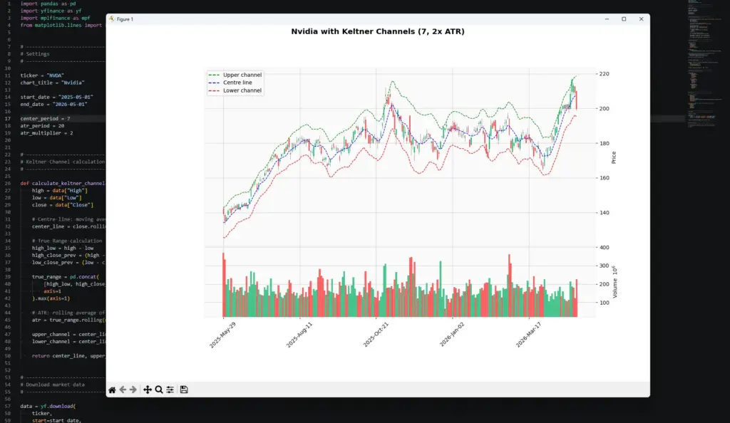
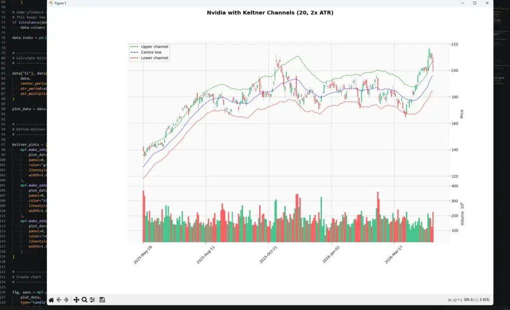
title=f"{chart_title} with Keltner Channels ({center_period}, {atr_multiplier}x ATR)",
figsize=(11, 7),
returnfig=True
)
fig.subplots_adjust(
left=0.07,
right=0.90,
top=0.92,
bottom=0.16,
hspace=0.05
)type="candle" gives us the candlestick chart.
volume=True adds the volume panel.
addplot=keltner_plots adds the Keltner Channel lines.
subplots_adjust gives the chart extra room so the right-hand labels and angled dates are not clipped.
Step 9: Add the legend and show the chart
Finally, add a legend, save the image and show the chart.
price_axis = axes[0]

legend_items = [
    Line2D([], [], color="green", linestyle="--", label="Upper channel"),
    Line2D([], [], color="blue", linestyle="--", label="Centre line"),
    Line2D([], [], color="red", linestyle="--", label="Lower channel")
]

price_axis.legend(handles=legend_items, loc="upper left")

fig.savefig("keltner_channel_chart.png", dpi=150, bbox_inches="tight")

mpf.show()fig.savefig() saves the chart as a PNG image in the same folder as the script.
mpf.show() opens the chart window.
Step 10: Run the script
Save keltner_channel.py by pressing Ctrl+S.
The easiest route is usually to click the play button in the top-right corner of VS Code. If that works, the chart window should open.
You can also run it from the terminal. Open Terminal > New Terminal, move into the folder where you saved the script, then run:
python keltner_channel.pyOn some Windows setups, use:
py keltner_channel.pyThe Chart Output from the Python Code
My initial output is shown below, you should have something similar to what I have here:
Customising Keltner Channel Parameters
Once the basic script works, the useful part begins: changing the settings and seeing how the channel behaves.
In the example above, we used a 20-period centre line, a 20-period ATR, and a 2x ATR multiplier. That is a sensible starting point, but it is not the only possible setup.
A shorter centre-line period makes the channel react faster to price. For example, changing the centre line from 20 to 7 will pull the middle line closer to price. That can make the channel more responsive for short-term charts, but it can also make it more sensitive to noise.
A longer ATR period smooths the volatility estimate. That can stop the bands from jumping around after one noisy candle, but it may also make the channel slower to adapt when volatility genuinely changes.
The ATR multiplier controls the width of the bands. A smaller multiplier creates a tighter channel with more touches and breakouts. A larger multiplier creates a wider channel with fewer signals.
I would change one setting at a time. If you change the centre-line period, ATR period and multiplier all together, you may like the new chart but have no idea which adjustment actually helped.
| Setting | If you reduce it | If you increase it |
|---|---|---|
| Centre-line period | Faster, noisier trend line | Slower, smoother trend line |
| ATR period | Bands react faster to volatility | Bands adjust more slowly |
| ATR multiplier | More band touches and breakouts | Fewer, wider breakout signals |
The NVDA example is a good reminder not to fade every upper-band touch. During a strong advance, price can keep pushing near or above the upper channel while the bands expand. A counter-trend trade there needs more evidence than “price touched the band.”
Modifying our Keltner Channel Parameters
The first chart used a 20-period centre line and a 20-period ATR. That is a reasonable starting point, but on this Nvidia example the 20-period centre line looked a little slow for the pace of the move to me.
To make the channel follow price more closely, I changed only the centre-line period:
center_period = 7
atr_period = 20
atr_multiplier = 2That keeps the volatility calculation the same, but makes the middle line more responsive. The result is a tidier-looking channel that contains more of the price action while still widening when volatility picks up.
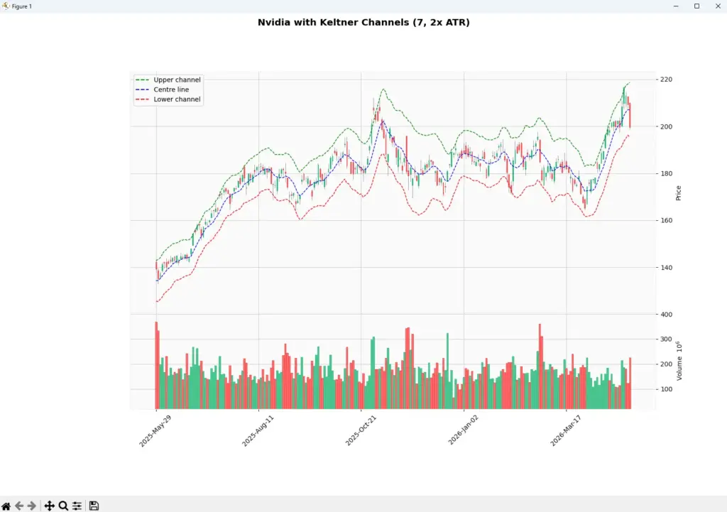
This is a useful reminder that the centre-line period and ATR period do different jobs. The centre line controls how quickly the channel follows trend. The ATR period controls how the band width reacts to volatility.
The cleaner fit does not mean the setting is automatically better. It only means this version follows this particular chart more closely, so it should still be tested across other periods and market conditions.
Frequently Asked Questions
Q: What are Keltner Channels?
Keltner Channels are volatility bands drawn around a moving average. The centre line is usually a moving average of price, while the upper and lower bands are commonly based on Average True Range.
Q: What is the usual Keltner Channel formula?
A common modern version is: centre line = moving average of price, upper band = centre line + ATR × multiplier, and lower band = centre line – ATR × multiplier.
Q: How do traders use Keltner Channels?
Traders use them for trend context, breakout signals, pullback areas and volatility analysis. A close outside the channel may support a breakout view, while a pullback toward the centre line can be useful in a trend.
Q: Are Keltner Channels buy and sell signals?
Not by themselves. A close above the upper band can show strength, but it can also be a late move. A touch of the lower band can show weakness, but it is not automatically a buy. Price action and risk management still matter.
Q: What is the difference between Keltner Channels and Bollinger Bands?
Keltner Channels usually use ATR to set the band width. Bollinger Bands use standard deviation. That means they both measure volatility, but they do it in different ways.
Q: What are good Keltner Channel settings for day trading?
There is no single best setting. Shorter periods and smaller multipliers react faster but can create more false signals. Longer periods and wider bands are smoother but slower. Test settings on the market and timeframe you actually trade.
Q: Can I code Keltner Channels in Python?
Yes. The Python tutorial above calculates the centre line, true range, ATR, upper channel and lower channel, then plots the bands on a candlestick chart.
Keltner Channels are useful because they put price movement inside a volatility-adjusted frame. They can help you see when price is trending, compressing, breaking out, or returning toward its centre line.
The mistake is expecting the bands to decide the trade for you. Use them as a map, not as a command.